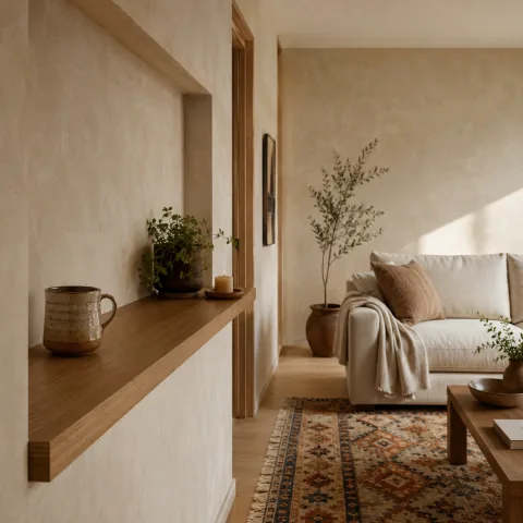
Over two days in situ, we mapped the alcove’s footprint, noting fixed elements, dust patterns, and the way natural light moved across walls. We tested scales with mock furniture, pausing to compare surface width against doorway rhythm and the room’s overall circulation. The goal was to retain air, not crowd the bay, while creating a legible line from sofa to focal point. We consulted manufacturers’ drawings and a light rough plan, then translated measurements into hinged shelves and a shallow console. Our notes emphasised finish warmth, depth illusion and a ceiling-height sense of vertical relief that would read as a room feature rather than a niche. The fieldwork demanded patience, rechecking alignments, and sometimes rethinking colour choices as the light shifted with the sun. By the third pass we began to see a coherent language: containment without heaviness, openness without wasted wall.
Understanding the fixed shallow alcove
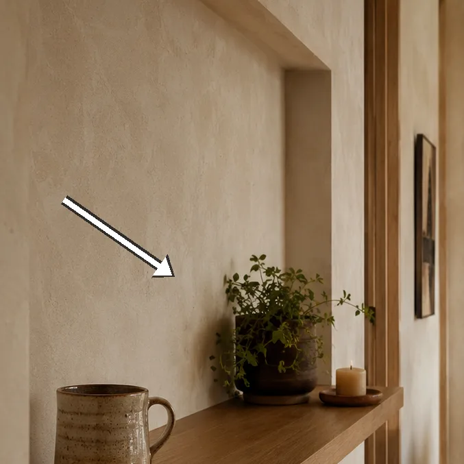
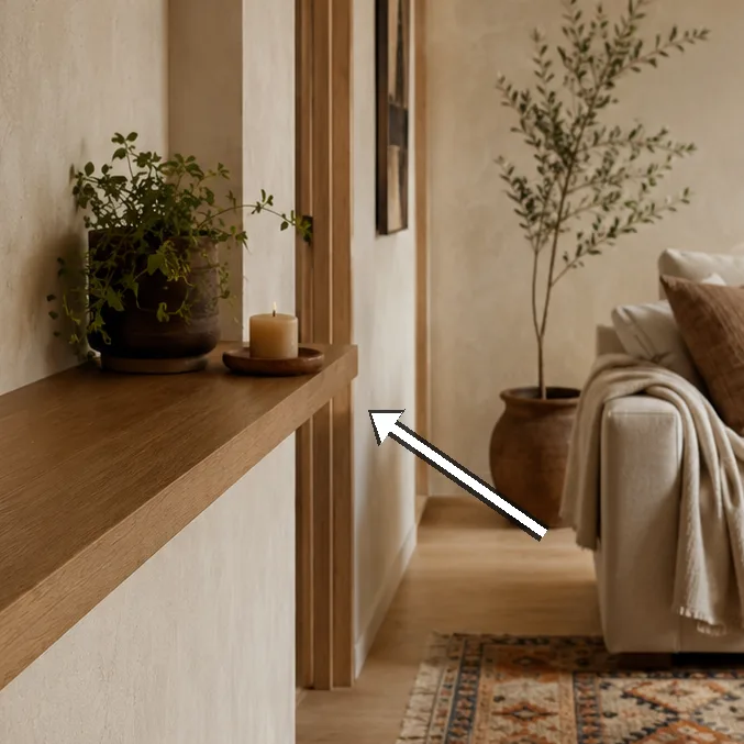
We began with a precise survey of the alcove’s fixed surround, documenting the exact depth, height, and the way plaster and ceiling profiles meet the opening. The space is a shallow pocket rather than a carved niche, which immediately narrows our options toward surfaces that behave like light canvases. This constraint became our compass: the least intrusive back panel, the slimmest console, and a continuous edge that could carry light without asserting itself. We measured the distance from the alcove’s inner edge to the sofa’s arm and compared it with the door frame, ensuring we could pass the seating area without obstruction. We also checked the ceiling line for any crown moulding that might interrupt a clean, uninterrupted line. The outcome was a clear brief: create air, not add mass, while maintaining a coherent connection to the room’s public axis.
Next we considered the architectural character of the alcove and how it interacts with the room’s existing palette. We tested a small set of back-panel materials—warm white plaster, smooth MDF with a soft satin, and a barely-there timber veneer—to gauge how they would read in daylight. The aim was a surface that would reflect and refract light subtly, so the bay feels larger even when the room is at rest. We mapped the alcove’s edges against the sofa’s profile, verifying sightlines to the media wall and ensuring the bay did not visually compete with the seating. The decisions were guided by a quiet insistence on restraint: fewer choices, better readability, more room for movement. Finally we recorded a baseline of the room’s ambient light at mid-morning and late afternoon to understand how colours would respond as the sun travels.
We then tested layout concepts that respected the wall line while offering practical storage without crowding. The preferred option included a shallow console, 28 cm deep, paired with a continuous back panel roughly 120 cm wide and finished in warm white. This pairing creates a linear, uninterrupted surface that can carry a small lamp, a couple of books, and a few seasonal objects without feeling heavy or intrusive. The depth constraint pushed us toward light timber trims, a micro-bevel edge, and glass-free shelving to maintain openness. We also prepared for future changes by marking where removable panels could occupy the space, allowing you to swap fabric, picture frames, or small offerings without dismantling the wall. The measurements became a practical language, guiding both finish choices and hardware decisions to maintain calm proportions.
 Save
Save
Measuring for harmonious scale
With the concept clear, we intensified our measurement process. We logged the alcove height at 235 cm, the inner width at 110 cm, and the shallow depth at 22–28 cm depending on the chosen finish. We noted the distance from the alcove to the sofa’s arm and the vantage line from the seating to the back panel. Our goal was to ensure that any decorative items on the console would sit at eye-level with the couch, creating a comfortable reading of the wall as a single, calm plane. We also considered how the alcove’s width relates to the room’s overall proportion, ensuring that the bay neither dominates nor recedes. The exercise reinforced the importance of consistent gaps—between the console and back panel, between shelves, and between the alcove and the neighbouring radiator grille. This level of scoping helps prevent later rearrangements from feeling forced.
We tested three scale options for the system and evaluated each against movement, light, and daily use. The first option kept a straightforward, low profile: a 28 cm deep console with a 120 cm back panel and slim shelving at 20 cm per shelf, spaced to carry everyday objects without looking cluttered. The second option expanded the back panel to 140 cm and introduced a narrow steel frame for a slightly cooler, more contemporary feel, while the third option relied on a more generous 170 cm width panel and shallow drawers that would extend the storage capacity by a few litres but risked softening the wall line. We compared how each option would catch daylight, how furniture would reach into the space, and how easy it would be to access outlets tucked behind the back panel. In the end, restraint won: the 120 cm back panel with 28 cm depth offered the best balance of air, legibility and daily practicality.
We also accounted for practicalities like outlets, cable routing, and the risk of tripping hazards around the alcove’s edge. Our plan included discreet cable management behind the back panel, with a short horizontal chase to keep cords hidden from sight and easy to access for maintenance. We considered whether to drill into the plaster to install concealed dividers or to rely on removable panels that could be updated as technology evolves. The final approach prioritised a clean silhouette, ease of cleaning, and the confidence that any future gadget would not require disruptive work. Finally, we documented the schematic for future builders: how the console would anchor to the wall, where the back panel would attach, and how the shelves would anchor to steel brackets that are barely visible.
Lighting and surface language
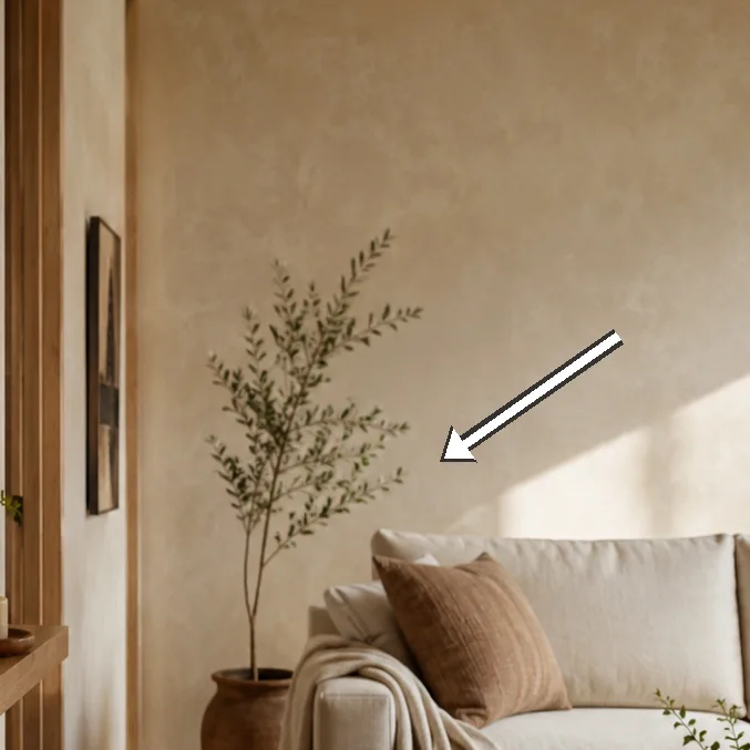
With structure settled, we turned to lighting as the primary instrument for evolving the alcove’s character. The objective was ambient glow that gently defines the back panel and shelves without causing glare on the sofa or walls. We planned a two-layer strategy: a soft, continuous edge light from an LED strip behind the inner lip of the back panel, and a focused wall-wash near the room’s centre to reveal texture. We tested colour temperatures around 2700K to 3000K to understand how warmth would shift across the pale surfaces, and we considered dimming to suit different times of day and moods. The tests showed that even small adjustments to colour and intensity could significantly alter perception of depth, making the alcove feel more expansive when set to a warmer, lower glow.
 Save
Save
We also explored finishes that interact with light in subtle ways. A satin oak trim offered continuity with the room’s existing timber, while a matte plaster panel could absorb warmth to soften the corner. We evaluated edge profiles for how they catch or reflect light, choosing a micro-bevel that would create a gentle teasing line rather than a hard boundary. In practice, the chosen language is quiet and resilient: the wall holds light, the console supports life, and the back panel acts as a screen for colour and texture. This combination avoids competition with the sofa and illuminates the items placed upon the surface, turning those objects into a part of the room’s quiet narrative.
A crucial takeaway emerged from the dialogue between texture and light: the alcove should feel inevitable rather than contrived. That meant controlling glare at the eye-line and ensuring the surface materials respond consistently as daylight shifts. We compared finishes on the back panel throughout the day, noting how plaster near the window record warm reflections while the white panel near the door stayed crisp. The result is a surface language that reads as a single plane when not actively used but reveals depth and tactility up close. The plan also anticipated practicalities, such as how often the shelves would be read for dust or how the lighting would be dimmed for movie nights without sacrificing the wall’s calmness.
“We found the alcove to be a quiet stage for light and order.” — Mira
Choosing storage without crowding
Storage selection began with a strict brief: conceal what must be hidden, display what contributes to calm, and do so without crowding the line of the wall. We rejected bulky cabinets that would press on the room’s rhythm and instead proposed slim drawers, a shallow console and a couple of concealed cubbies that align with the seating. Function meeting form was the core principle; hardware would stay inconspicuous, with soft-close hinges and a timber finish that sits quietly beside the wall rather than shouting from it. We also set an internal rule: leave breathing space above each shelf to prevent a crowded feel and ensure daily use remains intuitive rather than engineered. In practice, this means generous gaps between items and a simple, repeatable arrangement that can be refreshed seasonally without major moves.
Lighting integrations continued to guide our choices, ensuring that the storage does not appear to glow while the alcove remains legible in the evening. The cables, as a result, disappear behind the back panel, with outlets tucked neatly to the side of the console rather than along a visible floating edge. Our draft layout used concealed compartments for chargers and a small, removable tray for keys and daily essentials. The aim was to preserve a calm surface that is practical for daily life and robust against wear. We also prepared a simple routine: once a fortnight, we would rotate the objects, wipe the surfaces with a damp cloth, and check the soft-close mechanisms to ensure continued quiet operation.
 Save
Save
To validate the system, we populated the shelves with a finite set of objects: a small plant that thrives in indirect light, a modest stack of books, a personal photograph, and a few seasonal ornaments. Those items helped us test balance—the way weight distributes along the console and how light interacts with an open stack of pages. The exercise showed the importance of spacing and scale: larger objects anchor the ends of the shelves while smaller pieces fill gaps to avoid a staccato line. We also considered accessibility: how easily you reach a bottle of hand cream or a charger without stepping away from the sofa. The result is a display that feels curated rather than curated-for; items exist to support daily life, not to sit as a permanent museum.
- Keep depth shallow to preserve the room's air and avoid a boxed-in feeling
- Repeat the palette across back panel, shelving and accessories to unify the wall
- Add a dimmable light source to soften transitions between day and night
- Choose modular pieces that can scale with furniture changes
- Ensure cords and outlets are hidden from seating sightlines
Maintenance, care and future-proofing
Maintenance emerged as a mindful discipline rather than a chore, guiding the long arc of the alcove’s life in the room. We chose materials with practical durability: paint that resists fingerprints, timber finishes that tolerate daily handling, and a finish that can be repaired rather than replaced if a mark appears. Our plan included a monthly wipe-down routine and a quarterly check of the LED strip to ensure even illumination across the back panel. We also left space for future update by designing the back panel with removable fasteners and enabling panels to be swapped without destructive work. By anticipating wear and technology shifts, we hoped the alcove would age gracefully without requiring a full refresh.
Seasonal changes govern care routines, from humidity management in autumn to sunlight exposure in summer. We documented a simple schedule: adjust the lighting levels as the sun climbs and declines, rotate a few items for visual refresh, and monitor the console edges for any loosening or swelling. The maintenance plan recognises the fixed nature of the alcove while acknowledging that the room will continue to move around it. Our approach balances ease of cleaning with the need to protect finishes from spill, dust and sunlight. The result is a system that remains legible and calm because every routine is predictable rather than reactive.
In closing the section, weitemed the sense that a fixed shallow alcove can evolve in tandem with the room’s occupants. The practical care routines, careful material choices, and a consistent design language create a long-term comfort rather than a temporary fix. We concluded that maintenance should be as quiet as the mood it preserves: unobtrusive, inexpensive, and easy to adapt to shifting needs. The final plan emphasises resilience and adaptability, with a lightweight, repeatable language that makes future updates straightforward rather than disruptive. In this way, the alcove becomes a collaborator in daily living rather than a static feature to endure.
How to do it
Measure and map the alcove
Begin by recording fixed dimensions, depth, and surrounding geometry; note obstructions and the exact line where the wall meets the ceiling.
Design a light, clean back-panel
Select a back-panel finish that reflects daylight and makes the shallow bay feel larger; ensure the edge transitions are smooth.
Choose discreet storage
Opt for shallow drawers and concealed cubbies; avoid hardware that protrudes into the line of sight.
Test lighting plan
Install a temporary lighting test with dimmable LEDs to observe shadows, reflections and mood across different times of day.
Common mistakes to avoid
Overloading the alcove with bulky storage
Bulky cabinets press on the room’s line, steal air, and create shadowed corners. They interrupt sightlines and make the alcove read as closed rather than calm.
Ignoring sightlines and daylight
If light and line aren’t considered together, hotspots form and the space reads disorderly. The seating area loses cohesion and ease of use.
Inconsistent finishes and mismatched hardware
Uneven timber, chrome hinges on a matte panel, and hardware that catches light at odd angles distract from the pared-back look. The room stops feeling harmonious.
Frequently asked
What defines a fixed shallow alcove?
How should we plan seating around it?
What finishes work best here?
Which lighting layers are essential?
How to avoid visual clutter?
How to maintain balance as lighting shifts?
What if space needs to evolve?
What are common mistakes to avoid?
In closing
The fixed shallow alcove, once a constraint, becomes a quiet partner when measured, layered with light and disciplined storage. Our field notes propose a humane rhythm: air before containment, night-glow before glare, and a palette that repeats with intention. With patient testing and a few flexible details, the space can shift from niche to living room feature, able to adapt to changing needs without sacrificing calm.