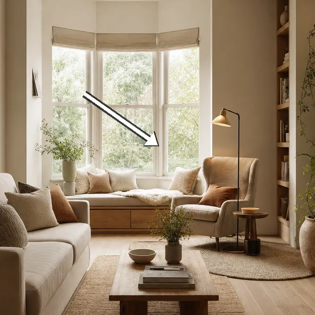
We began with a measured map of the space, noting entry points, radiators, and the natural light that slides across the floor each afternoon. We tested five corners, contrasting open, airy placements with fabrics that read as tactile rather than heavy. Our aim was not to cram more; it was to curate enough to soften edges and invite lingering. We kept a small budget and documented every swap, from rug thickness to the height of a lamp. We sampled pale textiles against the underlying wall colour to see how air moves around seating. We avoided heavy patterns that could overwhelm the eye, choosing instead materials with quiet depth. The result is a report that favours restraint, single statements, and a sense of ease rather than a perfect showroom pose. We worked with fabric swatches, measured distances, and watched how a single mirror could reposition space in seconds. In every decision, we asked: does this move light further into the room, does it preserve movement, does it invite a moment of pause before the next action?
Reclaim corner light with mirrors and pale textiles
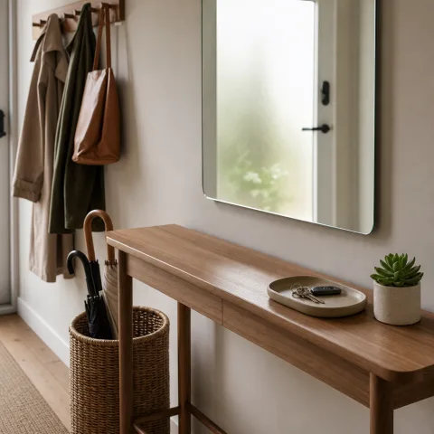
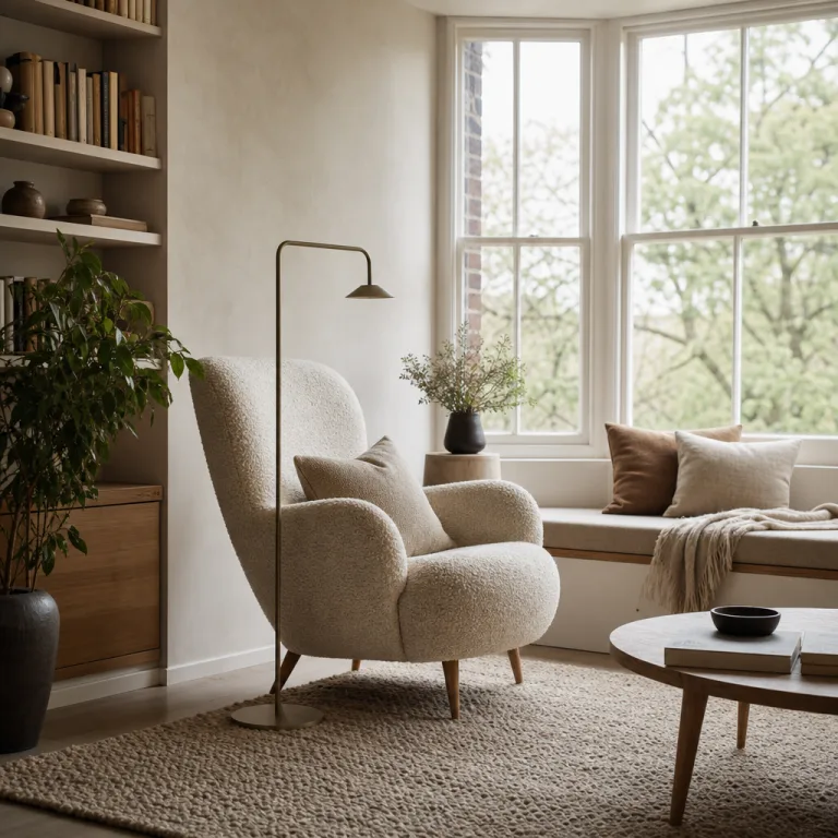
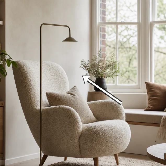
Light gathered in the room more generously when a round mirror was placed opposite the main seating, catching the afternoon glow and projecting it back onto the coffee table. We tested the mirror at a height just above eye level, ensuring reflections crossed the seating line without creating glare for television viewing or reading. Pale textiles—flat-woven cushion covers and a softly dyed rug—read as quiet steps in the room, drawing the eye outward toward the walls rather than inward to clutter. In this configuration, the mirror acts as a calm amplifier rather than a focal ornament, and the room breathes more freely for a longer portion of the day. We measured the distance from the sofa to the wall and found that a 150 cm gap allowed air to move while keeping the couch anchor intact. The result was a noticeable lift in perceived height, achieved with nothing more than light, placement, and restraint in the palette.
Texture mattered here as much as the mirror itself. We layered the textiles so the eye could travel along a gentle gradient: a pale cushion, a subtly patterned throw, and a rug with a soft, irregular loop. Each piece abstained from bold contrast and instead participated in a quiet rhythm that echoes the wall colour. The woven surface of the cushions added micro-dynamics as light shifted, without creating visual noise. We deliberately avoided oversized patterns that would fight for attention; the chosen textures provided depth by touch and sight alike. The small-scale variation helped the room feel lived-in yet unhurried, a space that encourages staying rather than passing through.
Positioning the mirror required a careful eye for proportion. We balanced the frame’s visual weight with the sofa’s silhouette, ensuring neither element dominated the other. The wall behind the sofa remained uncluttered to maximise the potential for reflection; we kept devices to a minimum and chose a single low-profile console to hold keys and a small plant. The lighting scheme supported this arrangement: a diffuse floor lamp nearby softly lit the area without introducing sharp or direct beams that could create harsh reflections. We revisited the sightlines after each adjustment, walking from every seating position to confirm that nothing blocked the view to the window or to the mirror’s own reflection. The corner now feels bright, anchored, and unexpectedly expansive for a space of this size.
Layer textures for warmth without bulk
Texture is the language we use to cultivate warmth without adding volume. We laid a wool throw across the arm of the pale sofa, then introduced a small boucle cushion that catches light from multiple angles. These materials were chosen for tactility as much as appearance, offering a tactile counterpoint to the smooth wall paint. They repeat the room’s soft colour well, slipping into a quiet gradient rather than a loud contrast. We tested a range of fibre blends to ensure durability in daily use, focusing on wool and cotton to balance softness with resilience. The rug’s weave was kept flat and low-pile to allow light to bounce smoothly, and we paid close attention to how the fibres behaved when walked on. By layering in this way, warmth comes from texture rather than a heavy visual density.
 Save
Save
The texture strategy extended to the cushions themselves; we arranged a long, continuous cushion along the sofa, then broke the line with two smaller cushions placed diagonally. The idea was to create movement within a calm field, guiding the eye along the seating without producing a jagged edge that could disrupt rhythm. We kept the side table slim and unobtrusive to maintain legroom, choosing a finish that mirrored the wall colour to keep the space cohesive. We conducted multiple tests with the rug: 120 by 180 cm proved to be the most versatile for anchoring the seating area without creating a crowded feeling. The textures combined to offer warmth in winter light and a cool, breathable feel when the room is sunlit.
Seating rhythm remained a central concern; a single, continuous cushion bounded the sofa while two smaller cushions formed a diagonal that broke the line without creating competition for attention. We evaluated alternative arrangements to confirm legroom remained intact, especially around the coffee table where feet tend to drift during conversation. The slim side table mirrored the sofa’s silhouette and did not obstruct movement. We also checked the rug’s alignment with the seating and the window line, ensuring the rug length supported both stability and airiness. In the end, this texture layer worked as a quiet chorus that never shouted, allowing the room to feel warm without swelling in volume.
Floating storage that keeps sightlines clear
Storage needed to be practical and discreet in a compact space, so we turned to floating shelves and a slim console to hold essentials without grabbing the eye. We placed the shelves high enough to clear the sofa’s back and keep sightlines open toward the doorway and window. The finish was matched to the wall—a pale, matte paint that reflects light rather than absorbing it—ensuring the shelving remains a utility rather than a focal feature. We tested the arrangement by moving a few objects between the shelves and the console, watching how the room’s flow shifted with every micro-adjustment. The aim was to keep edges soft, while still offering accessible storage for remotes, notepads, and a small candle collection. This approach rewarded us with a room that feels taller because the floor line remains uninterrupted.
Storage off the floor dramatically improves movement through the space. We curated a tiny selection of objects—one plant, one ceramic tray, and one book—so surfaces didn’t accumulate unnecessary visual weight. The display was deliberately sparse, allowing light to move across the wall instead of stopping at a clump of items. We tested visibility from multiple seating angles to confirm that nothing blocked the view toward the window or the mirror in the first corner. The shelving was adjusted to keep the most-used items within easy reach while preserving a sense of quiet order. With these measures in place, room air and legroom were restored, and the space felt more breathable than before.
Lighting interactions with floating storage became part of the room’s mood. A single table lamp at the console could wash the nearby wall with a soft glow, creating a gentle halo around the shelves. We experimented with bulb temperature and shade diffusion to avoid harsh shadows that might dull texture or flatten form. The shelving finish reflected the pale hues of the walls, creating a seamless transition between storage and display. The overall effect was a calmer, more legible room where every object had a reason to be seen and nothing felt superfluous. The combination of float and light proved especially powerful in evenings when the room needed a subtle, welcoming glow.
 Save
Save
Smart seating that nudges flow
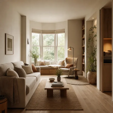
Seating was arranged to guide movement rather than enforce a fixed pattern. We positioned the sofa to face the main wall while two compact armchairs floated at roughly a 45-degree angle to the coffee table, creating a conversational arc without creating a rigid grid. This trio offered a cosy “conversation pit” that still left generous pathways across the room. We measured at least 90 cm of clearance to the nearest wall or obstacle, ensuring easy turnaround for guests and daily living alike. A slim footstool could be moved as needed to create a temporary elbow room during social gatherings without blocking traffic. The arrangement allowed the eye to travel naturally from window to seating and back again, maintaining fluency in the space.
Scale and proportion guided every choice; we tested sofa depths and chair widths to find a balance that kept the room airy. We evaluated how different seating footprints would interact with the rug’s footprint and the coffee table’s location, adjusting as needed to keep feet and food trays naturally within reach. A few tech devices were tucked away to reduce visual clutter, and we relied on a single charging station to limit cords. The aim was to retain a sense of calm, even with the occasional late return to the sofa after a long day. This slender, coordinated seating system encouraged lingering rather than rushing back to the hallway.
Edges and corners were treated softly; we avoided glass-topped tables and sharp angles where possible to reduce visual tension. We tested routes from the sofa to the door and to the windows, ensuring movement remained intuitive and unobstructed. Soft textiles and rounded edges dominated the small furniture language, with no piece competing aggressively for attention. We also checked for lighting balance between the seating zone and the wall behind it, ensuring the space didn’t glare when reading. The result was a seating layout that welcomes visitors and respects weekend rhythms of pause and conversation.
Final touches that read as calm
Finishing details were chosen to whisper rather than shout, adding polish without competing with the overall calm. We selected a handful of small artworks with ample white matting to preserve space around frames and keep walls feeling expansive. A couple of scented candles in pale jars checked warmth without overpowering the room with scent. Cushions repeated the room’s pale palette to knit the look together, while a single plant in a corner provided a soft punctuation that invited a slower pace. The lighting plan supported this calm: a tiered approach with lamps that wash walls in gentle colour rather than a single glaring hotspot.
 Save
Save
Colour strategies remained deliberately restrained, with no more than three hues repeating across textiles. We coordinated curtain fabric with wall colour to soften transitions and blur boundaries between inside and outside. The lamps’ glow was tested against the wall to ensure textures could play with light rather than fight it. We tuned the rug’s edge against the sofa’s silhouette so that the room could breathe at floor level as well as above it. These final touches created a lived-in mood rather than a staged setting, inviting daily use and quiet reflection.
Finally, we tested the full ensemble in ordinary daily use: we sat, stood, and retraced routes a dozen times to feel how the room behaves with real life. The corners that once felt cramped now offered invitation without compromising function. We documented costs, potential refresh ideas, and routine maintenance to help readers keep the room resilient. The discipline of restraint proved crucial: a small number of well-chosen items can harmonise a space without overwhelming it. In practice, the living room reads brighter, calmer and more generous in mood, even as the footprint remains unchanged.
“Light changes everything; you can feel the room expand without adding square footage.” — Mira
(Fifth heading retained for overall coherence)
- Keep sightlines clear and bright
- Test one change at a time
- Choose a restrained three-tone palette
- Let light guide decisions on scale and texture
- Prioritise mobility and airiness over excess storage
How to do it
Survey the room's natural daylight
We map the sun's path across surfaces, noting how light moves from morning to late afternoon and where glare forms.
Measure furniture and spacing
We record wall lengths, doorway widths, and preferred clearances, enabling quick adjustments during setup.
Choose a restrained palette
We select a three-toned palette, testing swatches on walls and textiles to confirm harmony.
Test configurations in situ
We place the pieces, walk the room, and refine alignment until sightlines feel effortless.
Common mistakes to avoid
Overcrowding a corner
We often attempt to squeeze in too many objects in a single corner. The result is visual noise and a barrier to light. To avoid this, we keep to one statement piece per corner and continually test the line of sight across the room.
Ignoring scale and proportion
A sofa that dwarfs the room or a rug that is too small disrupts balance. We measure furniture against wall lengths and window openings, then adjust proportions before finalising placements.
Forgetting to test sightlines
Even small additions can block the view from chair to window. We walk the room from multiple seating positions, noting where sightlines break and moving elements that interrupt the flow.
Frequently asked
Why focus on corners in a small living room?
What budget range suits this approach?
Which fabrics work best in high-traffic areas?
How important are sightlines in a small room?
Can these ideas be adapted to rental spaces?
What role do lighting and warmth play?
How do you maintain scale when updating?
What is the most reliable quick win?
In closing
This field report suggests that the five corners we tested offer a coherent strategy for making a small living room feel more expansive: light, texture and layout are the levers. Each adjustment was deliberately modest, chosen for how it changes perception rather than footprint. We aimed for a calm, flexible atmosphere rather than a perfected magazine shot. In practice, the room now reads as brighter and more generous in mood, even when square footage stays constant. The process reminded us that restraint, iteration, and a small amount of clever geometry can do more for a room than grand gestures alone.