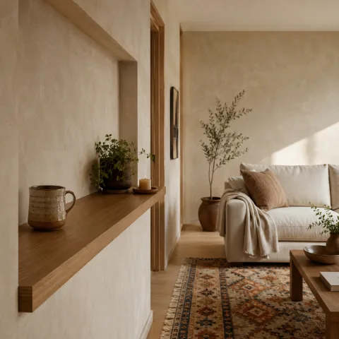
Across the room, the pastel stage feels deliberately calm, inviting us to linger beyond initial impressions and notice how light, texture and scale interact with ordinary rituals. The palette remains gentle yet confident, a family of hues we witness reinforcing each other when sunlight shifts across the timber grain. We track how the sheer fabrics soften edges, allowing architectural lines to breathe rather than compete with cushions and plants. Greenery arrives as quiet punctuation, its leaves echoing the curves of a chair back and delivering vertical rhythm to the shallow room. We note how light timber frames the sofa, the rug, and the side tables, tying the space together with a warm, unforced glow. We test how the plants move your eye around the room, creating a gentle tour from window to coffee table, with occasional pauses at a ceramic vessel. We measure price, footprint and maintenance against mood, aiming for a room that supports conversation, reading and a quiet kind of togetherness.
Soft Light and Textural Quiet
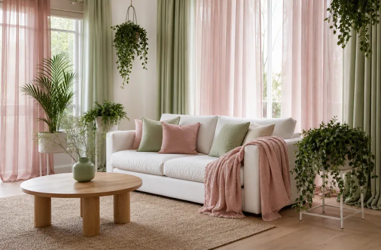
Natural light pools in from a large sash window, saturating the pastels without flattening their nuance. The translucence of the sheer drapes helps the space breathe, while revealing subtle shifts in colour as the day unfolds. We observe how the fabric's weave records movement, catching micro-dust motes that become part of the room's texture rather than noise. The timber floor acts as a warm reflector, bouncing light back up to highlight the soft edges of cushions and throws. In this quiet, everything reads as a careful balance of light, material, and scale, not a collection of separate practices. This balance is delicate, requiring mindful observation and patience as the room shifts with weather and occupancy.
Ceiling height is modest, making the drapes feel generous rather than decorative, a quality we aim for in any slow-living room. Because the drapes skim softly, they frame the window with a generous margin that invites the eye to travel along the fabric's fall. We experiment with tension: how tight a hem feels against a gentle breeze and how much movement is allowed before the rhythm breaks. The fabric's texture influences the perception of space, inviting the eye to rise and meet the upper edge rather than press toward the furniture. Together with the timber, the drapes contribute to a sense of continuity, turning a potentially flat wall into a softly layered backdrop. The room feels taller and more generous when the drape stack breathes rather than stiffens the window frame.
An undercurrent of colour comes from cushions in lavender and blush that nod to the pastel canvas without creating visual noise. We place them in a stepping stone arrangement along the sofa, with one seat cushion in a slightly deeper tone to anchor the group. The pairing is deliberate: the fabrics vary in weave and weight so light catches differently on each surface. We check the rug's edge to ensure it reads as a continuous plane rather than a stark break in colour. The result is a calm chorus, where each textile contributes to the whole rather than competing for attention. Even routine tidying feels restorative when the cushions align with the light's path and the timber's warmth.
Overall, the sense of quiet is achieved through measured repetition and mindful stopping points for the eye, allowing each element to breathe. We repeat the timber tone through a coffee table, a small stool, and a picture frame to unify the setting. The cushions repeat the muted palette in slightly different saturations, creating depth without visual fatigue. A single woven throw acts as a bridge between the sofa's fabric and the rug's texture, drawing attention to mid-tone warmth. Our maintenance routine becomes part of the rhythm: cushions rearranged after readings, drapes coaxed back into place after a breeze. On calm days, the room feels large in proportion, even when furniture footprint remains modest.
We walk the boundaries of the space, noting where light lingers longest and which surfaces hold the most texture. A careful balance in the seating arrangement keeps conversation within reach while preserving clear sightlines to greenery. We test the sofa's edge against the rug to ensure transitions feel soft and inviting. The room's quiet mood depends on repeated cues: soft edges, gentle curves, and consistent timber colour. When one textile shifts slightly, another part of the palette responds, maintaining harmony rather than surprise. The objective remains to cultivate a framework for daily life rather than to stage a moment.
 Save
Save
Plants as Living Architecture
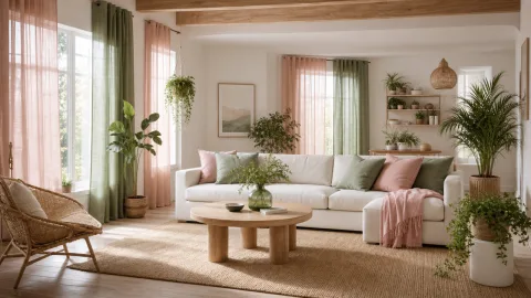
Plants arrive as performance elements, not fillers, each chosen for form and resilience. We select a vertical presence, a tall leafy plant that reaches toward the top edge of the window frame. A pair of trailing vines softens a shelf line and helps the wall read as more approachable, less clinical. Smaller pots lift on stands create micro-sculptures at table height, encouraging a quiet circuit from plant to person. Together, they establish a rhythm that breathes, suggesting a daily routine of care and observation. The plants' scale is deliberate, avoiding crowding while inviting touch and curiosity from guests.
We place a tall fiddle-leaf fig near the window to anchor vertical height and to draw the eye upward. A fern is tucked into a corner where daylight is diffused by a sheer curtain, so its fronds glow subtly. A pothos trail winds along a shelf, tracing a soft diagonal line that counterpoints the sofa's horizontal silhouette. We monitor humidity and light so each plant remains healthy without becoming an interpretive distraction. At this scale, greenery acts as architecture in motion, changing subtly with the changing light. We note how the plant shapes alter the acoustics of the seating zone, softening footfalls and enriching conversations.
Guests comment on the sense of airiness greenery creates, even when the room is crowded with conversation and a little noise. The plants' presence also offers a tactile contrast—glossy leaves catching light against matte ceramic pots. We rotate pots weekly to ensure even growth and to avoid a single plant dominating the view. The watering routine is mapped to calendar days, but adjusted for air quality, room temperature, and seasonal dryness. In practice, greenery anchors colour without demanding the spotlight, letting the room stay legible from any angle. We also photograph plant positions to guide future tweaks during redecoration cycles.
The shrubs and climbers provide a gentle vertical rhythm that offsets the sofa's horizontal dominance. We measure the distance from window to seating to optimise natural circulation and sightlines. The selection includes a low-profile specimen near the coffee table to ensure conversation remains central. The plants' scent—fresh, earthy, lightly resinous—adds another layer to the room's slow-living appeal. Lighting during the afternoon catches the glossy surfaces of pots, creating tiny textile-like reflections on the floor. This careful distribution ensures greens are everywhere without feeling like an afterthought or a distraction.
In total, greenery becomes architecture in motion, its shadows shaping the sofa's silhouette as the sun travels. We test placement by moving a plant a few inches to see if the composition holds. The result is relief rather than rigidity, a space that grows with gentle improvisation. Seasonal care routines become rituals that readers can adopt without commitment to a full overhaul. We document the processes—the watering, pruning, rotation—and the mood changes that accompany these maintenance moments. This approach makes the greenery feel integral, not ornamental, and elevates everyday life within the room.
Pale Palette, Deep Texture
 Save
Save
Here, the pastel extension is not about one shade but a family of softened tones gathered around a single core. We work with blush, lavender, powder blue, and ivory as anchors around the room but never as an overwhelming field. The sofa, in dusty rose, acts as a warm anchor that makes the lighter textiles feel more substantial. A linen chair provides a cooler counterpoint, its weave catching slightly different light so that textures stay interesting as the sun moves. We test furniture spacing to maintain generous circulation, ensuring colours are read against space rather than against crowding surfaces. In rehearsal, the room breathes more deeply when the furniture remains flexible and the palette remains tethered to timber and greenery.
Textural continuity helps the palette feel cohesive rather than contrived, and we lean on natural textures to soften lines. The rug's pile depth adds a tactile layer that mirrors the cushions' softness, allowing a comfortable stand-and-lean rhythm. We examine reflective surfaces such as a ceramic lamp base or a matte metal clock to ensure they don't overstate the palette. Colour shifts with time of day are anticipated; we document the changes and adapt lighting to preserve harmony. The overall effect remains gentle, with the eye moving proportionally around the room rather than sticking to one feature. We consider how fabric edges fray minimally over years, choosing robust weaves that will endure daily handling.
We note how daylight shifts the mood across the day, prompting us to rethink the textile layering for evenings. A subtle strategy is keeping throw weights light so you can reconfigure seating without losing the calm. We record how the pastel family references the greenery's tone, creating a dialogue around organic materials. This approach avoids the trap of looking staged; instead, it nurtures a sense of lived simplicity. We conclude that the palette works best when every item carries a 'quiet' function as well as a colour cue. Even the choice of cushions whispers about function—contentment in use, not perfection in display.
The room's palette remains adaptable, offering warmth without heaviness, and inviting comfort over rigidity. A large, soft-edged sofa helps anchor the space while allowing for spontaneous seating changes. We test the impact of a single accent textile against the broader continuum to ensure cohesion. Subtle colour variance across cushions prevents monotony, while the timber frame holds the line steady. The outcome is a room that reads as curated over time rather than polished in a single afternoon. We feel the balance between softness and structure, and the space seems to invite patience as well as participation.
The Rhythm of Soft Surfaces
Textiles become the room's tempo, guiding how people sit, move and engage with one another. We choose fabrics with forgiving textures to encourage everyday comfort rather than polished posture. Cushions vary in density, so you can lean back or sit close without creating awkward gaps. A wool throw folded at the arm of the sofa reinforces a sense of invitation and tactile warmth. Our method is to layer gently, avoiding rigidity while preserving a coherent rhythm. The result is a space that invites lingering conversations rather than rapid, distracting exchanges.
A light rug grounds the seating and defines a soft boundary for conversation. We test rug dimensions against the sofa and coffee table, ensuring comfortable leg space and unblocked sightlines. The rug's colour is especially important—it borrows from the cushions without duplicating their tone. We explore the interplay of shadows and textures on the rug during mid-afternoon sunshine. Movement across the room sounds different on wool versus cotton, changing how the room feels to be in. We choose a pile height that is neutral under foot, letting visitors roam but remaining aware of the room's balance.
 Save
Save
We also consider how subtle luminescence from lamps interacts with fabric, helping to extend the pastel into the evening. A brass lamp and a ceramic table lamp act as thoughtful punctuation marks, neither competing with but supporting the palette. Lighting is tuned to warmth, casting friendly glows that wrap the room in a hazy, welcoming atmosphere. We avoid cool, clinical lighting that would strip away the room's soft, tactile personality. Ultimately, soft surfaces carry the cadence of daily life—cozy, accessible, and intentionally understated. The lampshades, chosen for their simple geometry, diffuse light evenly and prevent hotspots across walls.
The arrangement also considers circulation, with clear paths from window to sofa to coffee table and back. We observe how a small plant on a pedestal affects the eye's movement as guests walk through the space. The tactile richness of textiles invites people to touch, lean, and relax in a natural, unselfconscious way. We document how the room's quietness encourages reading and conversation without forcing a particular activity. The furniture layout remains flexible, ready for a spontaneous seating circle or a cosy corner for one. This adaptability is a core aspect of slow living design, favouring longevity over instant gratification.
In all, the room's rhythm rests on a small set of reliable relationships: timber warmth, pastel softness, and green accents. We keep the palette light enough to feel breathable, but present enough to read as an intentional scheme. Spacing between pieces is calibrated to prevent visual crowding while enabling intimate chats. We test responses by inviting a friend to sit and observe how easily their gaze travels around the room. If attention fixates on one area, we tweak—perhaps shifting a cushion or rebalancing the greenery height. The goal remains to cultivate a space that feels inevitable, not curated, and constantly hospitable.
Rituals and Reconfigurations
Material choice becomes part of daily ritual—the act of selecting a throw, rotating a plant, or rearranging cushions. We keep cottons for everyday softness and linen for airiness, balanced by wool textures for depth. Furniture weighting remains light to preserve flexibility for quiet moments or social gatherings. We document the moment when a guest sits, the cushions adjust, and the room feels reawakened by small, mindful shifts. The space rewards repetition with gentle variation rather than dramatic change. In practice, becoming fluent in slow-living design means accepting gradual transformation rather than chasing perfect first impressions.
We routinely remind readers that the look is not a fixed 'solution' but an evolving practice. Seasonal textiles may be swapped in, but the core palette stays intact to maintain continuity. The greenery schedule aligns with care routines and weekly light checks for optimal growth. Even small updates—like swapping a vase or adjusting a throw height—refresh the room without alarm. In our journal, this becomes a series of tiny, delightful adjustments rather than a total redesign. The method is practical and forgiving, encouraging experimentation within a known framework.
Finally, the seating wedge remains generous, allowing conversations to unfold in a natural arc. We observe how people lean in to inspect the soft textures and how their voices soften in response. The room rewards patience; furniture will settle slightly over weeks as use realigns subtle tensions. Daily life becomes a source of inspiration rather than a constraint when textiles respond to touch and light. With deliberate restraint, the pastel environment becomes a stage for slow, meaningful interactions. The practice ends with a quiet satisfaction that the look can grow with you, not against you.
How to do it
Survey the room
We walk the space, noting light patterns, window height, furniture scale and natural circulation paths.
Define the palette
We select one dominant pastel and two supporting shades, testing swatches against the timber and greens.
Arrange layers
We place textiles, plants and timber in layers that frame conversations and maintain breathing room.
Test under varying light
We view the setup at different times of day to confirm it remains calm and legible.
Common mistakes to avoid
Overloading with colour blocks
The temptation to push saturated hues into the same plane can flatten depth. We counter by keeping one dominant pastel and using smaller accents that echo it.
Ignoring scale between textiles and furniture
A mismatch in proportion makes seating feel cramped or distant. We adjust by measuring cushions against sofa length and rug width.
Forgetting natural light in the evenings
As daylight fades, colour shifts become apparent. We test lamps and drapes under warm and cool light to maintain calm.
Frequently asked
What is the dominant colour story?
How do you keep the room from feeling clinical?
Where should greenery be placed?
What about lighting at dusk?
How to maintain the look long term?
Are sheer drapes essential?
What is a common mistake?
What is the takeaway?
In closing
From this fieldwork, we conclude that a pastel living room thrives on restraint, light, and living greenery. It rewards patient arrangement, flexible textiles, and timber that reads as warmth rather than a showy feature. It invites daily rituals and thoughtful pauses without demanding dramatic purchases. The exercise teaches us to choreograph light and texture as a duet, not a monologue. Such spaces remind us to slow down, observe, and consider how small choices shape everyday life, especially in homes built for long conversations and quiet mornings.