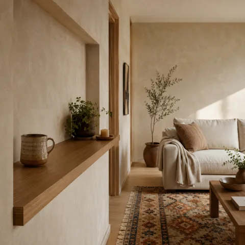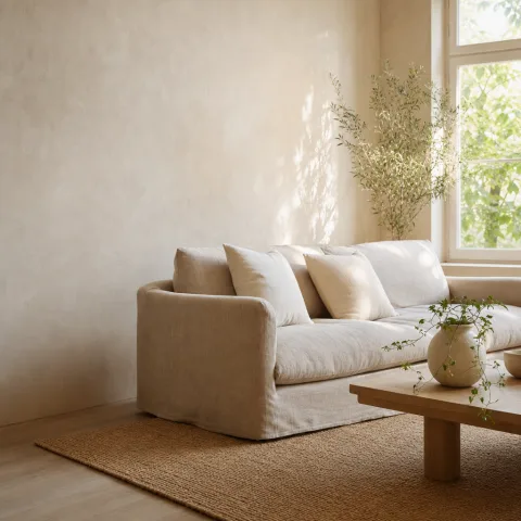
We arrived in the living room with daylight already threading through the windows. The walls, painted in a warm white, seemed to absorb the day and return it softly. We stood back to watch how the colour dissolved the edges of shapes into a gentle, continuous field. The room felt calmer, more coherent, and undeniably more welcoming to touch and sit against. Textiles and wood nearby began to respond to the light, shifting their perceived warmth with each passing minute. This quiet experiment became a practical guide as much as a mood board, a reminder that light and texture work together to shape a room’s character. Our goal here is not to chase perfection but to understand how warmth travels across a space over the course of a morning.
The mood of warm-white walls at dawn
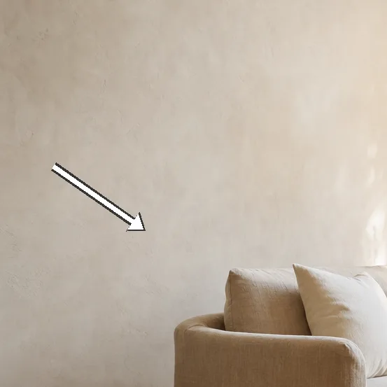
At first light, the walls seem to inhale and exhale, smoothing rough edges and inviting the room to breathe. The warm undertone turns the morning brightness into a soft envelope rather than a glare. We notice how the sheen on the plaster catches just enough sparkle to keep the air feeling airy and alive. The furniture reads more like silhouettes, less like separate objects, as the walls wrap them in warmth and continuity. By mid-morning, the contrast between wood and white softens into a gentle, almost musical, continuum. The room settles into a pace that mirrors our own slower morning.
Even where the light falls unevenly, the tone stays even, preventing the room from tipping into starkness. We notice how the sofa's fibre and the curtain hems pick up the same creamy hue, tying different textures together across the length of a wall. The eye travels calmly along the wall plane, not stopping at sharp white edges, and it begins to read the space as a single field. It feels like a quiet room that's tuned to a slower pace, where every detail supports calm. Even the coffee table's pale oak seems to glow softly, as if the wall's warmth has extended into the space, creating a seamless loop of warmth. The air feels lighter, not because it is airy, but because the colour invites you to linger.
To test the effect, we step outside for a moment; the room remains legible and inviting, a stubborn calm in changing light. Later, we compare with a cooler white in another room and confirm the difference, noting how the mood shifts with temperature. Overall, the dawn light in this space is kinder with warm white, not simply brighter. Morning shadows are softened; the room feels more like a single room rather than pieces arranged around a bright wall, and the seams between zones disappear. That is the start of our ongoing observations, a phrase we return to when new textiles arrive. The exercise teaches us to read light as a collaborator rather than a judge.
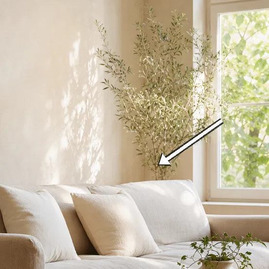
Shades, textures and the science of soft luminescence
 Save
Save
Texture plays a larger role than colour alone; the same white can behave very differently on satin and matte surfaces, depending on how light hits them. With a matte finish on walls, the light is absorbed more gently, reducing glare and producing a calmer surface. On a satin surface, it lifts the room a touch, creating a subtle outline around furniture and enhancing the perception of space. That is why we chose a low-sheen finish for walls and a careful mix of soft textures throughout the space, so the light travels with intention rather than bouncing away. LRV numbers are not design talismans, but they guide the eye toward warmth rather than brightness, helping us stay in the tonal neighbourhood we want. In practice, we treat LRV as a guide rather than a rule, letting real daylight confirm our choices.
Fabrics like linen drapes in a natural colour and wool throws on the sofa pick up the same creamy undertone, tying the room together without shouting. Wood furniture in warm oak or birch helps anchor the pale walls, delivering the sense that light sits on a solid foundation. Small cushions in cotton and boucle knit softly echo the wall's hue without creating dull monotony, while the rug aligns the floor with the ceiling for a continuous field. Rugs in natural fibres ground the palette and capture light with a gentle hand, producing both texture and warmth in equal measure. Window light is the final partner; because it changes through the day, our palette must adapt, remaining generous but never tyrannical.
Morning arrangements of seating invite the light to glide across the wall, turning chairs into stages for the glow. Adding a reflective surface like a brass tray or a polished lamp catches the light without shouting, giving the room a quiet shimmer. The room remains legible even as the sun climbs, preserving the calm we designed for and avoiding harsh contrasts. We learn that warmth is not a passing mood but a relational property between wall, textile and furniture, something that requires daily attention. These observations feed our practical tests, and they keep us curious rather than complacent.
Before-and-after: testing the palette with textiles
We test textiles in situ by draping linen and wool, watching their shadows and highlights interact with the wall in real life. Two weave patterns sit well: a loose weave and a tighter weave, both catching light softly across the surface. These textures soften the wall's edge without compromising the room's clarity, giving depth and tactility. Colours in cushions lean toward creams rather than pure white, allowing warmth to travel through tactile detail. The result is an approachable palette that translates daylight into warmth while remaining adaptable to seasons.
 Save
Save
Next, we compare rugs and throws; the rug anchors the space and the cushions pick up warmth, creating a cohesive floor-to-wall conversation. Wood floors in pale oak respond by reflecting a gentle glow rather than a harsh shine, furthering warmth. Small ceramics and baskets are added to catch and hold daylight in quiet corners, stitching the room into a living landscape. The balance between light and shade feels intentional rather than accidental, as if we designed a grown-up dawn. The result is a room that breathes gently, with texture guiding the eye.
From these explorations, the palette begins to feel purposeful, not prescribed. Each textile acts as a soft amplifier for daylight, lifting rather than flattening. With the walls as a quiet field, the textiles become the room's characters rather than distraction, suggesting where to sit and speak. These observations guide our final selection, ensuring that every choice has a reason rooted in light and touch. The exercise is an exploration rather than a destination, inviting ongoing refinement.
“The walls hold the light in a soft, breathing glow.” — Mira
Light-safely arranging windows and mirrors
Window treatments shape how much light enters and how it sits on the walls, which is the first decision in the room's quiet drama. Sheer curtains diffuse brightness; heavier fabrics add weight and warmth, while maintaining a breathable glow. Place mirrors strategically to bounce daylight without creating glare, echoing the room's rhythm rather than interrupting it. Consider the wall's rhythm when placing furniture to keep warmth balanced, avoiding crowded corners or sudden leaps in tone. Consistency in line and edge helps the eye glide from wall to fabric. We test one layout for a week to observe subtle changes.
We test with a pair of cushions and a low console to reflect warmth, ensuring that every surface has a job in the glow. Polished surfaces can reallocate light; we intentionally opt for matte or soft-gloss finishes on larger surfaces to diffuse reflections and avoid hotspots. Greenery and ceramics bring a living warmth to the composition, drawing the eye toward organic shapes. All changes are measured to avoid accidental brightness, keeping the room calm rather than dazzled.
 Save
Save
Over several days, the scheme proves resilient under changing light, with fabrics and walls keeping pace. Evening light feels calmer as the room remains softly lit, rather than turning harsh the moment dusk arrives. Consistency in finishes helps maintain warmth through seasons, even when the sun sits lower in the sky. Small adjustments in blinds make a noticeable difference, and we learn to treat them as part of the design.
- Choose warm-white with an eggshell or satin finish to diffuse light softly
- Test samples in early morning and late afternoon to see true colour
- Pair with natural textiles in creams, beiges and stone tones
- Keep wall colour consistent with wood and fabric undertones
- Use low-profile mirrors sparingly to reflect daylight without glare
Putting it into practice: daily living with warm white
With the final palette in place, we rearrange a few pieces to make space for daylight, testing different seating angles and sightlines as the sun moves. Mornings now begin with a calm coffee, framed by a wall that doesn't demand attention yet holds it. Shadows soften; the room becomes a stage for daily life, not a backdrop for decor. Storage and seating arrangement are chosen to maintain a calm, continuous surface, with seams between zones kept soft.
Lighting remains soft; bulbs with warm colour temperature help maintain glow without creating glare. We control the light with drapes; we avoid bright spotlights that erase warmth and instead rely on layered sources. Decor choices lean toward organic textures: jute, wool, linen, and stone. Radiant warmth is not about brightness but about comfortable depth that invites conversation.
Over time, the room evolves as our routines change with seasons. Small shifts, like moving a chair or swapping cushions, keep the balance. Guests notice the quiet, almost musical rhythm created by the colour. Ultimately, warm white becomes the backdrop for lived-in moments.
How to do it
prepare-the-space
Survey the room at different times of day, note incoming light, and decide on walls and textiles that chorus with it.
test-paint-samples
Apply patches of warm-white hues on the wall, observe under morning and noon light, and log shifts in tone.
select-materials
Choose fabrics and woods with warm undertones and low reflective surfaces to maintain softness across the day.
finalise-palette
Confirm the chosen white with a satin or eggshell finish and plan a consistent lighting strategy that reinforces warmth.
Common mistakes to avoid
overlooking undertones
Mistaking warm white for yellow; in low light it can read muddy or flat. Test under all daylight conditions across a week to be sure.
ignoring texture
Glossy paint reflects too much light and breaks the softness we seek. Balance with matte or eggshell surfaces; keep textiles tactile.
too much contrast
Pairing pure white walls with stark black furniture can create visual dissonance. Allow the walls to calm the scheme by echoing warm tones in fabrics and wood.
Frequently asked
Will warm white walls feel yellow in winter?
What paint finish works best for living rooms?
Can warm white be paired with bold accents?
How many coats of paint are needed?
How does natural light direction affect warmth?
Is it easy to repaint if not satisfied?
What about maintenance and cleaning?
Do warm whites clash with modern interiors?
In closing
Looking back, the morning light revealed a room that is quieter and more forgiving than we expected. The warm white walls did not demand attention; they invited it. We learned that warmth is a practice of materials, light, and rhythm, not a single shade on a swatch. By embracing texture and soft finishes, we created a living room that feels both present and patient. The work remains ongoing, a gentle process of tuning the space to daily life.