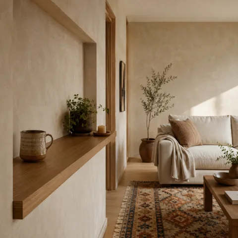
Entering the space, we sense an atmosphere that is both energetic and calm. The bold wall acts as a stage for the room's quieter actors, especially the soft textiles and natural wood. We spend time watching how daylight travels across the pigment, shifting tone from cool to warm as the sun arcs. Our aim is not to prove a look but to understand how colour behaves in real daylight, with real furniture and real days ahead. We test with practical, affordable swaps rather than expensive experiments, recording how each change alters perception. The room feels generous despite its brightness, which tells us the layout and material choices are doing some of the heavy lifting. By afternoon, the light softens enough to reveal subtleties in texture that might otherwise be missed.
Bold wall colour as the anchor
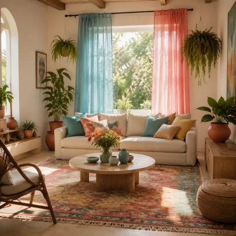
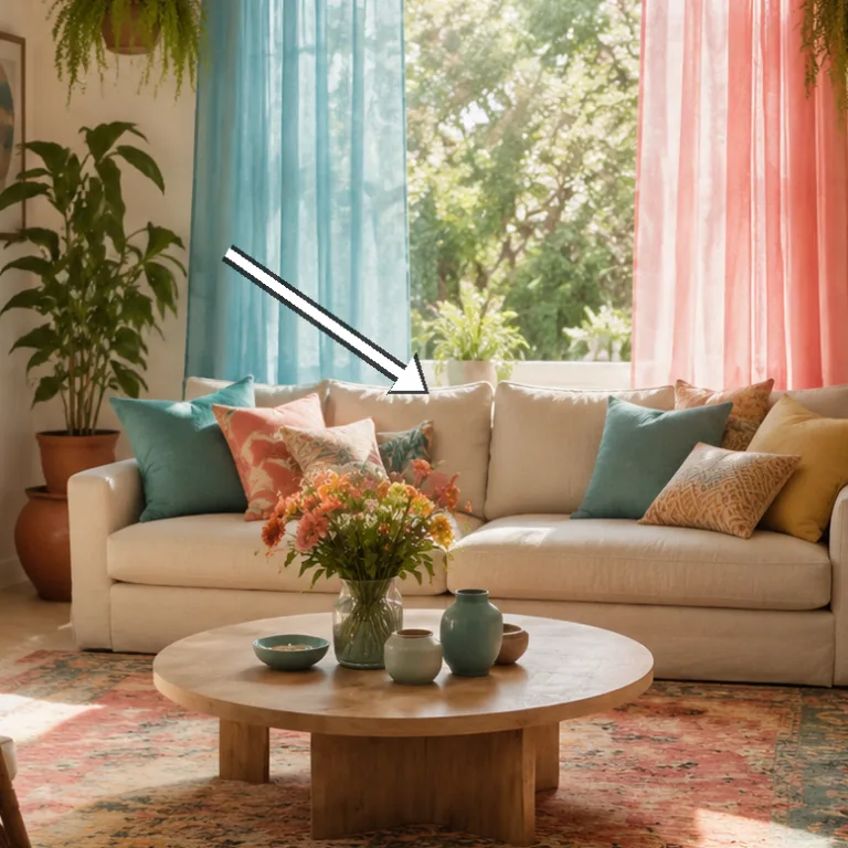
On entering, we meet a wall saturated with a blue-green pigment that reads as confident rather than loud. The hue sits at eye level, holding the room in balance while inviting softer textures to hover nearby. It is a colour that asks for light, not shadows, to reveal its subtleties. We note how the finish catches slight gleams from the window and retail surfaces outside the frame. The wall, while bold, becomes the anchor around which furniture and art organise themselves with ease.
Across the day the colour shifts with the changing light, leaning cool in the morning and warming towards the late afternoon. We test the wall against white plaster, pale wood, and a charcoal coffee table to understand how contrast shapes perception. The adjacent textiles soften the edge without dulling its presence, and cushions in moss and ochre act as live signals to the eye. We intentionally keep the ceiling white to preserve air around the ceiling plane and keep the room feeling expansive. The result is a hue that remains legible without becoming dominant.
Scale matters as the room breathes; the wall absorbs more space than it occupies, letting the furniture feel substantial rather than crowded. A slim console line, a low sofa, and two mid-size chairs curate a quiet choreography that respects the bold wall. The edge between wall and floor is crisp but not rigid, which prevents the room from feeling fortress-like. Small moments of texture, such as a woven rug and a linen throw, catch reflections and soften the boundary lines. In this arrangement, bold colour teaches restraint by offering a generous canvas for everything else.
Soft light as the second partner
 Save
Save
Soft light enters through a north-facing window, pooled gently across the wall and furniture. The linen drapes act as a second painter, muting glare while keeping the colour's edges readable. We add a dimmable wall lamp and a small table lamp to broaden the light's personality without creating hotspots. The room shifts in mood as shade moves across the pigments, revealing subtle undertones that are not obvious in harsh daylight. The aim is to let light fold around the wall rather than punch at it.
Layering three lighting layers—daylight, ambient, and task—feels like a careful orchestra. We test the timing of brightness as the sun travels, noting how the wall's warmth softens near noon and boldens again as it tilts westward. Diffuse screens and light-coloured fabrics blur the lines between the pigment and the surrounding surfaces. A warm glow from the table lamp adds body to the room without flattening shadows. The overall effect is a gentle, forgiving glow that never competes with the wall's character.
Even with glossy wood and metal accents, the wall's tone remains comfortable and legible. We learn to read colour by walking round the room, not just by standing still; the angle of light changes interpretation. The textiles catch the light in different ways, offering microtextures that keep the room alive. The interplay between colour and light creates a medium that is both precise and forgiving, a balance we aim for in future projects. In the end, the wall and the light cooperate to form a cohesive backdrop for daily life.
“The room breathes when light and colour finally agree.” — Mira
- Position seating to face the brightest wall
- Use diffuse screens to soften direct glare
- Keep a single source of strong colour, not multiple blocks
- Allow daylight to shift the hue across the day
- Test at morning and afternoon to observe variations
Texture and form across surfaces
 Save
Save
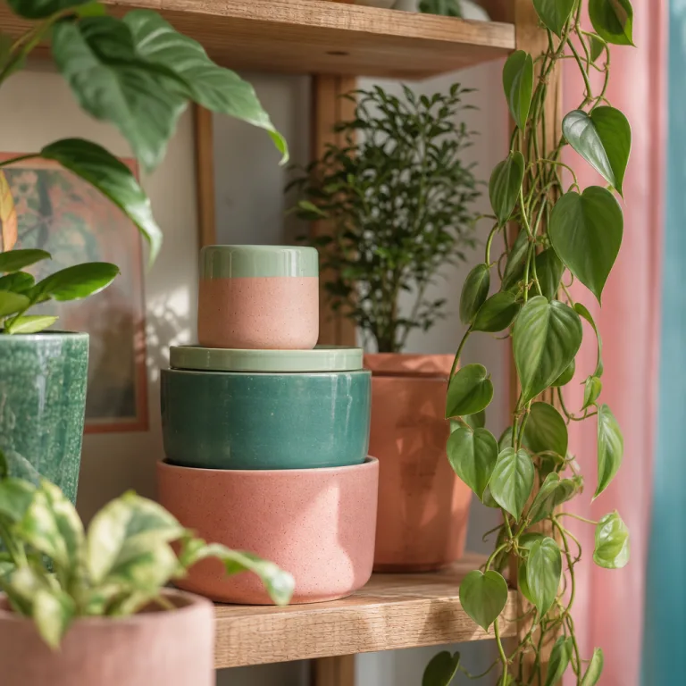
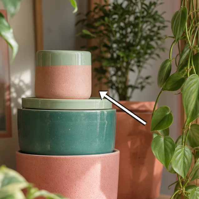
Texture becomes the third collaborator; fabrics and surfaces carry the bold colour without shouting back. A wool throw, a boucle cushion, and a linen-blend curtain all offer tactile counterpoints that catch light in different ways. We notice how the grain in the timber and the weave of upholstery take on new life when set against the saturated wall. The aim is a layered texture that feels tactile as well as visual. The room reads as a finished object you touch before you say hello to it.
Materials matter: natural wool, linen, and no-gloss finishes create a warmer experience than plastic or high-sheen plastics. The oak floor picks up the wall's tone, guiding the eye along pathways that connect seating with storage. Each textile acts as a soft filter, muting the wall slightly and enabling your eye to rest on form. The cushions' stitching and seams are chosen to be quiet rather than loud, preserving unity. We also consider the effect of reclaimed wood and handmade ceramics as anchors that echo the hue across different textures.
Lighting the textures with care reveals quiet stories of the room. The brush marks on a painted lamp base, the nap on a rug, the subtle gloss of a ceramic vase all contribute to a living ecosystem. We test how gloss on surfaces reflects the colour, ensuring the glow remains diffuse rather than sharp. A shallow depth of field between objects helps maintain balance, so the eye can glide from wall to chair to rug without resistance. The result is a tactile chorus that supports the wall rather than competing with it.
“The room breathes when light and colour finally agree.” — Mira
- Position seating to face the brightest wall
- Use diffuse screens to soften direct glare
- Keep a single source of strong colour, not multiple blocks
- Allow daylight to shift the hue across the day
- Test at morning and afternoon to observe variations
Proportion, furniture and negative space
 Save
Save
Proportion becomes the skeleton that holds the bold wall in place, preventing overpowering from defeating function. We measure silhouette against the height of the window and the width of the sofa, maintaining negative space around each object so the room feels generous. The furniture is chosen to carve a path through the space, inviting movement rather than stalling it. Shadow lines are considered like punctuation in a sentence, giving breath to the layout. The goal is to let the wall lead while chairs, tables, and rugs play the supporting cast in measured steps.
Scale is tested by swapping a low lounge with a medium-height armchair to test perspective from various points in the room. We keep the room free of visual congestion by reserving one piece in each zone as a quiet anchor. The bold wall acts as a constant; the furniture rotates around it, never blocking its light. A slim coffee table with a matte surface ensures reflections stay soft and controlled. The result is a sense of movement and calm, a space that feels both dynamic and stable.
Rhythm emerges from repeating forms: the same chair silhouette in two neutral colours, the same woven texture repeated on cushions, the same border on trims around doors. We watch how repetition creates coherence without monotony. Figures and voids alternate, letting light travel and the eye rest. The negative space around each piece becomes part of the design, not a missing piece. We finish this section confident that the room can adapt to everyday life without losing its bold heart.
Seasonal mood and slow-living discipline
Seasonality enters as a quiet variable; daylight length, outdoor colour, and indoor routines subtly alter the room's mood. In winter the palette feels closer to taupe and cream; in summer the colour reads toward emerald zest and sea-washed blues. We test how textiles react to changing humidity and sunlight, and how these shifts alter the visual warmth of the wall. The textiles we choose are designed to age gracefully and to be swapped without heavy redecoration. The idea is to grow with the space rather than tackle a single renovation.
Textures in wool and linen age with use, picking up character in the corners where light lingers. A cotton rug softens footfall and absorbs noise in a way that makes the bold wall feel more approachable. We prefer natural finishes on furniture to keep the room feeling calm and honest. We avoid slick finishes that reflect too much light and erase the soft edges we value. The slow-living ethos here is to allow time to tell the room's story rather than force an instantaneous comparison to a trend.
Patience becomes a design tool, guiding when we commit to a change and when we hold back. We document moods across a week, noting how the hue's perceived warmth rises and falls with weather. The room remains adaptable, inviting new textures or accessories as a gentle update rather than a full makeover. Our recommendations emphasise maintenance: simple lines, regular checks on daylight, easy swaps for cushions, and small refreshes that keep the space vital.
How to do it
Define the colour palette
We narrow our options to two stand-out hues and two neutrals, test them on wall patches at actual room height, and record daylight shifts over two days.
Test lighting and surface reflection
We arrange a lamp, ceiling light, and daylight diffusers to see how colour reads under different brightness levels; we document glare and mood changes.
Apply textures and scale
We introduce textile swatches, rug samples, and furniture silhouettes to assess proportion and tactility within the space.
Final arrangement and note-taking
We settle on a layout, photograph the room at morning and late afternoon, and compile final notes for the reader.
Common mistakes to avoid
Overfitting to a swatch
A common mistake is adapting the whole room to a single colour sample. We note how daylight shifts colour; test across two different times of day. A swatch cannot capture the room's evolving mood.
Ignoring scale
Colour reads differently at distance. A bright wall can feel overwhelming if furniture is too small or too heavy in silhouette. We present the wall against various seating configurations to understand proportion.
Over-lighting
Too many lamps create hotspots and flatten the soft light we seek. We suggest a single ceiling source plus hidden floor lighting, then add a secondary lamp only if necessary.
Frequently asked
What makes this living room feel bright yet calm?
How much did the project cost?
What is the most important decision for bold colour?
Can you replicate this look on a tight budget?
How do you maintain the mood over time?
What tools do you recommend for testing colour?
What should be avoided when balancing bold colour?
How long did the project take?
In closing
Ultimately we find that bold colour thrives when it is allowed to share the room with daylight rather than fight it. The wall reads as a personality that changes with the sun, while the textiles, wood and cushions provide a steady chorus that keeps the space cohesive. This balance between colour and light is not a one-off decision but a living process, one that invites gentle adjustments over days and seasons. We advocate a patient approach: observe first, test second, and decide third, with the room guiding mood rather than the other way round. In a slow-living sense, the bright living room becomes a practice as much as a place to occupy, a small discipline of colour, light and texture that rewards close attention.