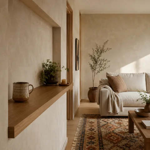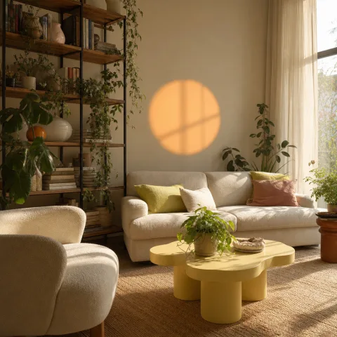
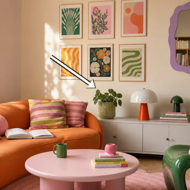
On the ground floor of our project home, the room measures 5.6 metres by 4.2 metres, with a 2.7-metre ceiling and a single south-facing window that floods the space with even daylight. We arrived with a strong but restrained palette of five pastel shades 7 blush pink, dove grey, mint, butter, and sky 7 paired with warm oak and rattan details that echo the natural tones of the floor. A boucle sofa in pale cream anchors the seating area, while a 2.4-metre wool rug in a soft sky-blue grounds the conversations around it. Storage is deliberately open but restrained, using woven baskets and a shallow shelving unit to keep surfaces clear without feeling clinical. Lighting is layered and adjustable: a frosted-glass ceiling orb provides diffuse daylight, two arc floor lamps illuminate reading zones, and a string of small LEDs runs behind the curtain track for subtle mood shifts as the day travels. Materials, finishes and spacing are deliberate, designed to feel calm yet vibrant for everyday life and occasional gatherings, with upholstery chosen for resilience and cushions for tactile reward. In this field report, we trace how the colour-blocking strategy translates into daily routines, not merely a momentary visual trick, but a practice that supports slow-living rhythms through the entire day.
Lighting as a design instrument
Lighting is not merely functional here; it defines the passage of time and mood with precision. A globe ceiling pendant provides a broad, diffuse light that mimics daylight in the early hours and softens toward evening. Two arc floor lamps offer targeted zones for reading and conversation, their curves echoing the room's gentler shapes. The colour temperature is kept around 2700K across fixtures to maintain warmth and a gentle glow. Dimmers on each main light allow slow, thoughtful transitions from bright task lighting to intimate, low-contrast ambience.
Together these choices prevent glare and preserve the room's gentle cadence, even as occupants move through meals, games, and idle evenings. Shadow play becomes a feature rather than a distraction, with long silhouettes moving across plaster walls as the sun shifts. The plaster finish helps pastel colours stay soft rather than saturating or washing out, letting light interact with pigment in a nuanced way. Table lamps cast pools of honeyed colour that soften edges and highlight textures in textiles and wood. The result is a room that shifts with the day yet remains legible and calm in all light.
To maintain cohesion, we keep bulbs consistent across fixtures and rely on dimming levels rather than different hues to preserve unity of tone. The approach allows for multi-stage brightness suitable for reading, dining, or casual gatherings, without ever becoming clinical or loud. In practice, this means you can age text on a page or conversations around a corner with equal ease and comfort. Spare bulbs and a small stock of replacement parts live in a labelled box for quick checks and updates. Regular shade cleaning and maintenance are part of the routine to retain brightness and warmth across seasons.
Textural layering for calm and character
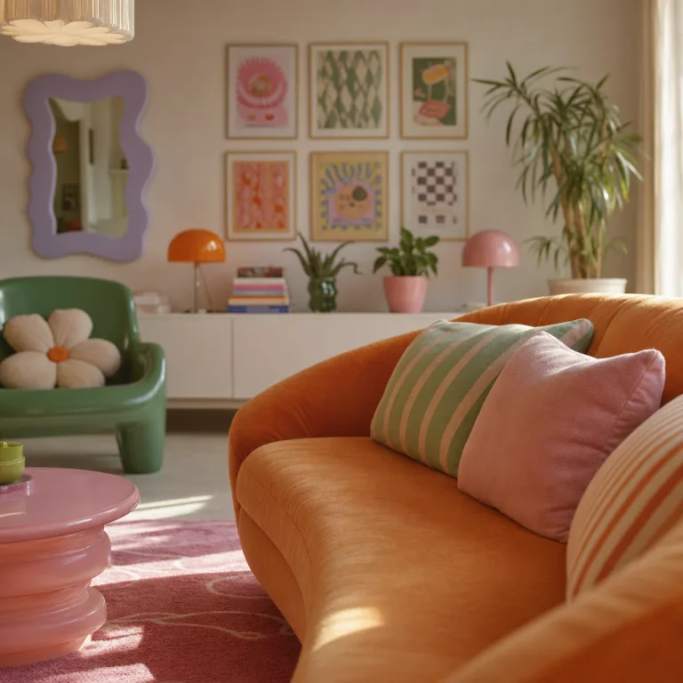
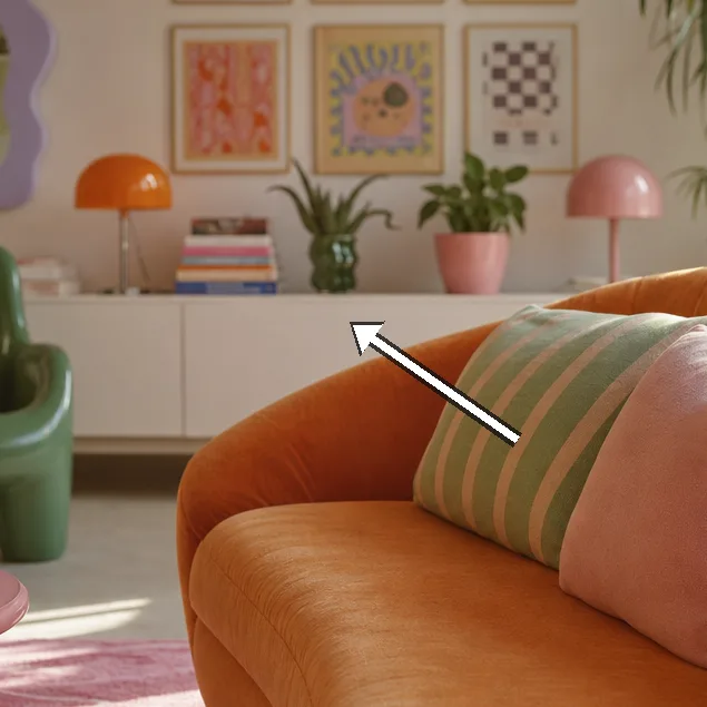
Texture is treated as a second script that supports and softens the pastel field rather than competing with it. Natural fibres are chosen for depth and resilience, from a 2.4m wool rug with a gentle sheared finish to linen upholstery that ages gracefully with use. We see how matte surfaces absorb light differently, adding a tactile layer that the eye recognises before the mind decodes colour. Cushions in linen, velvet and boucle repeat the palette while varying texture and weight.
 Save
Save
The textiles are layered to create depth: linen cushions in soft stone, a velvet throw in pale rose, and cotton upholstery that ages gracefully with use. Textural variety is deliberately controlled: no heavy damask, no glossy finishes, just subtleties that invite touch. The weave patterns in sofa fabric and the slight nap on the rug reinforce the palette without shouting. These choices keep the palette stable while giving the room tactile moments to notice when you sit down.
The textiles are layered to create depth: linen cushions in soft stone, a velvet throw in pale rose, and cotton upholstery that ages gracefully with use. Textural variety is deliberately controlled: no heavy damask, no glossy finishes, just subtleties that invite touch. The cushions and throws are chosen to be durable for daily use while offering a soft tactile reward when you settle in. A rattan chair and a bamboo coffee table introduce warm natural notes that echo wood tones in the floorboards.
The soft textures are balanced by generous negative space around major seating pieces. The room uses open storage and low furniture to prevent visual crowding, so the eye can rest on the pastel blocks. The textures invite fingers to explore the surfaces without competing with the colour story. A curved armchair provides a gentle counterpoint to the straight lines elsewhere, reinforcing the room’s calm tempo.
The cushions mix plain linen and a kiss of velvet, offering variation without jarring colour. The textiles here lean into soft, tactile forms that play with silhouette. A curved, low-profile sofa in boucle sits opposite a sculptural lounge chair with a rounded back, creating a dialogue between soft fabric and architectural line. Lighting catches the nap on the rug and the pile on the velvet, turning quiet surfaces into subtle focal cues.
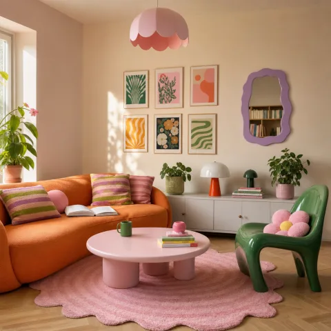
Pastel-base palette in play
The base palette is steady and forgiving: soft blocks of blush pink, dove grey, mint, butter, and sky drift across walls, textiles, and decorative objects. We intentionally repeat these five tones rather than introducing new hues mid-frame so the room speaks with one voice. Wall surfaces are kept matte and warm to catch colour in a gentle way, avoiding harsh reflections. A boucle sofa in pale cream anchors the seating area, while a 2.4-metre wool rug in a soft sky-blue grounds the conversations around it. Storage is open but restrained, using woven baskets and a shallow shelving unit to keep surfaces clear without feeling clinical.
 Save
Save
The projection of colour on different fabrics shifts how light sits across the room. Fabric finishes are chosen to catch light differently: cotton looks breathy, linen reads flat, velvet glows when lamps touch it. The palette is reinforced by soft transitions between blocks, never abrupt. We test swatches across morning and late-afternoon light to see how tones drift and where edges blur. A pale wood frame around a mirror subtly reflects the blues and pinks, extending the pastel field beyond the immediate fabric blocks.
The base palette is reinforced by subtle gradients that travel from wall to textile, creating an enveloping glow rather than a flat plane. The rug’s blue undertone keeps the room anchored while allowing the pinks to rise softly along the cushions and throws. The ceiling finish and plaster play with light just enough to prevent any colour from appearing clinical or overbearing. In practice, the combination remains calm during daytime reading, while hinting at something more playful as evening light softens. The relationships among the five tones are precise and repeatable across surfaces.
The shapes of the furniture harmonise with the pastel blocks, so the room feels cohesive rather than staging a visual trick. The curved sofa and rounded coffee table repeat the furniture language of the lighting fixtures, creating a generous rhythm. The palette’s warmth is enhanced by the pale wood floors, which reflect a hint of butter and sky when sunlight catches them. The cushions and textiles are chosen to age gracefully, so the room remains legible after seasons of use. Together, these choices keep the playfulness intentional and never decorative for decoration’s sake.
Retro forms with contemporary restraint
The focal pieces nod to mid-century forms without nostalgia overpowering function. A low walnut coffee table with a smoked-glass top sits between the sofa and a pair of compact lounge chairs, its silhouette a gentle arc that gathers the space. The lightness of the wood contrasts with the soft fabric blocks, giving the room a quiet drama while remaining eminently approachable for daily life. We choose rounded edges to maintain safety and tactility for kids and guests alike.
Soft-tint upholstery and pale wood prevent the retro shapes from shouting. The curves and angles are balanced by generous negative space, which allows the eye to rest and the mind to wander between conversation and contemplation. Textural detail on the seat surfaces keeps the look tactile rather than glossy, while brushed brass fittings pick up the warm undertones of the palette. The arrangement supports easy movement around the coffee table and across the rug, so play and chat can occur without friction.
 Save
Save
Decorative accents gathered from vintage sources anchor the palette without overwhelming it. A handful of vintage ceramics in muted tones sits along the sideboard, while a small plant breathes life into the shelf line. The overall feeling remains light and cheerful, with the retro vocabulary updated by soft fabrics and careful scale. We avoid heavy chrome or oversized hardware that might disrupt the room’s serene cadence. Instead, the simple metal details in lamps and trays reflect warmth and help the room glow softly.
The elements are configured for daily living as much as display. The sofa distance from the wall is calibrated to permit comfortable access to the back of the seating, while leaving negative space for a reader to stretch out a leg. The sideboard holds a few chosen objects with intentional spacing, so each piece has its own moment without crowding the surface. The arrangement invites conversation along a central axis toward the window light, with the retro shapes acting as friendly invitation rather than loud punctuation. The result is a modern-retro feel that remains usable, comfortable and balanced.
Care has been given to how these pieces will wear. The coffee table retains its legibility over time, the chairs stay comfortable after long chats, and the fabrics show a charming patina rather than wear tracks. We keep hardware minimal and warm, favouring matte finishes that harmonise with the plaster and textiles. The overall look is optimistic and calm, a modern interpretation of retro that respects everyday needs and rhythms.
Daily rhythms and long-term care
Accessories are chosen for durability and calm effect: a 2.4m wool rug, linen cushions, and a ceramic vase collection that nods to the palette without shouting. The display sits along a shallow shelf with a deliberate rhythm: a few larger objects spaced evenly, then smaller pieces that repeat colour and texture. The arrangement is designed to support daily rituals instead of forcing them, so a week of living here reveals how naturally the space adapts to breakfast, work, and play. The approach prioritises ease of use and gentle visual balance over trend-driven clutter. It is in the routine of daily living that the calm and playfulness truly reveal themselves.
Curtains are lightweight linen, 2.5 metres long to create gentle puddling, which softens the incoming light and adds a sense of gravity to the upper edges of the room. Baskets in cane store remotes and small items neatly, while contributing to the room's warm texture. The aim is for the room to age gracefully, with replacements coming in small, staggered updates that keep the palette intact. The layout also supports frequent, low-friction reconfigurations for meals, reading corners, or board games, all without compromising order. The overall objective is a space that remains usable and serene as life evolves around it.
Decorative accents perched along the sideboard echo the pastel palette and serve as quiet reference points for colour. A few vintage ceramics in muted tones anchor the display, while a small plant brings vitality and a contemporary counterpoint. The room is designed for daily living with practical details such as a comfortable sofa distance from the wall and ample negative space for movement. Cushions are rotated seasonally to keep the look fresh without introducing visual chaos. The finishing touches are deliberately restrained but personal, inviting frequent interaction rather than ceremonial posing.
How to do it
Assess the room and sketch the palette
Begin by measuring the room and noting daylight patterns. Sketch a rough layout and test swatches of the five pastel colours on wall and textiles before committing to any finish.
Select and mix textures for depth
Choose textiles with different textures—linen, cotton, and velvet—and keep furniture surfaces tactile. Aim for a maximum of three main textures to avoid clutter.
Arrange for flow and conversation
Place seating to optimise sightlines and conversation, with the rug anchoring groups. Ensure at least 0.6–0.8 metres of clearance around each piece for easy movement.
Finish with finishing touches and maintenance
Add decorative accents in muted tones, then test daily life usage for a week. Create a simple care routine to keep fabrics, wood finishes, and lighting looking fresh.
Common mistakes to avoid
Overloading with pattern
Too many patterns compete with pastel blocks; keep textiles cohesive. If you mix too many prints, the eye jumps around. Instead, repeat a single motif across cushions, throws, and accessories.
Under-lit spaces
Inadequate lighting makes pastel hues look flat during the day and dull after dark. Layer ambient, task, and accent lighting to preserve warmth and depth.
Ignoring scale
Furniture that is too large or small disrupts the pastel blocks. Measure spacing and maintain negative space before committing.
Frequently asked
Is this palette suitable for small rooms?
What fabrics are best for daily living?
How long does it take to create this look?
What if I have kids or pets?
How should I approach the lighting?
Which plants suit pastel interiors?
How would I update this look seasonally?
Can I replicate this look on a budget?
In closing
In conclusion, this pastel-block living room proves that calm and playfulness can coexist in a daily rhythm; the careful balance of colour, texture, and light supports slow living while leaving space for spontaneous, joyful moments.