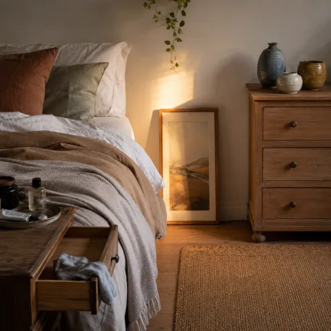
We open the room and note how the blush paints the air as if the morning itself had a soft whisper, settling in the folds of linen and the glass-y edge of the mirror. We test daylight at different hours with swatches held close to the wall, watching the pigment glow differently from dawn through late afternoon. The bed anchors the space with a truth that older houses crave: rest precedes display, and proportion governs calm. We speak softly with the fabric and wood, measuring how much warmth a brush of pink can give without tipping into sentimentality. The vanity becomes a map of our movement, a place to pause before the day begins and a sanctuary at the end, where we return for a quiet review of the hours passed. We treat every surface as a possibility rather than a display, resisting the urge to fill spaces with competing textures or loud trinkets. In sum, the room invites quiet rituals rather than rash decisions, and we let our pace follow its slow cadence, noting how small actions echo through the whole suite of surfaces. The aim is a room that feels at once familiar and newly discovered, a place we can inhabit with a steadier breath.
Choosing a blush palette for walls and textiles
We begin by reading the room's light and the way the blush shifts with the sun. We test three faint swatches on the largest wall, watching how daylight moves across the pigment from dawn through late afternoon. The goal is a hue that quiets rather than announces, that sits under fabrics without fighting with them. We reject anything with remnants of mauve in the wrong direction, preferring a soft pink with creamy warmth. The paint becomes a whisper, a colour that forgives fingerprints and dusk. We note the room's existing undertones and adjust accordingly to preserve harmony.
Texture plays as much part as hue. We select a matte, slightly chalky finish for the walls to keep the room feeling intimate rather than glossy. The textiles we choose are generous in scale but restrained in tone; a duvet cover in pale blush and a throw that hints at terracotta keep the palette anchored. We arrange a small palette of related tones: ivory, rose, and a whisper of peach. The aim is a coherent story that never yells but speaks in a whisper when you stand in the doorway. We study how the fabrics catch light differently depending on the angle of the sun and the position of the lamp.
Finally, we consider the frame of the room—how doors, rug, and mirror interpolate with the colour. We choose the final hue after a few hours more of observation, respecting the room’s natural light and the path of everyday use. A neutral skirting and an off-white ceiling keep the blush from becoming too insistent and help it breathe. The result is a softly layered backdrop that invites texture rather than competing with it, encouraging our senses to travel from wall to textile to wood without fatigue. We test the palette's resilience by moving objects under different lighting, then returning to the wall for one last check.
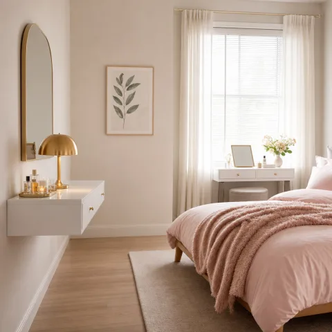
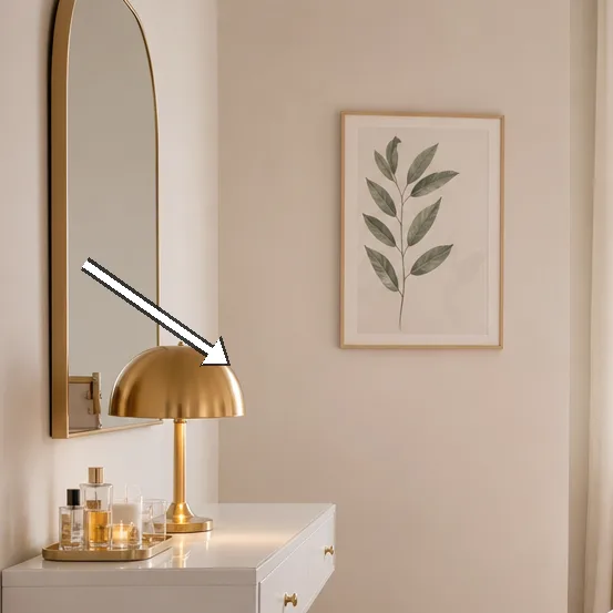
Calm vanity: storage and surface
 Save
Save
The vanity becomes a study in order. We install a shallow drawer system beneath the main surface to corral makeup, jewellery, and small brushes, loving the clean line it creates. On top, the surface remains exquisitely modest: a small tray for tidying, a vase of dried grasses, and a single diffuser that circulates a gentle scent. We design with negative space in mind, ensuring there’s room to breathe when we sit down to apply skincare. The mirror is framed in warm oak and hung at a height that makes eye contact easy without craning the neck. Finally, a soft cotton pad organiser keeps the essentials within reach without visual clutter.
Storage is as important as style. We use shallow, wide boxes in a pale timber to keep cosmetics upright and easy to return. A set of glass jars acts as catch-all for small items, while a jewellery tray anchors delicate pieces. The configuration allows us to see every item at a glance, reducing the mental load when dressing. We pay attention to the pull of the drawers—smooth, quiet, and confident—and the click of the hinges as you close the cabinet at dusk. Materials feel light in touch and sturdy in use.
We finish with a cushion of textiles that makes the vanity feel beckoning rather than clinical. A wool-blend mat underfoot absorbs sound and adds warmth to the area where we stand. The surrounding furniture is kept low and unobtrusive, so the focus remains on the hands and the mirror. We test small adjustments to the height of the stool to keep posture comfortable during longer routines. The result is a calm, almost ceremonial space that invites a slowing pace. We leave space for a moment of pause before moving on.
Lighting for a soft mood
Light is the quiet partner to colour. We layer a warm overhead glow with a pair of table lamps on the bedside tables, each fitted with a 6–8 watt LED bulb that renders skin tones gently. The vanity receives a dedicated, dimmable task light that we position for precise work without glare. We rely on light to reveal texture: the weave of linen, the grain of oak, the soft bloom of fabric edges. In the evening, the lamps soften to a honeyed amber that pairs with the blush without shouting. We check how the light travels along the wall and across the mirror, noting where shadows live and how they resolve as the room empties. We try different colour temperatures to see which best maps the daylight and the glow of the table lamps, then adjust accordingly.
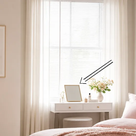
We consider curtains as both light-control and texture. Heavy linen panels offer privacy while still allowing a breathable translucence in daylight. The curtain rod is slim and unobtrusive, so the fabric can fall in soft folds that echo the room’s curves. We test light levels at different times of day, never letting a single source dominate. The aim is a quiet, controllable glow that clarifies the vanity’s tasks without creating hot spots. We test and revise until the glow feels like a natural extension of the blush.
 Save
Save
One wall is allowed a gentle contrast—perhaps a very pale mushroom or a warm white—to push the blush colour forward when needed. We avoid harsh ceiling lights that cut the room into stark zones; instead we prefer ambient balance with a central pendant that disperses light evenly. The result is a room that feels awake but never bright, with light that falls naturally and softly across the vanity and the bed. We test at dusk when the room shifts from daylight to radiance, and in the late evening when lamps plug in. The colour remains gentle, never competing with textures but inviting them to glow. We record our observations for future reference.
Textiles and textures to soften the room
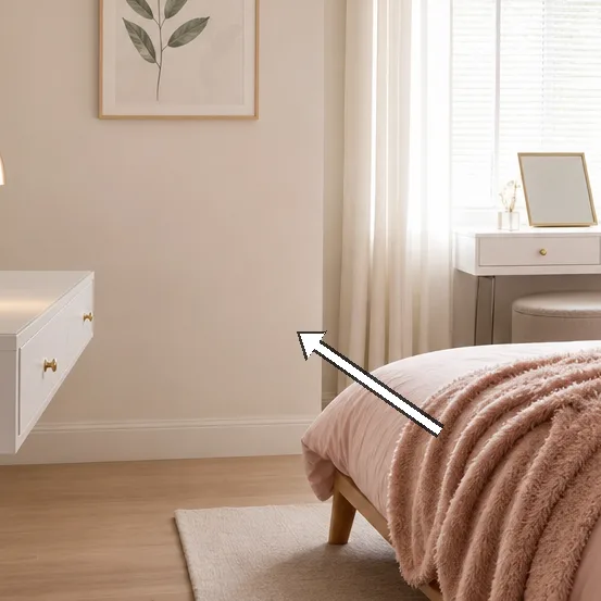
Textiles are our language of warmth. We lean into a mix of cotton, linen, and wool in creams and blushes to avoid any single surface from shouting. A bed throw lies loose at the foot of the bed, inviting feet to settle and encourage a sense of rest. Cushions in varying textures—ribbed knit, smooth satin, fine boucle—create depth without competing with the walls. The rug underfoot is low-pile and soft, absorbing footsteps and echo. We observe how fabric textures catch lamplight and how their edges soften when touched. We test a slightly heavier throw for cooler evenings and decide not to over-populate the bed with cushions.
Texture and tone work together when we choose accessories. A ceramic vase with a matte glaze sits beside a glass dish for small treasures; both catch the light differently and teach the eye to linger. We layer additional pieces such as a softly woven basket, a small brass tray, and a pair of porcelain cups to calibrate the rhythm of the surfaces. We restrict the number of accent items to three or four so the space maintains linear calm. The textures become the room’s quiet punctuation, guiding the eye around the space without shouting. We occasionally swap a single item to refresh the look without disrupting the calm.
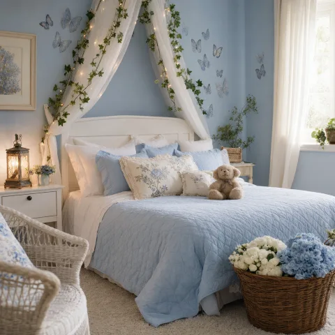
We finish with a plant or two, small but confident, to bring life without introducing humidity or drama. The leaves catch the blush of the walls and add a cool-green balance that reads as a gentle punctuation mark. The arrangement remains deliberate and spare, so the room never feels busy. We cure the urge to fill every corner with trinkets and instead celebrate breathing room. The green tones echo in the rug and a small ceramic pot that rests near the mirror, linking the vanity to the room beyond. We observe how a tiny plant can quiet the day with a single breath of colour.
Small-scale furniture and layout
 Save
Save
The layout prioritises ease of movement and proportion. We keep the bed width proportional to the vanity’s length so both features read as calm anchors rather than competing focal points. A compact bench at the foot of the bed doubles as a place to lay out an outfit and collect ideas without creating visual clutter, and it invites a moment of pause before dressing. We position mirrors to multiply light rather than reflect chaos. The drawers and shelves beneath the vanity are aligned with the wall to maintain a pure, uninterrupted line in the room. We test the sequence of steps from doorway to vanity to bed again, ensuring that you can move through the space with minimal effort and maximum calm.
We test seating heights and distances, allowing for a sense of flow from the doorway into the little salon of the bedroom. The furniture chosen is refined rather than ornate, with clean profiles and minimal hardware that catch light rather than cast shadows. We keep the surface area clear and the corners softened with textiles so the room feels intact when you enter. The end result is a compact space that feels generous because nothing fights the eye. We assess the path from the door to the vanity chair and back again, ensuring there is a welcoming loop rather than a narrow corridor. We reflect on how the placement supports daily routines and the slower rhythms of mornings.
We celebrate proportion and restraint as the cornerstone of the quiet blush. Every item has a purpose, every shade a reason, and every texture a join between the room’s parts. The vanity remains a nourishing ritual space, not a showroom feature. The room breathes when you turn on the small lamp and watch the blush glow softly across the fabrics. We test a final moment of tidying before bed, noting how the space feels when it is left in a calm state. The overall effect is a room that reads as intentional, comfortable, and ready for a long, slow week.
- soft textiles unify the palette
- texture anchors the calm
- minimal decor reduces noise
- sound-absorbing materials invite pause
- plants add life without busyness
Final considerations and personal ritual
We end with a quiet walkthrough, pausing before the mirror to acknowledge the colour shift and the quiet warmth it creates. The space feels more than the sum of its parts, a collaborative effort between pigment, fabric, light and intention. We note how each choice supports the daily rituals we perform here: dressing, skincare, quiet conversations with our own reflection. The room does not demand attention; it gently accepts it, letting the mind settle into a slower pace. We leave the door slightly ajar so that the room breathes into the corridor, inviting a soft morning routine rather than a hurried departure.
How to do it
Survey proportions and sketch
We measure key wall lengths and eye-height for the vanity, then sketch a simple plan to test scale.
Select colour and finishes
We sample swatches in daylight and lamplight, choosing a blush that behaves across surfaces.
Arrange storage and surfaces
We position drawers, trays, and a mirror to maintain calm and accessibility during routines.
Test lighting and textures
We adjust lamps and textiles, observing how warmth shifts through the hour and how surfaces feel.
Common mistakes to avoid
Over-saturation on walls
We see rooms that try to shout with colour; it quickly fatigues the eye. When a blush becomes a loud coral, it draws attention to every corner and creates fatigue instead of respite.
Poor lighting layering
Choosing one harsh light or leaving spaces underlit makes the vanity feel clinical. We prefer a combination of ambient, task, and accent lighting that blends into the wall wash.
Ignoring texture variation
A uniform surface can read flat and clinical. We aim for a tactile mix—soft textiles, warm woods, and a subtle weave in the rug to invite touch.
Frequently asked
How can I start with a blush palette?
What is the best lighting for a vanity?
How do I avoid a room becoming too pink?
What fabrics work best?
Where should mirrors be placed?
What is the role of texture?
How do I maintain calm with storage?
How long does it take to achieve this look?
In closing
What began as a gentle idea—soft colour, quiet surfaces, a generous sense of air—grows into a room that breathes with us. The blush becomes a year-round companion rather than a seasonal trick, evolving with the light and our routines. We leave with a durable belief that calm interiors arise from disciplined decisions: fewer, better textures; storage that recedes; and lighting that glows without shouting. In this bedroom, every element has a reason and every hour offers a new way to pause. The slow‑living practice here feels like a small, steady practice of care we can carry into other rooms and seasons.