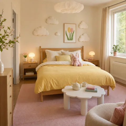
During a late-winter refresh of a compact bedroom, we began with a soft yellow sample and watched how daylight softened and changed it. We describe the room as measuring 2.75 metres in width and noting that a pale tone makes the ceiling feel higher. We tested different textiles and textures to remain tactile without shouting colour. The aim was to create a morning environment that feels calm before daily routines begin, something that can withstand a restless dawn. We moved the bed closer to the window to catch the first light without glare, and we added a wool rug to create warmth under foot. We photographed the space at three times of day to compare mood shifts and noted how the wall colour harmonised with timber furniture. In the end, restraint proved more powerful than a punchy accent.
Pastel yellow and daylight balance
From the outset we measured daylight as it moved across the wall, watching how the pale yellow persisted without dominating the room. The hue proved gentler when used on a plastered surface with a matte finish, absorbing rather than reflecting glare. We tested the effect of shifting furniture placement to redirect light, discovering that the bed's position could cradle morning warmth or invite a clinical brightness depending on the angle. The palette remained disciplined: white linen, a grey timber bed frame, and accents in natural fibres to avoid tonal discord. The overall sense of space grew when we invited the view to the window rather than trying to domesticate every square inch.
Retracing daylight experiments, we refined the ceiling and wall intersection to minimise chalky bloom around corners. We avoided glossy surfaces that shout yellow and instead embraced a soft texture that communicates warmth. The wall's soft saturation cooperates with the timber grain, pulling the eye along the room rather than pinning it in place. We tested two different paint brands and compared how each absorbed mid-morning sun—one leaning warmer, the other cooler—until we found a comfortable middle. The resulting finish carried morning light with a gentle halo that stayed tender without washing out the room.
Layout decisions influenced how the colour read in practice. We moved the bed closer to the window edge to catch the first light without direct glare, and we added a compact wool rug to soften the floor and invite barefoot steps. The rug's texture interacts with the linen throw and the cushions, creating a layered field that changes with the sun. We kept open surfaces for air and light, allowing the yellow to breathe and the timber to speak. Finally we photographed the room at dawn, noon, and late afternoon to document the shifts and confirm the calm remained intact.
Textile layering for warmth and softness
 Save
Save
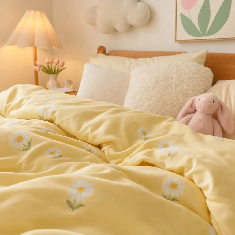
Textile layering is the backbone of the look, not a decorative afterthought. We began with a duvet in pale butter that softly relays light back into the room and reads as a warm surface when the morning sun touches it. The cotton sheets sit against linen blend pillowcases to create a tactile depth and a sensory anchor that invites touch at every turning moment. A wool throw at the foot of the bed introduces warmth when temperatures drop and adds a sculptural line that mirrors the bed's geometry. We chose curtains with a warm lining to mitigate glare while preserving daylight clarity, ensuring the room remains breathable and not overbearing.
Texture and colour talk with restraint. We kept the walls aligned with a monochrome palette, avoiding competing colours, and used a mid-grey rug to anchor the floor and prevent the yellow from seeming to float. Small accents of soft white maintain airiness, while natural timber grounds the space and offers a quiet anchor for light-filled mornings. When selecting cushions, we opted for textures rather than additional colour to maintain the calm and to catch light in intriguing ways, like a linen weave that catches the morning breeze.
Maintenance decisions mattered as much as aesthetics. We evaluated the ease of washing throw cushions and duvet covers after spills, noting the importance of durable fabrics that stay soft with repeated laundering. The curtains were chosen for their washable properties and their easy-to-clean lining, a practical choice when the room welcomes daily use by multiple hands. We also noted how the mirror's angle could load brightness at different times of day and adjusted it to diffuse rather than amplify glare.
Storage and organisation
Storage strategies in the pastel-yellow bedroom should be discreet, with surfaces left free to breathe in daylight. Hidden compartments and shallow baskets keep surfaces clear, while a slim under-bed drawer offers a place for seasonal textiles and spare linens. We test built-in shelves that run at a comfortable eye level to hold current favourites, so the eye isn't pulled down by clutter. The wardrobe, when pared down to essentials, reveals its contents through clear, soft-edged plastic boxes that stay tidy after daily use. The overall effect is a room that feels organised yet lived-in, capable of quiet daily rituals without shouting for attention.
 Save
Save
Organisation supports mood more than aesthetics. Labeling bins helps family members locate items quickly without moving the scene, and we purposely avoid transparent containers on public surfaces to keep the room visually calm. Regular rotations refresh the relationship with textiles and linens, preventing stagnation and reducing the chance of misplacing favourites. Cycle cushions and throws to maintain texture without overloading the space and to keep the ceiling feeling expansive. Keep a dedicated spot for daily necessities so the room can reset each morning without shuffling items around.
DIY storage ideas tested for durability included woven baskets with tight seams and wooden pegs for hanging items, tested under load to ensure longevity. Textiles tucked into baskets were helpful but required regular re-fluffing to keep their shape, especially after laundry cycles. Investing in a shallow wardrobe with adjustable shelves made daily routines smoother, allowing small outfits to be laid out in advance. Clear plastic boxes helped us see contents at a glance, while staying hidden enough to preserve calm.
“The room calms as the light softens and the yellow settles.” — Mira
Sleep-friendly-layout and daily rituals
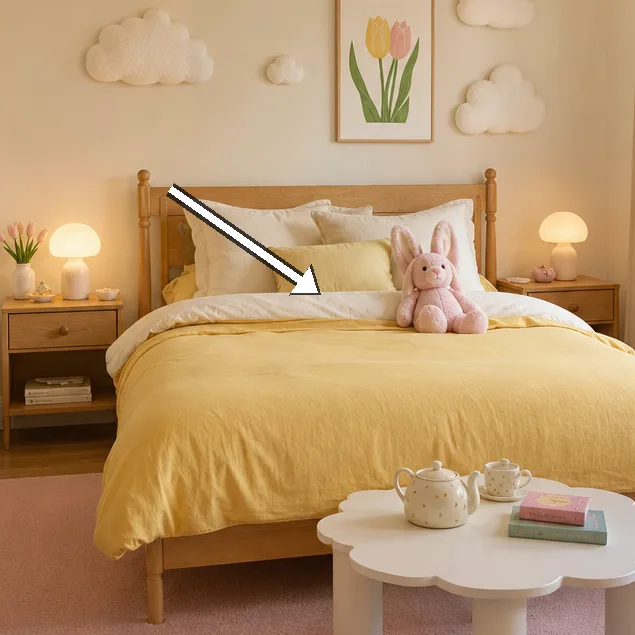
Sleep-friendly layout supports slower mornings and stronger routines, and we designed it to feel almost apologetically simple. We kept the bed central but slightly offset to avoid cold drafts along the edge, creating a sense of balance even when the room is dim. A small nightstand on the non-window side preserves sightlines and reduces clutter, letting your mind settle before any decision. A soft rug underfoot adds warmth when stepping from bed to floor, making the first movement gentle rather than abrupt. We tested a bedside lamp with a dimmer to create a calm transition from sleep to wakefulness.
Layered lighting aids the transition from sleeping to waking, offering three distinct moods within the same space. Between dawn and dusk, wall lamps and a floor lamp give different readings that can be measured against the yellow's tone. We used warm temperatures to maintain softness as the day progressed, avoiding cool light that would erode the gentle mood. A small timer helps us rehearse a gentle wake-up routine, turning gradually from 20 minutes of early glow to full daylight after breakfast. In practice, the yellow blooms differently with each lighting setting, revealing new textures in linen and the timber grain.
 Save
Save
Daily rituals and maintenance become the final act of the morning routine. We documented simple rituals that reinforce calm, such as bedmaking first thing, and found that a neat base supports a peaceful mind. We noted that consistent linen upkeep paid early dividends in mood and surface quality, because fabrics respond to light and touch. An organised dresser surface reduced friction during morning preparation, preventing a scramble for items. We also observed that a single plant added life without crowding the room, its quiet green echoing the yellow's warmth. The routine stabilises the visual field, making the space feel more cohesive.
- Declutter surfaces to let the yellow breathe
- Choose textiles with subtle texture
- Opt for layered lighting with dimmers
- Keep a single storage spot for daily items
- Rotate accessories seasonally to refresh calm
Personalisation and seasonal refresh
Personalisation is the final layer that makes calm feel lived-in, and we approached it with quiet restraint rather than bold statements. We introduced a framed photograph with warm tones to anchor a memory and to catch the eye without stealing attention from the walls. A plant added quiet vertical rhythm and improved air quality, its leaves catching the occasional sunbeam as hours pass. Seasonal textiles joined the space without overpowering the subtler yellow, staying within the same family of pale creams and muted greys to maintain harmony. We documented a small rotation plan to keep the look renewed across the calendar without destabilising the core mood.
Seasonal changes affect the mood more than drastic colour shifts, and in spring lighter textiles brighten the room while in autumn heavier weaves add depth. We avoided large, loud patterns that clash with the wall colour and instead leaned into natural fibres and muted tones that softly echo the yellow's warmth. The textiles transition with the seasons, while the walls remain constant, allowing memory and mood to travel with textures rather than colour alone. The final balance keeps the room cohesive while offering subtle updates that feel considered rather than contrived.
The final adjustment is a personal ritual of assessment; we review the space monthly and note any creeping clutter that begins to disturb the calm. We swap a cushion or two to test new textures and to invite tactile exploration without changing the hue. We balance function with emotion to maintain calm, ensuring every item serves a purpose within daily routines. In this way the pastel yellow room continues to welcome gradual changes while staying recognisably itself.
How to do it
Define the mood and plan
Choose a pastel-yellow base and map light sources, furniture, and textures on a single plan before moving furniture.
Select textiles and textures
Layer fabrics in decreasing tonal value, test ironed finishes, and choose textiles that wash well and wear nicely.
Arrange lighting for day-to-night
Install dimmable warm bulbs and position lamps to create three zones of glow for different times of day.
Test, refine, and live with it
Live with the space for a week, observe mood shifts, and adjust clutter and layout as needed.
Common mistakes to avoid
Choosing too bright a yellow
Readers often misjudge how bold yellow will read in evolving morning light. We found that pale, muted tones stay restful throughout the day, whereas a punchy hue can create glare on white surfaces.
Ignoring texture
Texture is essential to this look; without fabric, natural materials and rugs read flat against the walls. Add linen, wool, and weave to preserve depth and tactility.
Poor lighting planning
Ambient brightness shifts with daylight. Layered lighting is crucial so mornings feel gentle even after sunset, and avoid relying on a single harsh bulb that disrupts the mood.
Frequently asked
What makes pastel yellow suitable for calm mornings?
How long does it take to achieve the look?
What budget is typical for a gentle refresh?
Is texture more important than colour?
How do I avoid glare with yellow walls?
Can this be adapted for small spaces?
How should I approach seasonal updates?
What about storage in a pastel yellow bedroom?
In closing
Calm arrives not from brightness alone but through restrained, deliberate choices. The pastel yellow room teaches that texture, light, and plan—seasoned with small personal touches—create a sanctuary that remains usable, adaptable, and welcoming. It remains a space that evolves with the year, not a static display. In slow living terms, it is a room that grows with us rather than demanding constant change. The discipline of keeping surfaces clear and the warmth of fabric textures together form a daily invitation to breathe and begin anew each morning.