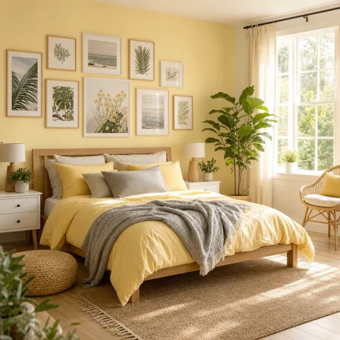
Soft yellow walls define a bedroom designed for calm light, a soft morning where colour does not shout, and a subtle, lasting green accent that feels like the outdoors brought inside. We approach the room as a field study, noting how daylight shifts across the pale surface, how the greens ground the scheme, and how every small choice affects sleep quality. The palette relies on a pale yellow base, warm-white textiles, and muted greens to create a restful mood that ages well with the room’s habits. We explain the decisions behind material choices, the positions of light sources, and the practical storage solutions that keep the space uncluttered and ready for daily use. We tested the space across late autumn and a bright late-winter afternoon to confirm the calm endures in varied natural and artificial light, and in different sleeping routines. The narrative remains practical rather than fashionable, offering guidance that can be replicated with common materials and modest budgets, plus a few trusted suppliers and simple projects. Readers will find a clear sequence for creating a calm yellow-green bedroom with longevity, including notes on maintenance and seasonal adjustments. It is designed to evolve with daily rituals rather than a one-off makeover.
Soft Yellow as a Gentle Stage
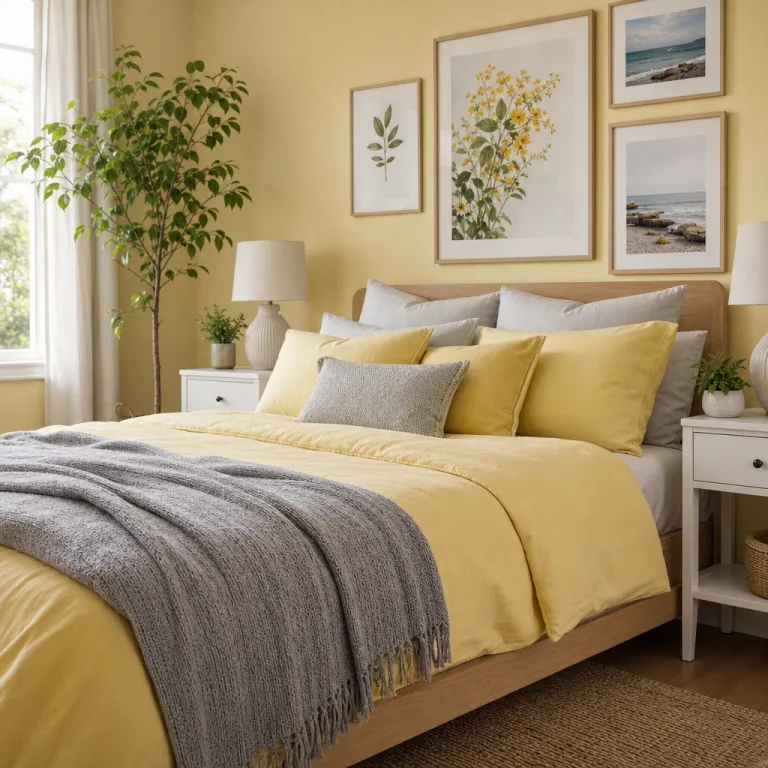
Entering the room, we observed how the pale yellow surface cools the brightest morning light into a soft, almost edible glow. The paint is a matte wash that absorbs glare and makes architectural lines feel gentler. The bed is low and grounded, with a simple ash headboard that lets the grain speak without demanding attention. The arrangement of furniture remains spare by design, inviting the eye to rest rather than chase colour. We notice how white linen and the ash tone work together to create daylight-friendly warmth throughout the space.
Window treatment is deliberate: sheer fabric lets morning light travel cleanly, while the curtain edge softens the boundary between inside and outside. The duvet and pillow cases are kept in pale greens and ivory to avoid competing with the wall colour. The throw at the foot of the bed adds a tactile weight that signals evening comfort without visually crowding the surface. The plinths are kept clear, with a single ceramic dish and a clock positioned to be used, not shown. The overall arrangement supports a gentle pace for waking and winding down.
Green accents appear as a quiet chorus rather than a loud refrain. Cushions combine linen, cotton, and boucle to catch light from different angles and to encourage touch. The rug underfoot is a natural fibre that anchors the space and dampens sound, making closing the door a moment of soft quiet. The vases and small plants offer vertical interest without stealing focus from the bed. In this zone, restraint becomes the instrument that keeps the room from tipping into decoration.
Calm Light through Layers and Bulbs
 Save
Save
Light in this room behaves like a choreography rather than a single event. Daylight filters through sheer fabric, then ceiling glow and wall lamps join in as the day progresses. The east-facing window brings a pale gold in the morning that lingers, borrowing warmth from the walls. We employ dimmable lamps to wash walls evenly and avoid harsh edges that might interrupt the soft mood. The aim is to keep the room feeling open and composed, never bright enough to wake the sleep you just made.
We set the ceiling fixture low and flattering to spread the glow across the ceiling and walls without drawing the eye to any one hotspot. The wall lamps flank the bed as practical reading lights, yet their light remains subordinate to the overall palette. A quiet table lamp on the dresser sits as a secondary focal point that can be dimmed for late-night pauses. We test 2700K versus 3000K bulbs to understand how the warmth shifts with temperature and time of day. The result is a light scheme that is forgiving and intuitive.
Texture matters as light shifts. A linen curtain edge catches each breeze and casts a long, narrow shadow across the room. The jute rug absorbs footfall and anchors the floor, preventing the yellow from becoming airborne. We confirm that daylight does not bleach the palette; warmth remains gentle and honest. Overall, layering light and texture proves essential to maintaining a calm atmosphere that feels alive rather than static.
Green Accents: Quiet Contrast
Green accents arrive through cushions, throws, and ceramic vases that echo the outside world without shouting. Choose greens between sage and olive to keep harmony with the yellow base. Texture adds depth; linen, wool, and boucle catch light and shade differently. Pattern is deliberately subtle, favouring tonal variation over high-contrast motifs. The curtains remain linen with a soft drape that filters daylight into a pale wash rather than a glare.
 Save
Save
Test the impact by sitting on the edge of the bed and looking across the room, letting the greens read as a quiet whisper against the yellow. The effect feels grounded rather than trend-driven, and it rewards careful observation over quick styling. Cushions and ceramics chosen in the same tonal family age gracefully as light shifts. A small plant in a terracotta pot anchors the corner without crowding, offering a moment of living colour. This restraint preserves the room's quiet, restorative atmosphere.
Careful sourcing matters for this palette: fabrics and finishes should share saturation to avoid jarring shifts. We compare swatches in daylight and lamplight to ensure consistency. The cushions, covers, and ceramics all speak the same language of warmth and quietness. If a piece shifts colour under evening light, we replace it quickly to preserve balance. A simple clay pot becomes a quiet hero rather than a loud statement.
“A quiet room speaks in touch and light more than in words.” — Mira
Texture, Fibre and Warmth
Textile choice remains central to the room's comfort and its visual tone. Soft textiles create a tactile map that invites hands to slow, especially after a long day. The linen curtain edge catches each breeze and casts a moving, soft-edged shadow across the bed. The wool throw at the foot adds material weight that signals evening and shelter. The rug, tightly woven in jute, anchors the floor with a warm, earthy texture that muffles footsteps and hums softly under foot.
Bedding uses cotton-linen blends that breathe and drape with quiet confidence. We layer a light duvet and a couple of extra cushions so the bed reads as a calm, sleep-ready surface. The textures respond to changing temperatures, remaining comfortable throughout the seasons. We avoid high-gloss surfaces that would tempt reflections and interrupt the soft mood. Dark edges remain softened by the pale yellow walls, keeping the room cohesive.
 Save
Save
Surfaces are kept matte and tactile to prevent glare and maintain warmth. We test finishes in both daylight and lamplight to verify the palette remains honest. Small details, like woven coasters and cork boards, reinforce the room's language. These choices knit the space together, providing a sense of lasting calm. Texture language becomes the quiet driver of daily comfort.
- Let natural light lead the mood
- Ground the palette with sage and olive
- Layer textures to invite touch
- Keep accents restrained for calm
- Choose durable natural fibres for longevity
Order and Storage for Daily Calm
Storage acts as the quiet partner to calm, keeping the surface clear and the mind clear. We install a shallow bench at the foot of the bed that doubles as a landing space. Under-bed boxes slide neatly in and out with smooth runners. We use baskets in different textures to differentiate contents by touch. In this setup, regular, brief resets before sleep help maintain daily balance.
Lighting and textiles are coordinated with storage so nothing looks out of place. We maintain a small design diary to track what belongs where and what can be refreshed. Clutter is treated as an ongoing conversation rather than a final condition. With practice, the routine becomes as calm as the room itself. A quarterly check of wear and shelf life helps pre-empt clutter.
We conclude that a bedroom is a space that grows with time and patience. We allow small updates, like new pillow covers or a plant swap, to renew without overhauling. By maintaining a clear base, the room continues to feel restful through the years. Ultimately, calm comes from restraint and measured changes rather than bold moves. These choices make daily life easier, not just more stylish.
How to do it
Assess the space
We begin by measuring window height, bed width, and furniture depth to understand how light travels through the room at different times.
Test lighting levels
We trial three lighting sets, recording perceived warmth and contrast at dawn, midday, and dusk, then select two that balance colour and shadow.
Build a soft palette
We select pale-yellow wall paint, olive greens, and natural fibres, then compare swatches in daylight and lamplight to confirm harmony.
Arrange practical storage
We plan discreet storage for bedding, cushions, and towels to keep surfaces uncluttered and daily routines streamlined.
Common mistakes to avoid
Choosing too bright a yellow
Bright yellows can ping in low light and wake the eyes. We found the softer, pale shade reduces glare and retains warmth even as evening light shifts. Always test a large patch on an actual wall before committing.
Ignoring texture variety
A room that is too flat will read clinical. We layered with linen, wool, and jute to create tactile interest that still feels cohesive. Without contrast, the calm becomes monotone rather than restorative.
Skimping on storage
Clutter interrupts calm and makes the light feel unsettled. We allocated a discreet chest at the foot of the bed and woven baskets for linens to keep the surface clear. The aim is to preserve breathability in the room.
Frequently asked
Which yellow is best for a bedroom?
How should lighting be layered in a pale-yellow bedroom?
How to add green without overwhelming the space?
What textures support a calm atmosphere?
What storage helps maintain a calm bedroom?
How to test a palette before committing?
Are plants essential in this scheme?
How long does it take to implement a calm yellow-green bedroom?
In closing
We leave the room with a quiet sense of achievement; the pale yellow walls feel like a soft refuge after a long day. The greens ground the scheme while the textures invite touch, making the space restorative rather than decorative. This room proves that calm is a practice of restraint, not a style verdict. We plan to revisit it seasonally, refreshing with simple textile swaps and gentle lighting to keep the same quiet balance.