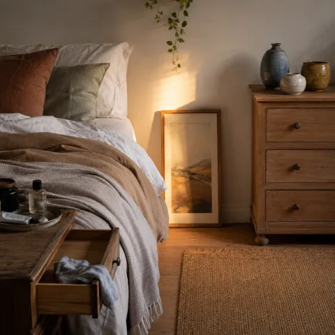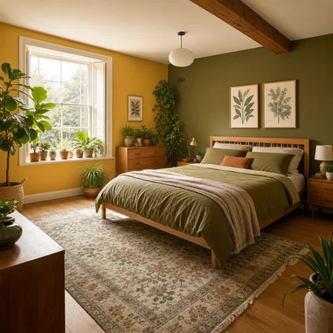
We arrived before dawn to shadow the room with quiet intention, noting how a space speaks through texture before colour. In this Green Oasis Bedroom we set out to slow the eye, trading clinical neutrals for gentler greens and a soft wash of yellow. We moved deliberately, measuring light at several points with a notebook and a few familiar objects that would hold the room. Textures became the language here: linen, wool, and rattan woven into a calm landscape that invites touch and breath. We tested simple contrasts—the cool breath of olive with the warmth of lamp-lit honey—to see how they behave at different times of day. The plan was to build a contained garden of stillness in a sleeping room, a place to pause before the day begins. What follows is the record of materials, proportions, and rituals we used to achieve that intention.
Natural materials and textures
We began with the foundational materials, choosing long-staple linen for the duvet cover and a wool blend for cushions. The linen feels cool in warm months and soft in cooler nights, while the wool adds subtle bounce without bulk. Rattan screens and a bamboo blind reference a light, outdoorsy mood without shouting greenery. Colour emerges through the textiles rather than surfaces, with mossy greens and pale olive working as a backdrop. We tested several weave densities to balance sound absorption with airiness around the bed.
We layered textures deliberately, letting the tactile contrast guide the eye from pillow edge to bedside plant. A boucle throw adds warmth at the foot of the bed while remaining easy to fold away for the morning. Ceramic pots in matte white and terracotta ground the greenery without competing with the yellow accents. We kept metal discreet—bronze-toned lamp bases and copper trays—so warmth travels through the room. The result is a soft terrain that invites calm rather than busy discovery.
In the wardrobe we chose a light breath of colour: sage-green curtains that filter light without darkening the space. The fabric breathes, catching a trace of sunlight and releasing it slowly as evening closes in. We avoided glossy surfaces that would reflect, preferring matte finishes that absorb noise and soften edges. A wool rug underfoot provides grounding and a tactile cue to slow steps. Little elements—seed pods, dried stems, a single fern—carry a quiet story of growth and calm.
A quiet palette of green tones
 Save
Save
The second stream of work aligned greens with a restrained yellow to mimic garden light through a window. We tested three greens in different saturation levels—sage, moss, and olive—to observe how each breathes when surrounded by light. The yellow accents are warm, not loud: a lamp shade, a small throw, and a ceramic dish that catch the eye without shouting. We balanced colour with negative space, leaving plain walls and a quiet corner to rest the eye. The palette now feels cohesive, like a small courtyard threaded into the bedroom rather than a painted mural.
Texture amplifies colour here; the green is never flat because the textiles carry subtle shading. We used a variety of weave patterns—herringbone, bouclé, and basket weave—to create subtle depth. There is room for negative space around the bed, letting the yellow accents glow without glare. Even the switch plates and door frames were chosen with the same quiet language, brushed brass to warm the greens. The overall outcome remains calm, adaptable, and easy to maintain for daily life.
We tested the effect of daylight transitions, watching how the green shifts from lime to olive as clouds pass. Evening light softened the yellow highlights, turning them into gentle glow rather than a signal. We paused periodically to note if any texture felt too busy or too fragile for regular use. The bed remained the central anchor, with plants stepping back slightly to avoid crowding the view. The exercise taught us to let the gentle yellow sit as a companion, not a rival, to the greens.
Light and shadows in the space
Natural light is the first tool we used to sculpt the room's mood, not a decorative feature. We treated window gaps as furniture, guiding how the eye travels from the bed to the plant corner. Shadows play a quiet role: a tall plant creates a column of soft texture against a pale wall. The artificial lighting is layered: a distant wall wash, a bedside lamp, and a small uplight to lift corners. Dimming it all to a cohesive warmth helps the space breathe like a slow sunrise.
 Save
Save
We tested a range of colour temperatures on the lamps, favouring warm white around 2700-3000K. The aim was to avoid blue tints that feel clinical and to celebrate the room's living minerals. When the lamp is on, the greens appear richer, and the yellow gains a honeyed glow. We checked the ceiling to ensure there are no bright reflections that could disrupt sleep. The result is a quiet lighting scheme that acts like daylight, rather than a spotlight.
Even with a dimmed lamp, the plant leaves catch warmth and throw tiny shadows across the wall. We avoided heavy blinds that block daylight; instead we rely on a light-filtering curtain. The bed seems to float against the soft, robe-like shadows on the wall. A subtle fragrance from a linen sachet completes the sensation of calm without intrusion. This balance of light and shade makes the room feel spacious, although the footprint is modest.
“Quiet corners invite deep breaths and careful listening to the room's slow heartbeat.” — Mira
Furniture choices and layout for calm
Layout decisions started with the bed as the central anchor, aligned to a calm axis and buffered by plants. A slim bedside table on each side keeps essential items within reach without crowding the surface. A compact chair nestles in a corner, inviting a quiet moment without blocking movement. The wardrobe doors glide softly on track and remain slightly ajar, suggesting a gentle rhythm rather than a closed box. We tested sightlines from the doorway, ensuring that the eye can rest on green and yellow pockets rather than clutter.
Storage was kept lean: woven baskets and a shallow tray that catch keys and a notebook. We avoided high-contrast finishes that would draw the gaze; everything remains subdued and cohesive. The bedlinen is swapped weekly, yet the palette remains consistent so the space reads as one room. A single statement plant sits at the far corner, anchoring the composition with a soft vertical line. We monitored airflow to prevent humidity build-up near textiles and ensure long life of materials.
 Save
Save
The yellow accents are integrated into small, tactile items rather than painted walls for flexibility. A shallow shelf hosts a ceramic bowl and a couple of small books that encourage slow reading. Lighting in this zone is balanced by the reflection from a pale mirror, expanding the visible space. We also considered acoustics, placing cushions on a bench to dampen footfall noise. The arrangement supports daily rituals: waking, dressing, and winding down with minimal friction.
- A single plant in a low pottery pot strengthens the room's low-level energy
- A woven basket stores textiles without bulking the look
- A compact lamp with a warm glow anchors the bedside
- A soft rug defines the bed area without shrinking the floor space
- A small tray keeps daily necessities within reach but discreet
Layering textiles for warmth and depth
The final layer is tactile: the cushions, throws, and the rug work together like a chorus. We matched texture and tone rather than pattern, choosing surfaces with gentle sheen and matte finishes. The bed becomes a stage for the textiles, not a battleground of competing prints. We avoided heavy drapes and opted for light, breathable fabrics that move with the breeze. The result is a room that rewards touch, with subtle colour shifts as you move.
We included a pair of linen cushions, a wool throw, a silk pillow, and a cotton-voile accent. We balanced sizes to avoid visual chaos while allowing a variety of textures for interest. The yellow accents appear here as small, deliberate gleams rather than loud blocks of colour. The greens stay dominant, but small pockets of warmth tie the space to the bed's edge. Future refreshes can be done with new textiles collected slowly over time.
We tested maintenance routines, noting how often each fibre needs refresh or cleaning. We documented care instructions in a small notebook to ensure longevity. The end result is a simple, resilient layer of luxury that remains honest and practical. We envision this room as a living project—incremental, patient, and refreshable. In this way, the Green Oasis stays inviting without becoming precious or fragile.
How to do it
Survey the room and map light
We began with a two-day daylight log to identify where sun hits the walls and bed. We tested the impact of different angles and noted how warm-yellow accents subtly shift in the gaze.
Choose materials that breathe
We selected natural fibres and low-VOC finishes, then tested texture combinations by draping fabrics over furniture and the bed. The goal was calm practicality as much as appearance.
Layer lighting for ambience
We installed a dimmable wall light and a warm table lamp, adjusting colour temperature to mimic morning sun. The result is adjustable warmth across the room to suit time of day.
Arrange for restful circulation
We arranged furniture to create a clear path around the bed and a trailing plant in a corner. The space invites slow entry and reduces visual noise for sleep and wakefulness.
Common mistakes to avoid
Overloading the palette
Avoid mixing too many greens or bold patterns. The room works best when colour remains restrained, letting texture lead. It’s easy to drift into a busy feel without anchor points.
Too-bright lighting at night
Night lighting should be warm and dimmed. Cold or very bright illumination disrupts the colour balance and sleep cues.
Cluttered surfaces
We found that small, purposeful surfaces stay calm longer than crowded ones. Store or rotate items so the bedside remains calm and legible.
Frequently asked
What makes a bedroom feel like a green oasis?
How do you balance colour without overwhelming the eye?
Which textiles contribute to the calm atmosphere?
What lighting works best?
What should I avoid when styling this look?
How much does this setup cost?
How important is plant maintenance?
Where should we start if the room is small?
In closing
As we closed the door on the Green Oasis, the room offered a slower rhythm rather than a showy display. The balance of texture, light, and colour now acts like a small sanctuary we revisit daily. We learned that restraint is a design tool as potent as any palette, and that regular adjustments keep space living. Moving forward, we commit to simple rituals, tidy surfaces, and mindful purchases that support calm growth in the bedroom.