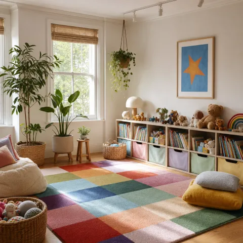
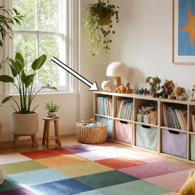
We arrived on a late-winter afternoon, shoes tucked by the door, to see how a living room could host play without losing its calm. The space had been cleared to form distinct zones, with a low timber shelf running along a softly painted wall that carried a quiet rainbow. The palette of the room began with a pale chalk base and then layered in saturated accents through cushions, a rug and light-wood furniture. We noted how the lighting, largely natural with a bedside-like lamp for dusk, held colour without glare and allowed drawing and reading to coexist. Storage decisions stood out: labelled baskets, shallow boxes and a compact art station kept clutter contained while inviting use. In the corner, a small reading nest offered a retreat that was both separate from and connected to the bustle of play. Our field notes trace not a finished showroom but a living sketch that grows with the family and the day-to-day rhythm of life.
Design language: allowing colour to breathe in a living room
Within the Rainbow Playroom, the design language is quiet but deliberate, with a gentle balance between bold colour blocks and soft, tactile surfaces. Wood and linen replace hard plastics where possible, allowing little hands to explore without harsh edges. An open sofa and a shallow seating shelf frame the central play mat as a safe, contained zone. We shadow the rainbow with a restrained wall colour - warm grey-beige - that lets the brighter pieces sing without shouting. Textures play a leading role: cotton, wool and jute invite touch and help children regulate sensory input.
Texture and scale are carefully staggered so no single hue overwhelms the eye. A washable play mat anchors the centre, while cushions in gradient tones offer cushions for tumblers and toddlers alike. Lighting is soft and layered, with daylight, a low-watt bulb and a shaded pendant that diffuses colour gently. Storage is tucked beneath seating at child height, creating instant access while keeping the overall silhouette calm. We avoid excessive wall art, preferring a few statement pieces that can be rotated to refresh the space.
Dialogue with the family revealed an intention to keep every choice practical and free from fear of mess. Materials are described with care: timber rather than engineered boards, cotton covers rather than synthetics, and washable finishes on paints. Acoustics are softened by a felt rug edge and sound-damped curtains that reduce echo without blocking light. Colour distribution is controlled by recurring repeats - soft peach, sage green and a sinking blue - that knit the room together. Even the rug seams are deliberate, guiding footfalls and turning play into a slow, mindful process.
Zone planning for active play and quiet reading
 Save
Save
Zone planning is the core here: a sunken play mat invites tumbling on one side, a cosy reading nest sits beside a window, and a small art desk anchors the opposite edge. We mark each zone with a soft boundary - blue painter's tape or a rug edge - so movement feels intentional and contained. Children can switch between activity and rest without leaving the room, a feature we consider essential for modern family life. The art corner uses low-height storage for paper, crayons and fabric scraps, encouraging independent choice while keeping clutter manageable. Even the switch between zones is choreographed: a gentle shift in light and sound cues signals a new activity.
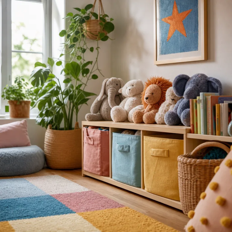
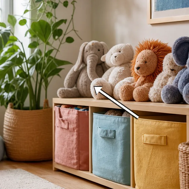
Storage strategy is tactile and accessible: baskets at kid height in timber frames, plus labelled tubs for crafts and small toys. Labels are crisp but friendly, featuring clear words or pictures to reduce friction for little readers. Materials for storage avoid plastic granularity that scatters during play; cotton bags and linen baskets feel calmer and more durable. Rotation is planned: toys are cycled in and out each week so the playroom remains fresh yet familiar. Maintenance routines form part of daily life, with a quick wipe-down and a weekly sweep that keep the space inviting.
Safety is built into every choice: rounded corners, non-slip rugs and fabric that withstands frequent washing. Whiteness of walls is intentionally tempered by warm tones and wood grain to prevent the room from feeling cold. Electrical outlets are shielded, and cords are tucked away to reduce distractions but maintain access for adults. Flooring supports balance and proprioception - soft underfoot without making the room feel sluggish. Overall, the Rainbow Playroom is a dialogue between colour and calm, designed to grow with the child rather than needing constant reorganisation.
Materials to nurture a tactile rainbow
Textures take centre stage in the tactile rainbow, inviting little hands to explore without shouting colour. Natural fibres like wool, cotton and jute soften the glare of bright hues and dampen noise. Fabrics are chosen for durability and comfort, with machine-washable covers that survive crayons and snack spills. Soft cushions in three adjacent tones anchor the eye and create a relaxed perching spot for grown-ups beside the children. By combining a variety of textures, the space feels layered rather than loud, encouraging slower play and thoughtful interaction.
 Save
Save
Colour distribution follows a simple rule: repeat a palette across cushions, rugs and wall art to knit disparate pieces. We reserve the most saturated accents for small, repeatable motifs so kids can recognise them quickly. Light surfaces reflect daylight, while matte wood absorbs and softens the spectrum when evening draws in. Artwork is sparse but expressive, with handmade pieces that carry personal memory rather than a consumer trend. Altogether, the rainbow reads as an integrated script rather than a collage of bright moments.
Toy materials are chosen with longevity in mind: wood, cork and natural textiles. Storage units use fabric bins wrapped in canvas for easy grabbing and gentle stacking. Play stations feature a simple stream of contents - crafts, blocks, figures - so children can focus on the activity rather than the mess. Colour-coded bins help with quick tidying and teach early organisation without scolding. Consent to touch is mediated by the child-friendly surface finishes, which stay pristine through regular washing.
“We value a space that grows with them and calms the room.” — Mira
Storage and sustainability
Storage and sustainability begin with materials: timber frames, linen baskets and labels printed with non-toxic ink. All fabrics are machine-washable and colourfast, and finishes are chosen to minimise chemical off-gassing. Packaging is kept minimal, and where possible we reuse or repurpose fruit crates and cardboard. Colour-coded storage maps align with the overall palette, helping grown-ups maintain order without stifling creativity. Maintenance routines are built in: a weekly check of surfaces, a quick wipe and a touch-up with a damp cloth.
Rotation reduces boredom and waste: toys move between living-room storage and another play corner to extend life. Small changes—swap cushions, switch art on the wall, rotate a shelf of books—keep the Rainbow Playroom feeling fresh. We test a scene by living with it for a week, noting what brings calm and what creates friction. By anticipating growth, we design for simple tweaks rather than major upheaval. Ultimately, sustainability becomes a habit rather than a feature, woven into daily decisions.
 Save
Save
Respect for ongoing reuse means inviting children to decide what stays and what shifts. Labeling string bags with words or pictures boosts independence and keeps the space navigable. To maximise longevity, we prioritise timeless shapes and restrained colour rather than fast fashion cues. Rotation schedules are communicated with a simple chart that families can adapt over time. With care, the Rainbow Playroom remains a calm, inviting hub that supports both play and rest.
- Low-odour, water-based paints for walls
- Linen or cotton storage baskets for toys
- Machine-washable cushion covers and rugs
- Sturdy timber shelves with soft edges
- Recycled or upcycled storage crates
Growth and adaptation
Growth and adaptation appear in the way the room accommodates new interests and different heights. We imagine the space as a backdrop for a changing portfolio of activities - from storytelling to climbing to quiet crafts. Adjustments are economical and reversible, ensuring the room remains, in spirit, a calm hub rather than a laboratory of constraints. Even small changes - rearranging cushions, rotating a few books - signal progress without upsetting routine. With every season, the Rainbow Playroom stakes its place as a supportive stage for families learning together.
Parents and carers benefit from predictable routines - same morning tidy, same night-time wind-down - while children relish the playful surprises. Colour is trimmed back in moments of fatigue, then released again with a new arrangement to renew curiosity. Access points remain child-friendly, but adults can still operate from the sofa, using soft cues to guide activity. Language about the space becomes a shared vocabulary, reinforcing calm through words and touch. Ultimately, the goal is to create a home where play and rest exist in harmony, not in opposition.
We leave the Rainbow Playroom with gratitude for spaces that invite slow attention and resilient joy. It is a reminder that everyday interiors can nurture resilience by combining colour with order, texture with meaning, and memory with possibility. Beyond aesthetics, the room becomes a practice in listening - to children, to daylight, to the rhythm of meals and reading. And in that listening, we find that a calm colour story can hold a family through the busy hours of life. May our own rooms hold space for colour, care and quiet play, day after day.
How to do it
Assess and define zones
Walk the room with a critical eye, mark a central play area, a cosy reading corner and a small art desk, then arrange furniture to create natural flow between each zone.
Select materials and finishes
Choose durable, washable surfaces: timber furniture, cotton covers, wool runners and non-slip rugs; avoid glossy plastics that trap glare or feel clinical.
Install storage with accessibility
Position baskets and boxes at child height, label clearly with pictures, and keep frequently used toys within easy reach to minimise clutter creep.
Create routines for maintenance
Establish quick daily tidying and a weekly rotation of toys and books so the Rainbow Playroom stays calm, legible and engaging for months.
Common mistakes to avoid
Overloading walls with high-contrast art
In a Rainbow Playroom, too much contrast competes with the eye and grows restless. We learned to pair bold pieces with softer fields of colour. Keep an anchor wall and rotate pieces.
Choosing cheap, non-washable fabrics
We found stains accumulate quickly in children's spaces. Select fabrics with stain resistance and easy-clean finishes. A few durable cushions reduce replacement cycles.
Ignoring storage near work surfaces
Without located storage, small items spread to every corner, creating visual noise. We prioritise accessible, labelled storage that discourages clutter creep.
Frequently asked
What is the budget range for a Rainbow Playroom?
How long does it take to set up?
What if we have a small room?
Which materials help with safety and cleaning?
How often should zones be refreshed?
How do we involve children in the design?
Can the space grow with older children?
What are signs the space is too busy?
In closing
In closing, we find that a Rainbow Playroom works best when colour is a quiet companion to order. It is not a showroom of hype but a living space that accepts spills, noise and growth. By keeping finishes durable, storage accessible and textures generous, we create a calm stage for children's play and for the adults who share it.