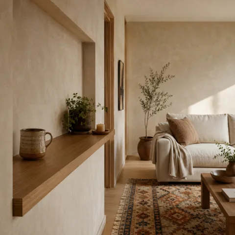
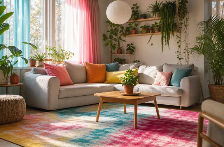
From the doorway, the room seems to breathe and shift with the day. We assess how the palette behaves in daylight, then track how warmth moves from windows to sofas and shelves. Our aim is a measured balance between energy and ease, so neither colour nor foliage overpowers the other. We test scale early, laying out a sofa line that feels generous yet efficient for conversation. The plants establish vertical scenes while textiles whisper alongside soft natural textures. We document every observation in a running notebook to capture the room's evolving personality across two weekends of gentle adjustment. The final read is a colour-forward living space that feels lived-in, yet unmistakably crafted for slow, thoughtful use.
Colour-first framework for living spaces
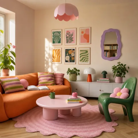
We begin by identifying a primary colour family that will travel across walls, upholstery and shelves, anchored by the room's daylight. The chosen hue should respond to the architectural frame and widen or tighten with the furniture plan. We test large swathes on draughted boards and neutral panels to watch how heat shifts as the sun crosses the glass. The process is slow and collaborative, with swatch boxes opened and closed until a single tone carries the room's mood. The aim is a confident anchor that unifies the space rather than shouting from the corners.
Next we map neutral anchors that temper brightness without dulling personality. We work with warm and cool neutrals in slightly different sheens to catch light in different ways. The neutrals act as quiet stagehands, letting the saturated colours sing without shouting themselves. We test swatch threads against upholstery and rug piles, stepping back to see how the eye travels across the room. The goal is a rhythm that reads as deliberate and calm, even in moments of busy texture. The task is to observe how neutrals change the perceived depth and balance when a larger chair or a rug is added.
Finally we verify the practical implications of the palette by observing how it behaves in real life: daylight, artificial light, and evening warmth. We note how textiles pick up and share colour, how wood grains echo or soften the hues, and how plants reflect tinted light onto nearby surfaces. Where necessary we dial back brightness on walls or adjust a chair cover to maintain restful balance. The tests become the blueprint for a room that feels alive yet not overworked, even after furniture shifts or seasonal changes. We also discuss storage and texture management, ensuring textiles have safe homes when not in use. The result is a living blueprint rather than a fixed diagram.
Plant-led height and texture
 Save
Save
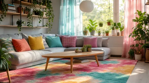
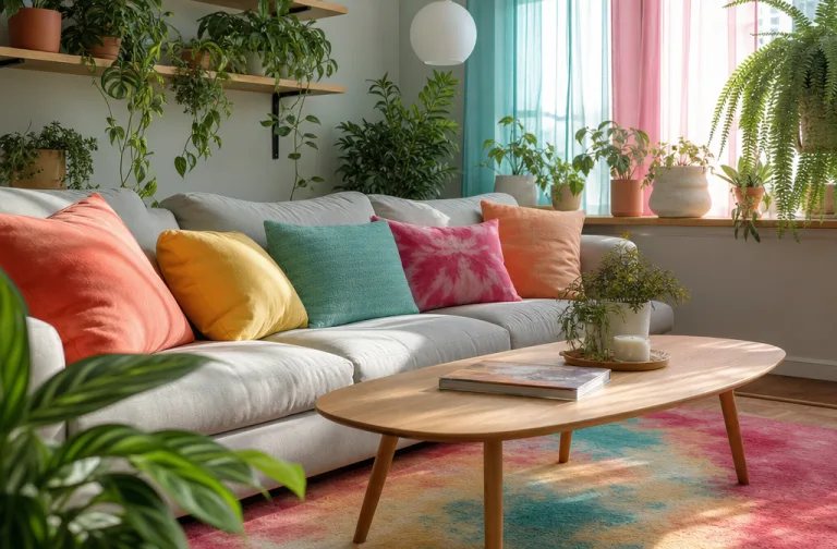
Vertical visuals are our first priority for a sense of air and space. We place tall plants in corners and behind seating to draw the eye upward and to frame the room's silhouette. The goal is a layered skyline of pots and leaves that travels from floor to planter to shelf, so the eye can rest on a series of green edges rather than one flat plane. We mix broad-leaf specimens with slender, arching varieties to avoid visual heaviness in any one spot. Pot shapes and materials are chosen to echo furniture finishes, whether clay, stone, or a matte black glaze. The approach is practical: sturdy stands, stable bases, and easy-access watering routes.
We deploy trailing greens along shelves and freestanding stands to soften corners and allow light to pass through. Leaves of different shapesrounded, lobed, slendercreate a gentle dialogue that keeps the room from feeling static. We curate a rotation of specimens so the plant life feels seasonal but not arbitrary, more akin to a living gallery than a rigid collection. Accessibility is key: we place frequent-care plants within reach of daily watering, while larger specimens stand slightly apart to preserve clear pathways. We also consider pet safety and furniture finishes when selecting varieties and pots. The overall effect is a layered green plane that frames seating and niches without crowding.
Care routines become part of the room's rhythm rather than a disruption. We arrange sturdy pots on wide bases to protect floors, and we choose lightweight planters that can be moved to adjust the composition when needed. We document watering cycles to avoid overwatering, particularly for middle-height specimens that sit near seating zones. A simple notebook tracks light exposure, asking us to rotate pots monthly to keep growth even. The result is a vertical and horizontal lattice of greens that invites touch and rests the eye between cushions. Overall the houseplant programme becomes a living feature of the room rather than a maintenance chore.
Lighting as tactile texture
We treat light as a fabric that drapes across surfaces, shaping colour and texture. By combining floor lamps, table lamps and a subtle ceiling wash we create depth that changes with the time of day. Warm bulbs are essential; they render fabrics with a soft glow and bring greens to life without turning everything into a single hue. We test multiple lighting temperatures, noting how warm and cool tones affect textiles, art, and wood. We adjust brightness to avoid hotspots and to keep the palette consistent across zones.
 Save
Save
Daylight is a living partner in the room, offering dynamic shifts that we map with the furniture arrangement. We place mirrors and light shelves carefully to bounce minimal glare while amplifying daylight on pale walls. In the evenings, dimmers reveal the room's warmth and keep the saturated colours from appearing flat. We also monitor reflections so that glass and shiny surfaces do not produce competing highlights, which would fatigue the eye over longer stays. The overall effect is a room that reads as continuous light and colour, rather than a series of static snapshots.
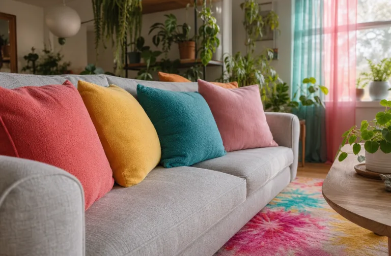
We balance brightness with soft textures—like brushed linen, velvety cushions and a wool rug—to ensure the eye travels smoothly rather than clashing across surfaces. The lighting plan supports a gentle narrative of day-to-night use, with every zone receiving appropriate attention when needed. The aim is a room that reads warm and present rather than hollow and styled. When well executed, lighting becomes another texture the eye can feel rather than simply a utility. We tweak lamp heights and shade shapes to shade corners without creating shadows that flatten texture.
Surface honesty and material mix
Surface honesty remains our guiding principle: materials should tell their own story. We favour natural timbers with clear grain, stone textures with small imperfections, and woven fabrics that carry subtle variation in weave and colour. Coatings are selected to respect the material's character, with matte walls playing against satin finishes on cushions or a lacquered tray for contrast. The palette works in tandem with the texture to reveal the room's tactile vocabulary rather than masking defects. We also check joinery and edge detailing to ensure durability under daily life.
Zones are designed to present different material bodies in close proximity without feeling disjointed. A coffee table may carry a live plant beside a ceramic bowl and a cotton runner; a woven basket sits near a soft rug to anchor the seating arrangement. We avoid fast-fashion finishes that glare or peel, preferring durable textures that will wear gracefully through daily life. The reader feels the truth in each object: wood grain, glaze variation and fibre randomness are not flaws but the room's voice. This tactile honesty invites touch and careful inspection.
 Save
Save
Durability and ease of maintenance enter early in the process. We select fabrics that resist pilling and can be cleaned, while finishes on furniture support regular use without showing every mark. Textures must endure frequent handling as cushions are moved and throws rearranged. We test how spills or dust respond to laundering or gentle wipe-downs, and we choose coatings that clean with a damp cloth. The textures invite touching, not pampering, and the room remains legible through weeks of living.
- Position plants at varying heights across surfaces
- Layer textiles for tactile depth and warmth
- Test light across spaces to harmonise colour shifts
- Keep surfaces clear to let textures speak
- Rotate plants and cushions with the seasons
Flow, scale and daily rhythm
The final capstone is a room that breathes as a coherent organism rather than a curated set of bones. We choreograph movement by scale, ensuring major pieces relate to the room size while inviting social interaction through generous seating. A clear choir of height, texture and colour progression runs from the door through seating zones to the plant corners, encouraging a gentle, meandering flow that still feels purposeful. Sightlines are checked for quiet moments where one can pause and notice a particular leaf or weave. We test seating arrival, ensuring guests can slip into conversations without rearranging furniture.
Pathways are kept open to avoid bottlenecks; seating is arranged with inviting angles that coax conversation and introspection alike. We observe how the room behaves when people arrive, move, and sit for longer periods, adjusting furniture arrangement to maintain a sense of calm. Day-to-day living tests the balance between convenience and beauty, reminding us that a room should host life rather than demand it. The rhythm becomes an everyday practice rather than a one-off renovation project. Finally, we reflect on how small shifts in plant positions or cushions can alter the room's perceived openness.
We end with a flexible framework: the plants tell the colour story, textiles emphasise texture, and lighting shapes mood. The room remains legible across seasons and light conditions, with small changes producing noticeable shifts in atmosphere. Our goal is a space that feels intentional but lives with ease, supporting slow living rather than rapid turnover. Finally, the room invites long, unhurried stays and gentle cycles of adjustment as needs evolve. The result is a steady, evolving backdrop for daily rituals, conversation and quiet afternoons.
How to do it
Survey the room
Measure the main wall, note window orientation, and list conflicts between space and light.
Layer plant life and textiles
Group plants by height, place trailing varieties along shelves and stands, then add cushions with varied textures to soften edges.
Test lighting and reflections
Install warm bulbs, assess how surface colours shift during the day, adjust reflectivity and lamp positions to avoid glare.
Fine-tune with cushions and art
Move items until breathing space appears; swap prints to balance colour across zones and avoid clashing tones.
Common mistakes to avoid
Overloading the palette
Too many competing colours create visual noise; test swatches in natural light and step back to judge harmony.
Neglecting plant placement
Poorly positioned plants can crowd seating areas or block natural paths; assess sightlines before settling layouts.
Ignoring scale and proportion
Furniture and greenery must relate to room size; oversized planters shrink space, undersized greens feel accidental.
Frequently asked
What makes a living room feel alive without being chaotic?
How do you choose plants that thrive indoors?
What is the role of textiles in a colour-forward room?
How often should you refresh a colour-led scheme?
What is a good rule for scale among furniture?
How can lighting influence mood across a day?
How important is clutter in this setup?
Can you build this on a budget?
In closing
The room closes with a quiet, resolute energy: colour, plant life, and texture coalesce into a lived-in sense of place that persists longer than trends.