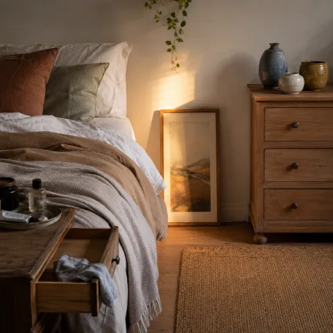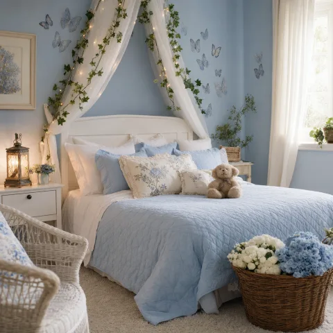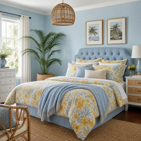
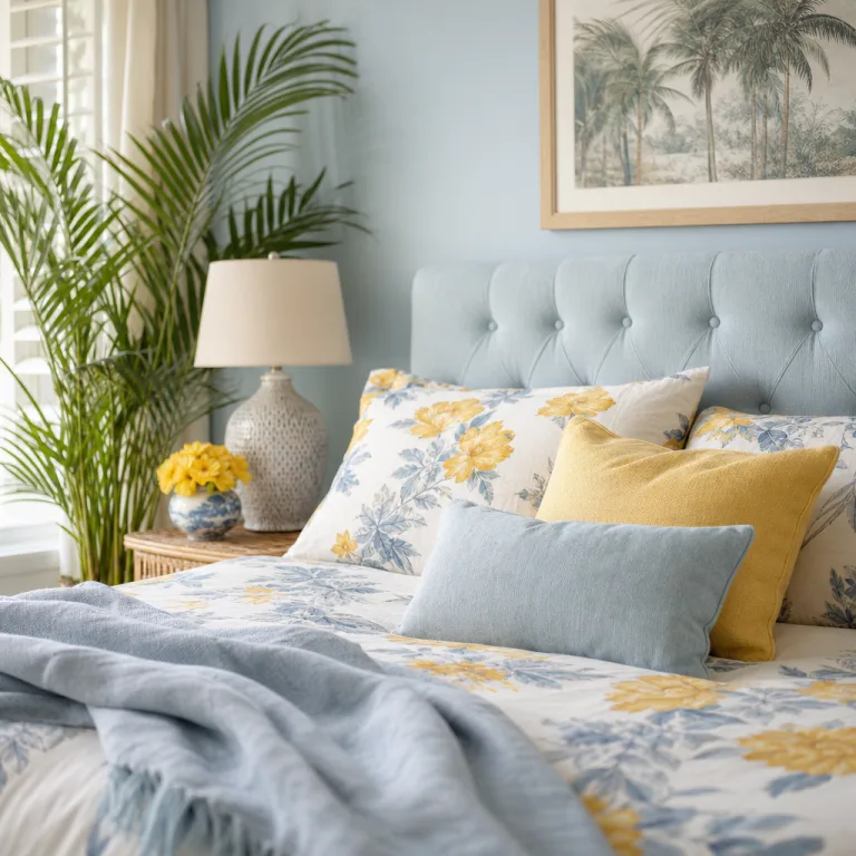
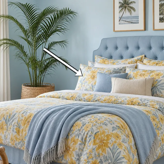
We arrived to document a coastal blue bedroom where palm-print linen anchors the mood and a calm light softens every edge, inviting slow mornings and longer evenings without hurry. The room sits at the end of a corridor, its casement window facing east and catching a reed of morning sun that we measured against the wall colours. Materials were carefully chosen for maintenance and touch, with a flax linen that breathes, a solid oak bed frame, and fixtures in muted brass. Every detail spoke of patience and restraint, from the rug that gently cushions footsteps to the curtains that billow with a quiet sea breeze. We moved around the space with the rhythm of a small project, tracing traffic flow, testing fabric weight, and noting how light travels from dawn to late afternoon. The aim was not novelty but a room that invites lingering and slows the pace of morning routines. In the following sections, we record the choices, practicalities, and ideas readers can adapt to their own bedrooms.
Palette, light and sea clarity
Warm daylight makes the walls look almost feathered, a soft blue with a grey undertone that calms without muting the room. We tested two swatches on the largest wall and settled for an eggshell finish that catches just enough sheen to reflect afternoon light. The ceiling remained white to preserve height and airiness, while the dark timber floor grounds the scheme. The bed and window frame sit on the same axis, which helps the eye travel naturally from sea to surface. We appreciated how the colour looked in the early sun and again in the late light when the blue seemed to deepen slightly. The result is a colour field that feels coastal but not nautical, flexible enough to pair with varied textiles.
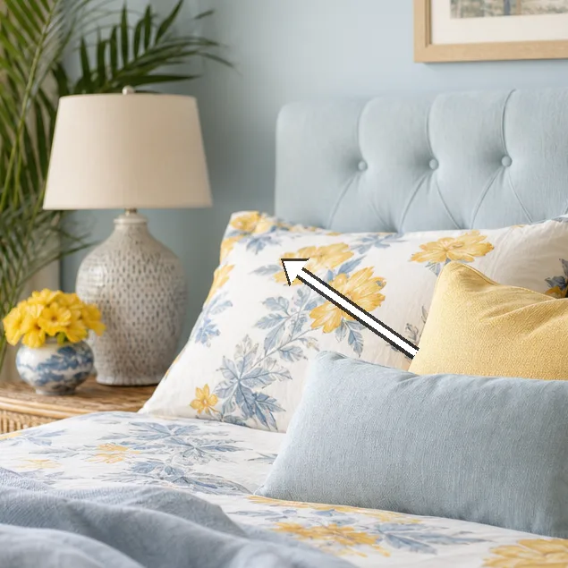
Light plays across the linen-sheathed bed and the palm-printed drape, altering the mood as hours pass. Morning brightness slides through the window and softens the palm print, turning the linen into a tactile map of shade and texture. The palm motif is kept large-scale and painterly, avoiding a busy look by pairing with a single solid backdrop. The linen has a natural variation in warp and weft that adds character rather than noise. We noted how the drape tucks behind the curtain rail when open, creating a gentle canyon of air between window and bed. The palette remains consistent, allowing cushions and throws to shift the emphasis without clashing.
Foot traffic, door swing, and the rhythm of waking hours all shape the room's efficiency. The width of the doorway dictates the legroom beside the bed and how easily a person can reach the wardrobe. Attention to the geometry of space matters as much as colour. The bed is offset from the wall to allow a clear path from door to window without interrupting the chair's corner. Nightstands on either side balance the visual weight of the linen and hold a pair of warm brass lamps. The floor's oak boards run lengthwise to lengthen the room, while a low-pile rug anchors the feet. We resisted adding extra furniture that would interrupt flow, and the result feels unforced and calm.
Palm-Print Linen: texture and practicality
 Save
Save
Palm-print linen acts as the room's heartbeat: breathable, cool in summer, warm to the touch in winter. The print is large-scale and graphic but softened by the linen's natural slubs and the fabric's drape. We tested washing twice at 40 degrees to gauge shrinkage and colourfastness, noting only a slight tolerance in the print. The weave breathes with the room's humidity, contributing to a sense of air rather than weight. It pairs best with solid groundwork—powdery blues, pale stone, or oat-colour textiles—so the palm never dominates. Maintenance is straightforward: air-dry, iron on a low setting, and fold away when not in use to preserve the print's fidelity.
Layering textiles for comfort and cohesion. Layering is deliberate rather than decorative. We balanced the palm print with a duvet cover in a lighter shade of blue and a throw in a sandy oatmeal that picks up the warm thread in the linen. The pillow mix included two plain cotton covers and two textured linen shams to give depth without creating visual noise. We tested a wool felt underlay under the rug to dampen footsteps and improve warmth. The approach is practical: keep the textures tactile, the colours restrained, and the room instantly comfortable.
Care and durability are part of the equation. Linen prints can soften with use, but repeat washing requires attention to label care and gentle detergents. We tested a mild spray stain remover on a corner of the duvet cover and found no colour bleed after drying. The pattern remained crisp, though the print slightly softened at the edges after multiple cycles. We recommend rotating textiles seasonally so that each piece wears evenly. In short, palm-print linen stays elegant if treated with patience.
Bedroom layout and circulation
Placement of the bed governs the room's dialogue and its ease of use. We positioned the bed along the longer wall to align the eye with the window, creating a sense of horizon at bedtime. The nightstands provide symmetry and function, with lamps that offer low, warm light for reading. A slender woven rug runs under the foot of the bed, guiding feet toward the doorway without interrupting the door swing. Circulation remains clear from wall to wardrobe, allowing a soft, quiet flow through the space. The result is restful, with enough space to sit up and breathe before sleep.
Scale of furniture must respond to room size and ceiling height. We avoided oversized pieces that crowd the bed and chose a low, unobtrusive headboard to preserve airiness. A compact chest of drawers doubles as a bedside surface and reduces visual clutter. The rug chosen sits just beneath the bed, extending into the walking zone to define the sleeping area without breaking the line of sight. Lighting is positioned to skim along the texture of linen, creating depth rather than glare. The overall proportion feels calm and sustained through daily use.
 Save
Save
Storage strategies. We integrated storage into the wardrobe and under-bed options to reduce visible clutter. We opted for a tall wardrobe with a soft-close mechanism and a single line of brass handles to echo the lamp fixtures. A shallow bench at the foot of the bed offers a resting place for fabrics and a surface for folding garments. We also considered hidden storage for seasonal textiles, keeping the room uncluttered while preserving the palm print's integrity. The arrangement prioritises accessibility, so morning routines remain predictable.
Storage, finishes and coastal wear
Finishes nod to the coastal palette with brushed brass, soft ash tones, and a satin, low-sheen paint on trim. The hardware on the wardrobe has a rounded profile that catches the light without shouting; it reads as practical rather than decorative. The bed frame's oak shows a subtle grain that improves with patina, evoking driftwood aged by salt air. We kept finishes durable and easy to clean, prioritising longevity over trend.
Durability matters in a space exposed to humidity and sunshine, so we tested fabric behaviour near the window. The linen remains breathable and cool to touch, with only minor wrinkling that adds to its lived-in charm. The seagrass rug underfoot offers resilience and warmth without absorbing moisture. We avoided glossy surfaces that would reflect glare, preferring matte textures that soften the sea light. The combination of oak, linen, and fabric prints creates a tactile harmony that ages gracefully.
Maintenance and coastal reality. Salt air and humidity can affect metal and wood, so we noted maintenance steps. Wipe down brass with a dry cloth to avoid tarnish and check door hardware for squeaks seasonally. The linen care routine remains simple: wash, air-dry, and iron lightly if needed to restore crisp lines. With regular care, the room's palette stays honest and the palm print remains a lasting character.
Final touches and daily rituals
 Save
Save
Art choices lean to horizon lines: a single coastal photograph, a small mirror to bounce light, and a few shells displayed sparingly. We selected fabrics and objects that encourage daily rituals—a warm lamp for late reading, a tray for a mug, a plant to refresh the air. The cushions are arranged to invite a long, relaxed sit, not a stiff pose. The overall arrangement is intentionally quiet, allowing rumination rather than distraction before sleep.
Lighting strategy includes a warm amber bulb at night and daylight-responsive options during the day. Statement pieces remain minimal to keep the palm motif legible. We also used a simple timer to shift lighting gently as the room's light changes. Ultimately, every element supports calm routine rather than drama. The effect is a room that ages with you without shouting about it.
Daily rituals and usage patterns. We observed how the space performs during a weekday morning and a weekend evening. The bed remains the focal point without dominating, allowing attention to linger on textiles and light. A simple routine emerges: lay out the cushion stack, draw the curtains, sip a tea, and prepare for rest. In this room, time slows and decisions about textiles and finishes feel more deliberate. That slowness is the intent we set out to document.
“The blue feels like sea air stitched into linen.” — Mira
- Limit patterns to two in one room to maintain calm.
- Keep linen dominant and let prints breathe.
- Choose lighting with warm, adjustable tones.
- Test daylight in both morning and late afternoon.
- Store textiles out of sight when not in use to reduce visual clutter.
How to do it
Step 1
Survey daylight and measure the space, noting window height, bed width, and clearance to the door, so palette and layout can respond to actual light and movement.
Step 2
Test textiles by draping fabric swatches over the bed and chair to observe how the palm-print linen interacts with light at different times of day.
Step 3
Place key furnishings, then adjust their positions to optimise flow, accessibility, and the eye's resting point.
Step 4
Apply finishing touches, assess maintenance, and document care routines to ensure long-term calm rather than trend-driven changes.
Common mistakes to avoid
Too many patterns
Too many patterns clash when a palm print is paired with other busy motifs. The remedy is to pick one dominant motif and two supporting textures, then let light and space do the rest.
Over-wrapping windows with heavy cloth
Heavy drapery blocks daylight and dampens sea breeze, shrinking the room's perceived size. Use lighter fabrics and keep ease of access to air to preserve mood.
Ignoring traffic flow
Furnishings placed without regard for movement create pinch points during mornings and evenings. Test the space by walking the route and reconfiguring for smooth circulation before finalising.
Frequently asked
What makes this coastal look calm rather than clinical?
How does palm-print linen pair with blue walls?
What rug size works best under the bed?
How should lighting be layered in this room?
What maintenance does linen require?
Can this look work in smaller rooms?
Which materials age well in coastal climates?
How do you avoid visual clutter?
In closing
This field visit reinforces that restraint is not a sacrifice but a design decision. The palm-print linen provides texture and warmth without shouting, while the coastal blue offers horizon and calm. Light becomes the silent partner, shaping mood as it travels through the room. With careful layering of finishes and deliberate furniture placement, the space ages with grace rather than collapsing into trend. We leave with a plan readers can adapt—keep it simple, let air rule, and design for lingering rather than viewing.