Upon entering the room, we close the door with a soft hush and let the atmosphere unfold. The bed is the room’s anchor, dressed in chalk-white cotton with a ribbon of pale pink along the edge. On the pillow, a cluster of dried rose petals presses into the fabric, releasing a faint sweetness that lingers. Across the alcove, a line of helium balloons floats at different heights, their messages written in a script that feels personal and intimate. A string of warm LEDs threads along a mantelpiece, casting a gentle golden wash that softens the room’s angles. The air carries a hint of vanilla and a trace of rain from outside, which makes the theme feel seasonal rather than contrived. We walk slowly, taking notes on how these elements interact when the space is not merely staged but inhabited. Our aim is to separate the poetry of the look from the discipline of living, so readers can recreate it without sacrificing practicality.
A palette of blush and soft daylight
Blush tones anchor the room without shouting, supported by a whisper of warm daylight. We note how the base bed linens pick up a soft pink from the rose-petal heart, while the walls remain creamy and quiet. Contrast comes from wood tones in the furniture, which stabilise the blush without competing with it. The result is a calm field of colour that invites rest rather than drama. Textiles in satin and linen catch the light differently, creating micro-shifts as we move across the room. The overall palette feels deliberate, not incidental, and it supports the room’s slower tempo. Our hands trace the fabric to understand how tactile pull and visual calm work together. Our assessment becomes a guide for readers who want similar serenity without sacrificing character.
Texture and form shape the experience, preventing a tentative theme from tipping into clichés. We touch the fabrics with our hands: the crisp duvet, the smooth pillowcases, and the softly napped throw at the foot of the bed. The tactile mix reads as deliberate rather than accidental, inviting contact and rest. Surfaces carry just enough sheen to reflect the lamp, while matt finishes hold the room steady. We notice how colour and texture combine to deepen the sense of calm, even when the heart motif edges closer to the centre of attention. The result is a room that feels curated and comfortable at once. The careful positioning of the heart keeps the romance legible without dominating the scene. Readers can feel the intention behind every stitch and seam.
Lighting is the quiet conductor of the scene, not its loudest note. The warm LEDs on the mantel blend with the daylight that slips through a sheer curtain, so the room feels cosy at all times. We measure the glow by eye rather than by a dimmer setting, noting how brightness changes with the time of day. In the corners, small lamps on stands offer pockets of intimacy without creating glare. The balloons themselves catch reflections from the glass, throwing soft pink highlights onto the bed. This is where restraint proves useful: too much brightness would flatten the romance. Our approach is to observe the glow as a texture rather than a feature, so it remains in service to mood. The result is a room that breathes with you.
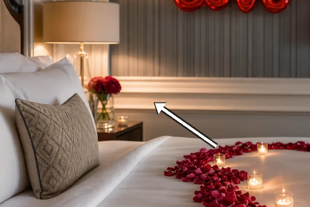
The rose-petal feature wall
 Save
Save
On one wall, a trail of rose petals mapped in an abstract heart forms the room’s focal point. The petals are real in places where the light catches them and synthetic in others, creating a textural patchwork. We observe the heart framed by a narrow strip of wallpaper with a faint metallic sheen to give depth. The effect is decorative but not jokey; the petals read as a gentle cue rather than a loud declaration. We test scale by stepping back and then leaning in close, noting how the heart reads from different distances. The result is romance with restraint, a technique we can recommend. The wall becomes a quiet artwork that invites touch and quiet admiration.
Texture contrast matters: real petals would wilt, but dried alternatives stay crisp for weeks. We encourage a mix of organic shapes and a controlled layout to avoid a chaotic bloom pattern. A matte paint behind the heart helps the petals stand out without introducing glare. The edges are crisp, the centre soft, and that balance anchors the space. We consider maintenance: how to refresh the look after a week or two without full renewal. The wall feels both romantic and durable, a usable feature rather than a one-off flourish. It remains practical for ongoing care and long-term style.
Discreet fragrance completes the moment without overwhelming the senses. We positioned a small diffuser near the door to distribute scent without concentrating it on the bed linen. The petals themselves carry a light aroma that lingers as a distant memory of the moment. We remind readers to check for allergies and to avoid open flames around decor. The heart remains the artwork, while scent performs the memory function. The outcome is a wall that explains romance with quiet, legible lines. It becomes a ritualised backdrop rather than a temporary flourish.
“The room breathes softly, as if love could settle into the carpet.” — Mira
Floating words, anchored hearts
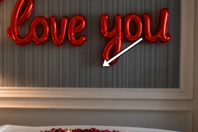
Helium balloons drift above the bed, each bearing a handwritten message in delicate script. We photograph their movement at different angles to understand how weight and gravity affect perception. The balloons soften any hard edge and give the ceiling a sense of airiness. We note the strings are gathered loosely rather than taut, so the space feels relaxed. Even when the room is still, the balloons imply motion and intention. We test different heights to balance the vertical line of the headboard with the floating shapes.
 Save
Save
Balloon colour should echo textiles rather than compete with them, we decide after a quick test. We choose pale pink or champagne to mirror the bed linen and cushion tones. The effect is a cohesive rhythm rather than a collage of primary colours. We test different heights to balance the vertical line of the headboard with the floating shapes. The couple represented by the phrase on the balloons reads as part of a personal ritual rather than a commercial gimmick. The lesson: balloon decor works best when it feels personal and tempered. It stays intimate and readable from all angles.
Message legibility matters as much as aesthetics; we avoid dense script that becomes unreadable from the doorway. The phrase I love you is kept simple and clear, chosen to age well with the room. The balance between tenderness and decor is delicate, and we notice how the script colour harmonises with the rose tones. We consider how messages translate into memory years later and whether they still feel intimate when viewed from different angles. We finish with a reminder to ensure the balloons are anchored safely and disposed of responsibly. The balloons read as a soft, personal vow rather than a commercial flourish. It is a quiet, lasting memory in a busy home.
- Balance colour, texture and scale for calm romance.
- Let one rose shade dominate across textiles and lighting.
- Echo personal handwriting in balloons without clutter.
- Treat maintenance as part of the mood, not a chore.
- Keep safety and disposal in mind for long-term use.
Textiles that whisper
Textiles are the quiet engine of comfort, even when the decorative notes are bold. We begin with the duvet cover, in a crisp cotton blend that holds shape and creases with a gentle charm. The pillows mix firmness with plushness, so the bed reads as a welcoming place rather than a display. A throw cushions the foot of the bed with a tactile counterpoint, adding warmth to the rose-petal focus. We find that the tactile variety supports the room's romantic aim without creating visual noise.
Layering textiles creates depth that photographs well and feels convincing in person. We compare satin, linen, and knit textures to assess bounce and drape under the bedside lamp. The colour interplays are subtle: a single shade echoed in multiple fabrics creates cohesion. We test the pillow arrangement to find a balance between neatness and lived-in charm. The result feels curated yet not contrived, perfect for slow evenings.
 Save
Save
Care remains practical: washing cycles, fabric finishes, and potential staining from rose petals must be planned for. We note the duvet's ability to respond to a light iron or steam for a restful surface each night. The textiles' longevity supports a long-term romance with the space rather than a one-week mood board. We discuss budget-friendly swaps that preserve the overall feel. The section ends with an emphasis on regular refresh to keep the mood alive.
- Balance colour, texture and scale for calm romance.
- Let one rose shade dominate across textiles and lighting.
- Echo personal handwriting in balloons without clutter.
- Treat maintenance as part of the mood, not a chore.
- Keep safety and disposal in mind for long-term use.
A slow-day routine within a rose-lit room
This final section focuses on daily rituals that suit the look rather than merely admiring it. We describe a morning routine of soft lighting, a hot cup of tea, and a window view that opens onto greenery. The bed becomes a stage for small self-care actions—changing into something comfortable, folding laundry slowly, reading a few pages. We highlight the way the decor supports a slower pace, not a rushed morning. The heart-shaped feature acts as a warm reminder to linger before the day begins.
Evening rituals grow out of light and scent: a diffuser with lavender, a candle that burns with a careful flame. The room invites quiet conversation between partners, a ritual of notes and shared plans. We outline a five-minute reset: dim lights, stack cushions, smooth the duvet, and press a kiss into the pillow. The rose-petal heart stays present but unprovoked, a soft punctuation to the day. The design then becomes a living backdrop for connection rather than a static scene.
Maintenance is part of the romance: scheduling refreshes of the petals, checking the battery life of the lights, and retying any loose elements. We suggest a monthly minor refresh that keeps the space feeling current without losing its identity. The depth of care makes the room resilient, capable of hosting spontaneous conversations or quiet reflection. In our notes, the romance remains anchored by texture, light, and a gentle palette. The section closes with a sense of time slowing, exactly as intended.
How to do it
Step 1
Survey the space, clear a path, and decide where the heart will live on the wall.
Step 2
Draft a quick layout on the bed or floor to check scale with a tape measure and compare visual weight.
Step 3
Install the rose heart, thread the lighting, and secure the balloons, then adjust heights, tension, and alignment until the composition feels stable from multiple viewing points.
Step 4
Live with the scene for a day or two, observe how it changes with daylight and weather, then refine textures, light levels, and balance to preserve calm while inviting use.
Common mistakes to avoid
Overcrowding the bed with props
Overloading the bed with multiple large pieces makes the focal point lose presence. When every surface competes for attention, the heart motif becomes a backdrop rather than a hero. We observed mirrored patterns in too many colours and textures and the result felt busy instead of intimate.
Ignoring natural light
Artificial glow cannot replace daylight. We saw that relying solely on lamps creates a theatre look rather than a room to rest. The lesson is to balance fake light with the outside world.
Weak focal point
When the heart or balloon line is faint or misplaced, the romance evaporates from the room. Scale and alignment matter; a slightly skewed heart can look accidental rather than intentional. We recommend a clear anchor and consistent margins.
Frequently asked
Who is this look best suited for?
What elements are essential vs optional?
How can I reproduce this on a budget?
How long does the look last without refreshing?
How should I maintain safety with balloons?
What scents work best with this look?
What if I don’t want real petals?
How do I measure success of the design?
In closing
Looking back, the room suggests that romance does not demand grand gestures but a series of small, thoughtful choices. The rose-petal heart holds its place as quiet poetry, and the balloons punctuate the air without shouting. In practice, this look rewards patience, care, and regular refresh rather than a single weekend makeover. If we were to live with it another month, we would notice subtler shifts in scent memory and texture warmth, reminding us that slow design is a living process.