We approach this room as a study in quiet and restraint. The lavender-dominated palette is deliberately gentle, designed to invite rest rather than visual celebration. We observe how white walls and pale textiles act as a canvas, allowing texture to speak with subtlety. Our notes focus on how daylight interacts with the fabrics and furniture in the early, middle and late hours. Our goal is not to create a 'look' but to cultivate a space that supports slow mornings and slow evenings. Throughout, we test small shifts and observe how minor changes yield meaningful shifts in mood. Each detail is measured against comfort and function.
Soft daylight as the quiet architect
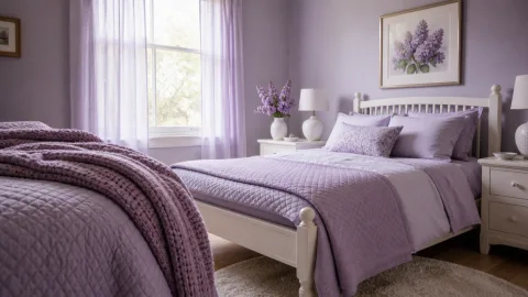
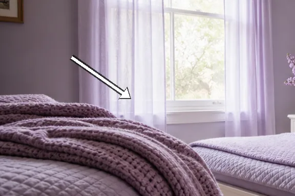
We step into the room before the day fully arrives, letting the pale lavender surface of the duvet absorb the light rather than glare at it. The walls remain bright white, a clean canvas that makes the lilac textiles feel intentional rather than decorative. The window is dressed with a sheer curtain that softly smooths the daylight into the space, creating a constant glaze across the bed and dresser. We note the absence of busy patterns, favouring quiet shapes and honest materials that invite touch. The mood feels deliberate, as if the room has been staged for calm rather than show.
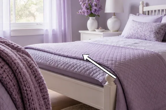
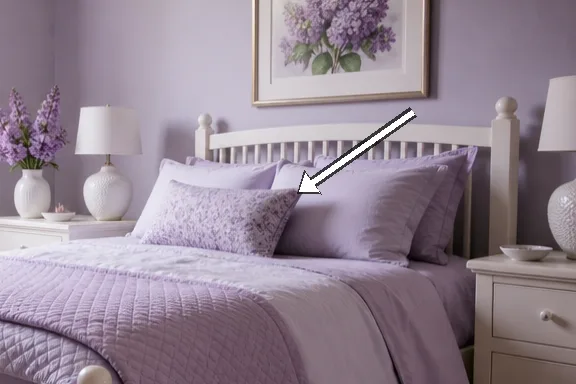
Along the far wall, a simple solid-wood bed frame sits low to the floor, its oak tone warming the cool whiteness around it. The duvet cover, a cool lilac, falls in soft folds and catches the light without appearing loud. On either side, small bedside tables rise gently, their surfaces kept clear to reflect the daylight rather than compete with it. The textiles stay close to the bed: a velvet cushion in a slightly deeper iris and a wool throw that has a muted sheen. We appreciate the restraint that keeps the room feeling expansive rather than crowded.
Perspex and ceramic accents act as quiet punctuation marks: a lamp with a linen shade casts a warm halo at dusk, and a white ceramic vase holds a single steam of lavender sprigs. The curtains, sheer and pale, diffuse the sun so it becomes a soft, even glow across the linen. We test the balance by moving a chair slightly to catch a slant of light, discovering that the room gains depth without losing airiness. The result is a space where the eye moves gently from bed to window to dresser without forced focal points. We recognise that every small adjustment can shift the perceived scale, which makes the act of decorating feel more like listening than arranging.
The lavender palette in practice
 Save
Save
The predominant lavender is muted with blue undertones, chosen for its capacity to recede rather than compete with white. We observe how the lilac textiles do most of the talking: a duvet, a couple of cushions, a light throw. The wall colour remains white, an intentional backdrop that makes every lavender detail feel refreshed and clean. We test small colour notes in an off-white rug, a porcelain vase, and a timber bed frame; these keep the scheme grounded. The rhythm of the palette is slow, with no jagged transitions, allowing the eye to glide from surface to surface.
Texture enters through fabric and fibre rather than via bold hue. The linen duvet is cool to touch, the cotton curtains have that delicate drape, and the velvet cushions catch a second glint of daylight. White surfaces reflect light back into the room, while the lilac textiles add depth and warmth. We pay attention to the cotton thread count and to how the weave catches the light differently on cloudier days. The effect is a soft, layered harmony that does not shout, but invites closer look.
We consider the costs of achieving this look: the balance between high-quality textiles and affordable basics. The duvet is mid-range, the curtains are inexpensive but well cut, and the wooden bed is a solid investment that pays back in daily ease. We prefer to swap expensive throws for simpler, better-fitting textiles that can be layered. The aim is to create the sensation of luxury without ostentation, a quiet room you notice only by how it makes you breathe. The approach remains practical, with room for adjustments as seasons shift.
Lilac textiles and tactile warmth
Textiles drive the room's comfort more than architectural features. The lilac cushions vary in satin, velvet and woven cotton, creating a tactile map across the bed. We test drape and fold to see how light plays with texture, noting how a wool throw softens a cold evening. The bed linen pile looks inviting but not congested, a balance achieved by deliberate scale and spacing. In short, textiles are the room's warmth, not its loudest colour.
 Save
Save
Throw placement matters; a single larger cushion anchors two smaller ones, avoiding a busy surface. The velvet shard catches the light in a way that the linen does not, adding subtle sheen without glare. We compare the feel of a brushed cotton against a silk-sateen blend and decide to keep both, but in measured quantities. A lavender-scented sachet on the wardrobe door adds a moment of aroma without occupying visible space. The overall effect remains intimate and quietly luxurious.
We keep white to the primary furniture and pick lilac accents to punctuate corners: a small rug by the bed, a framed textile print, and the cushions themselves. The lighting in this room changes with the sun; the textiles respond with slightly different tonal shifts as the day wears on. We notice the edges of the curtains blur softly when the sun is low, which enhances the sense of calm rather than sharp contrast. The result is a quiet, tactile chorus that invites touch and slow contemplation. We end this section with an observation: texture is a language, not merely decoration.
“A calm room invites slower mornings and deeper breaths.” — Mira
White furnishings as a stage
White furnishings act as a stage for the lilac and the daylight to perform. A dresser with a slim profile keeps lines clean while reflecting the soft glow across the room. The mirror is kept small and borderless to avoid doubling the visual weight, letting light bounce instead of multiply. We test a ceramic vase on the surface to remind the eye that whiteness has warmth if handled correctly. The room feels taller because the white planes meet the floor and ceiling with deliberate alignment.
Storage is concealed in shallow drawers that keep the surface uncluttered, a principle we apply to keep the space breathable. We avoid busy cupboards that would compete with the bed and its lilac companions. The lighting plan relies on a single warm-glow lamp at night, its shade overstated slightly to prevent glare. White surfaces reflect the daylight as if the room were a small, closed courtyard. The overall effect is calm geometry rather than decorative excess.
 Save
Save
Texture and warmth are allowed via materials rather than colour; we surface-clip soft textiles to the edges of white furniture to create tactile corners. We dust and polish with light oils to keep the whiteness pristine and honest. The visual weight of white is not overwhelming because the lilac textiles intrude only as needed. We end this section with a reminder: white is a supportive stage, not a protagonist. The careful balance between sheen and matte finishes helps the room breathe.
- Limit colour to one dominant lavender hue
- Choose textiles with varying textures
- Let daylight do most of the visual work
- Keep surfaces clear and well-organised
- Use warm wood and ceramic accents to add warmth
Layout for slow mornings
This final section considers how the layout supports slow mornings and restful nights. The bed remains the central anchor, positioned to catch the window light without creating glare on the white dresser. We test the path flow from door to bed to closet, ensuring movement stays unblocked by furniture. Small mismatches in distance are corrected by sliding a stool or adjusting the rug's edge to guide the eye. The aim is an interior that invites calm decisions rather than hurried actions.
Seating choices are kept spare; a single armchair sits by the window, offering a place to pause with a book or a cup of tea. The chair's fabric echoes the lilac found on the bed, tying the space together without repetition. We cover the cushion with a light throw on cooler days to preserve warmth. The light, even and soft, makes morning routines feel shorter and longer at once. We notice how little changes to the seating angle can reshape the perceived space.
Finally, maintenance and care are part of the design: the room rewards minute adjustments over bold rearrangements. We note how easy it is to refresh the look with a simple swap of textiles or a dip in the curtain fold. The lavender theme should be re-easy to live with, not a hard-won installation. In time, this space becomes a climate of rest rather than a gallery of ideas. Our closing observation is that slow-living interiors are built on patience, not on trend.
How to do it
Assess the light
Observe daylight hours to understand how the lavender reads at different times; note how the white surfaces rebound light.
Test textiles
Experiment with textile textures and densities; swap cushions to see how mood shifts with touch and sheen.
Check spacing
Walk the room several times to ensure pathways remain unblocked and the bed remains the visual anchor.
Refine palette
Tighten shades of lilac and white, ensuring one dominant hue and a few supporting tones.
Common mistakes to avoid
Overloading the palette
Avoid layering too many lilac tones; the room loses its calm. Instead select one dominant lavender and pair it with white and a single neutral accent to retain airiness.
Ignoring daylight angles
If curtains are drawn too tightly, daylight becomes flat instead of a soft wash. We tested gently diffused curtains to preserve the glow.
Forgetting texture
A white room can feel cold if textures are absent. We included textiles, wood, and ceramic to create warmth and tactile interest.
Frequently asked
What makes this lavender bedroom feel calm?
Which textiles create warmth without heaviness?
How can I adapt this look for a small room?
What about scent and atmosphere?
How to maintain the light in winter?
What role do rugs play?
Which materials age best in this palette?
Is it possible to reuse this approach elsewhere?
In closing
Today we close this field report with the realisation that slow-living design rests on restraint: daylight, texture and careful proportion, not fashion. The lavender echoes softly across lilac textiles, while white surfaces reflect calm and space. In living with this approach, the room teaches stillness and invites us to breathe more deeply, daily.