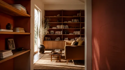
We had been considering a subtle shift that would change the study without repainting the whole room; the inside of the shelves felt like a small theatre for the books and objects we keep. Painting the interiors in a deep clay red seemed to offer warmth, depth and a new way to frame collections. We wanted the pigment to act as a backdrop that made spines and ceramics look more tactile, not to shout or dominate the room. Testing samples and working patiently allowed us to understand how the colour shifted with light and at different times of day. The project required only a few tools, a modest pot of paint and some careful preparation, yet it changed how we approach styling and maintenance. By working bay by bay and letting each coat cure, the final surface looks deliberate and calm rather than hurried. The shelves now feel like intentional spaces rather than mere storage.
Why we chose a clay red
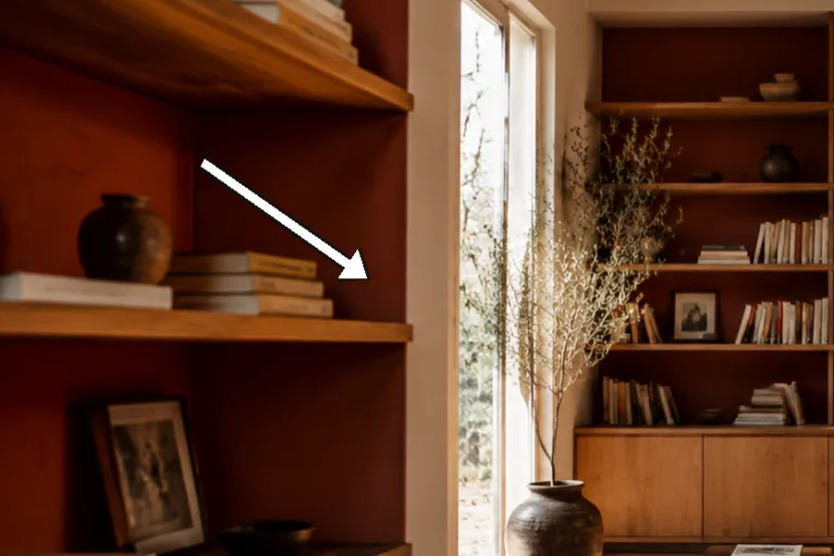
We wanted a tone that would sit behind books and small objects without competing for attention; clay red gives warmth and depth without the brightness of vermilion or the heaviness of chocolate brown. In our north-facing study the pigment reads mineral and muted rather than overly saturated, and that quality suits the linen, oak and grey-blue fabrics that surround the shelves. We made sample swatches on card and on the shelf panels themselves because the underlying material and the light alter the hue noticeably. Three small tests over two days were enough to confirm a favourite that neither skewed orange nor looked too purple in artificial light. The chosen tone feels like an anchora grounding backdrop for things rather than a colour that demands to be the rooms focus.
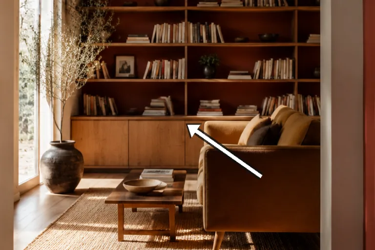
A clay red also enhances other hues: cool blues calm down, creams gain warmth and brass takes on a softer glow. Because the interior is a contained area it allows us to be bolder than we might be on a whole wall, while still keeping overall harmony in the room. The colour helps reduce glare from glossy spines and makes matte covers and ceramics appear more sculptural. We liked that the pigment would age with use; small signs of wear seem to sit naturally within the deep tone rather than appearing as damage.
We also considered psychological effects: warm, earthy tones encourage lingering and contemplation, qualities we want in a reading corner. Choosing clay red felt like inviting a different tempo to the room, one that supports slow rituals of selection and care. Finally, the colour aligns with the houses broader palette so the shelves feel integrated rather than fussy, and the modest change consumes little material while giving a sustained visual return.
Preparing the shelves properly
 Save
Save
Preparation is the backbone of any tidy paint job; for us that began with removing everything, making an inventory and vacuuming the bays to clear dust and crumbs. Any glossy or sealed areas were gently sanded with 120150 grit to give the paint tooth and to avoid peeling later. Small holes from previous fixings were filled with a water-based filler, left to dry and then sanded smooth so the finish reads uniformly. We also worked out the sequencing so we could paint from top to bottom, preventing wet panels from being accidentally smeared when cleaning lower bays.
Masking is a small labour that pays off: painters tape applied carefully along trim and adjacent walls produced crisp edges and saved time on corrections. We protected the floor and nearby furniture with dust sheets and secured the tape against seepage. For tight mouldings we used the sash brush for cutting-in and taped closely to avoid paint on the face of the shelf. Removing tape too early or too late can cause ragged edges, so we generally peel it once the paint is set but still slightly pliable to preserve a clean line.
Climate and ventilation matter; we painted in dry conditions around 15 20C with a window open a little to help solvents evaporate without creating a strong draught. We kept a damp cloth and a jar of water close to the work so that small mistakes could be wiped while the paint was still wet. Planning such small comforts good lighting, a stool at the right height and frequent short breaks makes the process less fatiguing and improves accuracy when cutting-in corners. Taking time in preparation reduced anxiety during painting and produced a more considered result.
Choosing paint and sampling colours
We bought several small sample pots and painted them on card and on spare shelf panels because the same pigment reads differently on different substrates. Observing the samples over morning and evening light revealed shifts that made the difference between a tone that felt warm and one that felt muddy. We sought a clay that leaned mineral rather than bright, and we were cautious about undertones that could push too orange under lamplight. Choosing a matt emulsion helped the pigment appear dense and tactile rather than glossy; for a frequently used shelf an eggshell would be more durable but would also reflect more light.
 Save
Save
Using a tinted primer can reduce the number of topcoats when moving from light to dark, but we instead applied a thin first coat of the chosen colour as a sealer because our shelves were already pale and well prepared. This approach minimised visible undercoats and allows the final colour to build depth progressively. We settled on a mid-range durable emulsion rather than the cheapest option because it offered better pigmentation and coverage, which meant fewer coats overall. Keeping a small sealed pot for later touch-ups is a practical habit we now always follow.
Budget and sustainability also influenced our choice: buying what we needed, using every drop and storing leftovers responsibly fits our slow-living ethos. The cost for our four bays came in modestly; careful measuring prevented waste and gave us just enough to touch up in the future. Colour sampling might feel like an extra step, but it prevented the much larger waste of repainting an entire unit if the first choice failed in situ. In short, invest time in sampling and a little more in a decent product and you save labour and frustration later.
“The clay red hums quietly behind our books and objects, changing how light behaves.” — Mira
The painting process, step by step
We start each bay by cutting in the corners and trim with a 25mm sash brush using short controlled strokes, taking care not to overload the brush to avoid drips. After precise cutting-in we roll the flat panels with a 10cm foam roller, which gives a smooth, even surface free of visible stipple. Keeping coats thin is essential: heavy application sags and takes longer to dry, so we prefer two thin coats to one heavy one. Work in sequence from top shelf to bottom so any accidental runs are caught and smoothed as you progress rather than becoming baked into a finished surface.
For joints where shelves meet vertical panels we follow the cut-in with the brush and then blend into the panel with the roller, feathering strokes so brush marks dissolve into the rolled surface. If small drips occur we wipe them immediately and smooth with a brush tip before they skin over. Shelf pins should be removed and painted separately or replaced after drying to avoid trapping moisture and to prevent rust marks. We also leave the front trim unpainted as a deliberate contrast against the clay interior to avoid a boxed-in effect in narrow bays.
 Save
Save
Drying times depend on temperature and humidity, so we always allow at least 24 hours between coats and prefer to wait 48 hours before reloading shelves to ensure the film has cured sufficiently. Removing tape at a shallow angle while the paint is still a little pliable preserves a crisp edge; if the paint has fully cured, score the tape edge first with a blade to avoid lifting flakes. Clean brushes and rollers promptly with water and store leftover paint sealed for touch-ups: a little care in this final stage extends the finishs life and keeps the result looking considered.
- Test samples on shelf panels, not just card.
- Sand glossy surfaces and clean with a tack cloth before painting.
- Cut in with a sash brush then roll flat panels thinly.
- Wait 24 hours between coats and 48 hours before reloading.
- Keep a small sealed pot for future touch-ups.
Styling the shelves after painting
Once the paint was cured we approached styling slowly, treating each bay as a small composition rather than a place to store everything. We distributed pale ceramics and cream-bound books across bays to balance the dark background and left negative space so the clay tone reads as part of the design. Groupings of three and a mix of vertical and horizontal stacks create rhythm and avoid visual monotony; small objects placed on stacks of two books add height variation without obscuring the backdrop. We also moved a few items to other rooms when they clashed with the new tone, choosing instead items that harmonise with the earthy pigment.
The painted interior made us more aware of texture: matte covers, linen spines and small ceramic glazes respond differently against the clay, so we used that to curate tactile contrasts. Brass and warm metals warmed further, while glass and white ceramics offered crisp punctuation. We recommend styling with patience: place items, live with them for a day, then adjust; sometimes a composition reads very differently in lamplight than in daylight. The shelves have become an invitation to slow rotation rather than a static archive.
Maintenance is straightforward: a soft duster, occasional very fine sanding for scuffs and precise touch-ups with leftover paint keep the finish fresh. Avoid abrasive cleaners which can flatten the matt surface and cause patchiness; for stubborn marks a spot sand and repaint restores uniformity with minimal fuss. Over time small signs of use will appear, and we accept those as part of the surfaces life rather than flaws to hide. The painted interiors now feel lived-in and intentional, and they subtly change how we select and care for objects each day.
How to do it
Clear and assess
Remove everything and vacuum the bays. Inspect surfaces for gloss, holes or flaking and plan any filling or sanding so you can work efficiently and avoid surprises once painting begins.
Prepare and mask
Sand glossy areas lightly with 120150 grit, wipe with a tack cloth and apply painters tape to trim edges. Protect floors with dust sheets and remove shelf pins to paint around or separately.
Paint in thin coats
Cut in edges and corners with a sash brush then roll panels with a 10cm foam roller, applying thin even coats. Wait 24 hours between coats and smooth any small drips before they skin over.
Finish and restyle
Remove tape at a shallow angle while paint is slightly pliable, wait 48 hours for full cure before reloading heavy items, then style slowly, leaving space and balancing light objects against the dark background.
Common mistakes to avoid
Skipping sanding
Not scuffing glossy or previously painted surfaces risks poor adhesion and visible brush strokes; a light sand with 120150 grit and a thorough wipe-down prevents rework.
Choosing a high shine
A gloss or high-sheen finish will reflect light and highlight imperfections, whereas matt keeps the clay tone dense and consistent across panels.
Rushing the coats
Applying another coat before the previous one has cured traps moisture and can lead to tacky or uneven areas; wait at least 24 hours between coats and 48 hours before reloading.
Frequently asked
Will a deep interior colour make the room feel smaller?
How many coats are necessary?
Can I use eggshell or satin instead of matt?
How long before I can put things back on the shelves?
Will paint smell linger?
How should I touch up scuffs later?
Is the change reversible?
What if the shelves are untreated wood?
In closing
A small weekend project produced a significant shift: the clay-red interiors framed our books and objects in a quieter, more tactile way and encouraged a slower, curated approach to styling. The work rewarded careful preparation, patient sampling and thin coats more than high cost or technical bravado. We kept the palette modest, the finish matt and the process deliberate, and the shelves now feel like an integrated part of the room rather than mere storage. The change has become part of our daily rituala small prompt to handle things with care and to enjoy a more intentional pace in how we live with objects.