The first time we tried the two‑paint test we were painting a tiny hallway that connects three rooms and collects everything the rest of the flat refuses to hold. I (Mira) brought home two half-pints of paint I liked on the card—one a warm stone, the other a green that read as almost neutral under the store’s fluorescent lights. Theo cut two sheets of A4, we slopped the paint on with a cheap chip brush, and taped the papers to the wall next to the light switch. We meant to check them an hour later and instead left them up for four days. By day two, the green looked suddenly strict; by day four, the warm stone had softened into something companionable with our scuffed floor and a thrifted rattan basket. The point is not that we ‘picked’ the obvious winner in twenty minutes. The point is that time and daily light made the decision for us in ways we hadn’t predicted.
The test in one sentence
The two‑paint test is intentionally unglamorous: paint two sheets of paper in candidate colours, tape them roughly at eye level on the actual wall you’ll be painting, and live with those patches for at least four days. That’s it. No finishing coats, no careful lighting rigs, no large sample boards. The philosophy behind the method is procedural humility — give the room time to show you how a colour behaves under the exact mix of light, reflections and objects that constitute your home. We’ve done the test in a low northern bedroom, a narrow sunlit hallway and a small kitchen, and the lesson repeated: what looks decisive in the store can look indecisive, awkward, or unexpectedly flattering in place.
There’s also a practical reason to use paper rather than primed boards or large sample pots: the smaller, less precious sample lowers your stakes. If you hate the colour after three days you haven’t committed gallons of paint or the cost of professional labour; you’ve wasted a few sheets and a small pot. The smaller scale also translates better to the human scale of a room — a colour that reads as a polite backdrop on a little patch is easier to imagine wall‑sized than one that looks vibrant and too saturated on a big hardboard sample under fluorescent store lights.
Why two, and not dozens
Two forces are at work when you stand at the paint counter: a fragile preference and a desire to ‘solve’ the room immediately. Offering two options keeps the thought process simple and forces a daily, comparative reading. If you bring ten chips home you’ll tinker endlessly; if you bring one you’ll rationalise compulsively. Two gives you enough friction to notice differences without creating paralysis. Over three room tests, we found that a head‑to‑head comparison made subtle undertones legible. It’s easier to see that one swatch reads cooler, the other slightly muddied, than to articulate the precise undertone on a lone chip.
Why paper swatches are honest
Paper absorbs paint differently than primed boards or factory‑finished sample sticks; that matters. A little tooth and variable saturation on paper allows you to see the way the paint layer behaves at close range and from a few steps back. In our bedroom experiment, one colour on a glossy sample read bright and decisive, but on paper it revealed a faint pink undertone that embarrassed itself in evening lamp light. That honesty is useful because the objective is not to show off the paint as pigment, but to reveal how it sits beside your skirting, your curtains and the day’s changing light.
Why chips lie: the psychology and physics of colour
A paint chip in a store is a tiny, idealised sample viewed under artificial light and surrounded by other chips it was chosen to flatter. We have learned to mistrust that environment. Psychologically, humans respond to novelty and contrast; a colour that reads as striking on a neutral rack becomes tired quickly when it competes with books, plants and a sofa. Physically, the colour temperature of the light in your room changes by hour and season; the same chip will lean blue under a cloudy morning and honey under late afternoon sun. Add the reflective bounce from a laminate floor or a matte charcoal sofa and the chip’s undertone is rewritten.
Undertones are the part of colour that people often miss. They are subtle — a whisper of olive in a beige, a ghost of violet in a grey — but they are decisive in small rooms. We’ve chosen paint that ‘looked like’ our old linen at the store only to find that in the hallway it read as faintly sickly because of a green undertone colliding with a houseplant’s reflected light. The two‑paint test surfaces these undertones in context; when two candidates sit side by side, the undertone that clashes becomes more obvious than when each stands alone.
How surrounding colours alter perception
A rug, a wooden floor, even a single framed print will change the way a paint reads because our eyes process colour relationally. In the kitchen experiment, the same pale grey that seemed to quiet the countertops when viewed alone suddenly made our battered birch table look toastier and more golden, which altered the room’s whole balance. Colour does not exist in isolation; it is constantly in dialogue with texture, temperature and the other pigments already present. The two‑paint test forces that dialogue on a manageable scale.
Why memory and mood mislead
A lot of complaints about paint choices start with, ‘I thought it would feel like…’ and for good reason: we often pick colours to recapture a memory or an image online. Memory simplifies light and removes the fuss of daily life. Mood, too, is fickle — a colour that cheers you in a bright mood may feel clingy on a grey day. By watching patches for multiple mornings and evenings you see which colour continues to feel like home and which one is protected by a fleeting preference. The test strips away the drama of decision‑time.
 Save
Save
How we ran the experiment in three rooms
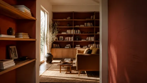
We tried the two‑paint test in three different contexts: a north‑facing bedroom that gets cool, flat light; a narrow hallway that captures the warm end of the day through a courtyard window; and a small kitchen with a single skylight and lots of reflective surfaces. Each room taught us a slightly different lesson. The bedroom’s colours needed to be fluffier and warmer to avoid feeling like hospital paint; the hallway required patience because it reads the afternoon sun like a spotlight; and the kitchen revealed how gloss and sheen on cabinetry can make a neutral feel sugary. Running the method in multiple spaces made patterns apparent and sharpened the way we talk about undertone.
In the bedroom we left swatches up for six days by accident because we were away for a weekend. The extra time matters: shadows and artificial light reveal themselves only after you’ve put down your things and resumed ordinary life. The hallway test was quick by comparison; within 48 hours one swatch had acquired an orange halo that read as ‘formal’ rather than cosy. In the kitchen, the reflective backsplash and the stainless kettle conspired to brighten the lighter swatch in some angles and wash it out in others. Each surprise helped us refine not just the colour but the finish and trim decisions that followed.
What we learned in the bedroom
The bedroom’s lesson was about scale and calm. A paint that reads pleasant on a chip can feel too bright across a whole wall when the light is cool and flat. We found ourselves dialing back saturation — not to a bland grey, but to a warmer, slightly greyed linen that makes sheets and wood grain look richer. The delay of a few mornings allowed us to notice how the colour behaved under bedside lamp light and under the pale dawn that leaks around our curtains; that combination was the final arbiter.
What the hallway taught us about mood swings
The hallway was a reminder that a single angle of sun can make or break a colour choice. We’d preferred a crisp pale on a swatch, but when the courtyard light hit that morning it gained an unexpected honey cast that made the space feel older than we wanted. Retaining the swatches for multiple afternoons showed the shift repeatedly; the second option — a dustier, cooler stone — quietly resisted the flirtation of direct sun and ultimately proved the more consistent choice through seasons.
 Save
Save
Light and time: why we wait four days
We settled on four days because it is long enough to see morning, midday and evening light fall across the sample, and short enough to keep the experiment immediate. In practice, the right amount of time depends on how much your room’s light changes. A north room with even shade can reveal undertones slowly, while a room with wide windows can show dramatic swings within a single day. Four days tends to catch at least one weekend, two different routines and enough variety in weather to make undertones legible. The accidental six‑day test in the bedroom only reinforced the point: more time rarely hurts.
Time does something else: it forces familiarity, which is a subtle form of stress‑testing. A colour that sparks a little thrill the first hour may feel theatrical the third day once you’ve walked past it with a cereal bowl or a pair of socks in hand. Conversely, a colour that felt dull at first can read unexpectedly right after you live with it and see how it plays with your favorite objects. The test privileges the durable, not the dramatic.
Practical notes on placement
Put the swatches at eye level in the area where you will notice them daily — near the door, beside a bedhead or above the kitchen counter. Avoid corners where shadows will hide undertones and don’t place them where a lamp will shine directly on them for eight hours a night. We taped ours next to existing fixtures to see the relationship to hardware and switches, and that small choice revealed whether the colour harmonised with metals and ceramics. Also note reflections: if a chrome kettle or a glossy cupboard is nearby, move a swatch a few centimetres; the difference can be telling.
How to document what you see
We made a habit of photographing the swatches at roughly the same times each day: early morning, late afternoon and after lights on. Taking notes matters too — a quick line like ‘reads green at 6pm beside plant’ is more useful than a vague impression. The photos are not for social media; they are for memory. They help you remember that the colour that felt flattering on day one faded in sympathy with your rug on day three. This record also means you can return to the same decision later without re‑measuring everything from scratch.
 Save
Save
Textures, trim and what the floor will do to your paint
We learned to consider the room’s materials as active agents in colour, not passive backdrops. A pale wall beside a honeyed oak floor will read warmer than the same wall beside a cool concrete slab. Skirting board colour and sheen are similarly persuasive: a bright white trim makes a colour pop, while an off‑white or cream softens it. In our hallway the choice to paint trim a single shade darker than the wall created a framed effect that calmed a colour that otherwise threatened to dominate the narrow space. The two‑paint test makes those relationships legible because you see swatches next to the very things the wall will coexist with.
Sheen matters more than most people expect. Flat paint hides a multitude of sins but can read dull under certain lights; eggshell bounces light and can read fresher but will show brush marks. We tested the look by adding a tiny strip of higher-sheen paint on the side of one swatch to see how it behaved near our kitchen cabinets. The result altered our finish choice: a muted eggshell on walls with satin on trims offered the easiest balance between durability and the soft ‘lift’ we wanted in daily light.
Trim colour as a design lever
Painting trim slightly darker or in a warm neutral can help ground a room, especially small ones. We tried a crisp white with one of our chosen colours and then a warmed-off cream. The cream, coincidentally, made the wall colour feel more intentional and less like a mistake. Think of trim as architectural punctuation: it can calm, emphasize, or frame colour choices without demanding a different pigment on the whole surface. The two‑paint test is good for this because you can hold small strips of trim next to the swatches to preview the conversation.
What floors tell you
Floors reflect colour more than we credit. A glossed wooden floor adds warmth and can shift a cool grey into taupe; a concrete floor keeps a palette strict and modern. In our kitchen, a pale grey swatch that felt neutral against a rug seemed cooler when set against the honey of the existing floorboards. After the test we sampled a slightly warmer grey and found it played better with both the floor and the copper pans. It’s a small tweak — a few percentage points toward warmth — but it makes the whole room feel cohesive.
 Save
Save
Small adjustments that make a chosen colour sing
Once the two‑paint test settles a choice, the real work is in modest, sensible adjustments. That usually meant tweaking tint, sheen and trim rather than switching pigments wholesale. We mixed in a touch of grey to soften one winner, added a teaspoon of warm yellow to another to stop it reading as basement-cool, and ultimately decided to use a single slightly darker tint for the skirting. These micro‑moves are inexpensive and quietly powerful. They preserve the core decision the test has given you while tuning the finish to fit your daily life.
Another small adjustment that pays off is choosing the right primer or base. If a wall has strong existing colour, the primer you choose will change the final appearance. We sometimes painted our swatches over a small area of the actual wall so the test included the base colour; other times we primed the few centimetres first to mimic what a coated wall would look like. The small additional effort avoids surprises when you paint the whole wall and keeps touch‑ups simple down the line.
A short list of low-cost tweaks
When to accept a compromise
There are moments when a colour is technically right but emotionally off; in these cases we privilege daily comfort. If a chosen paint reads correct next to the floor and trim but makes you feel slightly on edge passing the room, a small tweak toward warmth or softness is worth the compromise. Accepting a slightly less ‘perfect’ technical match for the sake of livability is not defeat; it’s tailoring a room to the people who live in it. Paint is a long conversation, not an edict.
“Colour isn’t found; it’s negotiated over days of light and habit.” — Mira Aslani
Common mistakes and how to avoid them
The biggest mistake is making a final call too soon. We’ve seen people paint an entire room midday after a shopping trip and then regret it when the evening light reveals undertones. Another error is testing on a clean, empty wall that does not reflect the room’s usual clutter. The two‑paint test deliberately introduces ordinariness; leave a plant pot, a lamp or a pile of magazines near the swatches to reproduce the lived-in balance. A third frequent mistake is ignoring finish: the same pigment in flat and satin will behave differently around light sources and dust.
People also over-correct for trends. A hue that is ‘in’ does not guarantee it will pass the test in your room. Trend-driven choices tend to be high-contrast or highly saturated and they often clash with the slow palette of vintage furniture or plants. If you’re borrowing a colour from a magazine, put it through the two‑paint ritual alongside a safer option. Often the safer option ages better.
A short shopping list for the experiment
Cost-wise the experiment is modest: a couple of sample pots will set you back a fraction of the final paint job. If you’re renting, this is the moment to test whether a shade will stand up to deposit inspections — sometimes a softer neutral reads less ‘experimental’ and negotiates better with landlord expectations. The small expense of a week’s test is insurance against repainting an entire room.
How to do it
Buy two candidate sample pots
Choose two colours you like but that feel meaningfully different in undertone; buy small sample pots rather than relying on paper swatches from the store.
Paint two A4 sheets and tape them up
Apply each colour to a full A4 sheet with a chip brush, let them dry, and tape them side by side at eye level on the actual wall you plan to paint.
Observe through different lights
Photograph and note the swatches in morning, afternoon and evening light for at least four days, making short observations about undertones and reflections.
Test finishes and trim
If one swatch wins, test a small strip of the preferred shade in different finishes (flat, eggshell) and hold a trim sample beside it before ordering full paint.
Make small adjustments
If needed, ask your paint supplier for a slight shift — a touch more grey or a touch warmer — then re-test that micro‑adjustment on a paper swatch before committing.
Frequently asked
What if both swatches look bad after four days?
Can I use adhesive-backed sample strips instead of paper?
How big should the swatches be?
Do finishes really change colour?
In closing
If there is one practical rule we’ve come to repeat, it’s this: make the room decide, not the mood you are in when you stand at a paint counter. Tape two real things to a real wall, wait longer than feels reasonable, and notice which one survives habit and bad light. This is less about finding a perfect colour and more about learning what your light and objects will tolerate. The quiet work — choosing a slightly warmer undertone, cutting the paint with a touch of grey, or accepting that the trim needs to be a shade darker — usually matters more than the splashiest decision you might make in a single, high-energy trip. Colour is stubborn; it lives with you. Treat it like a roommate you have to like for years, not a one-night stand.