We bought three tester pots on a Saturday morning and cut rectangles of cheap cardboard to tape to the kitchen wall. The wall is the only blank vertical in a 740-square-foot rental and it has become, in the way small apartments insist on doing, the place where decisions go to be made public. We taped the swatches large enough to read from the sofa: an olive that looked calm in the paint shop, a warm stone with a hint of ochre, and a dusty teal that was, briefly, very persuasive. Then we did something obvious and stubbornly old-fashioned — we sat with them. For forty-eight hours the colours lived there while we cooked, baked, and read. Sunlight walked across the swatches, the kettle steamed, and a rainy Sunday turned the room bluish and quiet. The colour that stayed was not one of the three testers. It was a small blend borrowed from each, but more important was the lesson the wall taught us: colours reveal themselves in habit, not in haste. This piece is about that patient method, the lighting trick that exposed undertones, and the brand we would buy again when the wall finally spoke back.
The wall and the weekend test
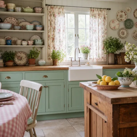
The wall is the only uninterrupted vertical in our kitchen — a fact that makes it more important than it should be. It holds the open shelf, the small clock, and the history of sticky notes. A blank wall in a small rental quickly becomes a stage: you either dress it neatly or it accumulates failed projects. We decided to treat the decision like a ritual rather than a race. On Friday evening we measured the wall, cut three cardboard panels to scale, and carried them to the paint shop where the assistant handed us three little tins without ceremony. The act of taping them on large and literal rectangles changed the stakes; for once the colour would live at human scale rather than a neat fan deck in fluorescent light.
We taped the swatches with painter’s tape at eye level, leaving the edges deliberate and slightly imperfect. Each patch covered roughly the area of a small wardrobe door, three feet wide by five feet high, so the effect would be legible from the sofa and while standing at the sink. The physicality of those rectangles matters. Colours announce themselves differently when scaled up; a hue that reads elegant on a three-inch square can be loud in a three-foot field. By the time we had tea, both of us were oddly defensive about our choices — a reminder that paint decisions tend to carry ego. The test pushed ego out of the room and replaced it with time.
Why we used large taped rectangles
Large patches show how a colour behaves with texture and light. Small circular stickers or thin strips lie to you; they don’t show how brush marks, wall imperfections, and reflected light from counters change the perception of colour. We wanted to see the paint meet grout lines, the edge of the shelf, and the shadow cast by a pendant lamp. Bigger also makes the choice communal; friends visiting that weekend could say what they saw from the sofa rather than guess. You learn more about a colour when it occupies a place — it stops being a swatch and becomes a surface that will have to live with your dishes and plants.
How the experiment forces discipline
There’s an odd clarity to committing to a weekend test: it forbids impulse repainting and forces small rituals — making coffee, opening a book — that reveal the colour’s real company. When every quick fix is banned, other things have room to breathe. We were surprised by how quickly our daily habits became the colour’s context. Where its undertone was warm, the kettle seemed to pick up a copper halo; where the hue was cool, the wood cutting board read more orange. The discipline of living with the swatches is the point; a paint decision is not a headline, it’s a companion.
Why an accent must be patient, not loud
An accent is not a billboard. In a kitchen — where light changes, smells settle, and counters accumulate objects — the job of an accent wall is to listen and harmonise rather than shout. We tend to admire confident colours in magazines, wrapped in white space and studio light, but the effect in a lived kitchen can be exhausting. A brave colour that reads as shouting in the morning becomes background noise by evening, and the brain tires of cortextures it fights. Our aim was not to choose the most interesting colour but the one that would allow our dishes, herbs, and mismatched mugs to look like themselves again.
We were less interested in a statement than in a tone that made the room feel deliberate. That means avoiding colours with strong chromatic intensity or harsh undertones that will fight every wooden shelf and brass handle. In practice it meant favouring muted depth and a soft, complex undertone — something that, when you bring a bowl of tomatoes to the counter, allows the tomatoes to glow rather than vanish. Patience in colour is a kind of generosity: a wall that steps back invites the rest of the kitchen to speak.
The difference between tone and character
Tone is about value and how dark or light a colour reads; character is the personality given by undertones — green, red, blue, or grey. In a small kitchen the balance between tone and character matters more than spectacle. A mid-tone with a greenish undertone might read olive in noon light and as flat gray at night; a pale warm tone can feel like sunlight even when it’s cloudy. The challenge is finding the mix that supports the room at different hours, so your collection of objects looks intentional rather than accident-prone.
Why patience beats a bold font
Bold choices age fast. They demand curation and constant attention. We wanted an accent that would collect life without demanding daily defense. During the test we noticed that the swatch we initially loved for being "distinct" made our plant leaves read flat in afternoon light. The colour that eventually won allowed the plants to be themselves: greens looked greener, not washed. Patience in colour is not timidity; it's the quiet confidence of a good frame. It supports whatever is placed in front of it and disappears when it should.
 Save
Save
The three colours we tried and why they looked promising
The first was an olive with a brownish base that the tin labelled "sapling." In the shop it read like a serious grown-up green; at home, in warm breakfast light, it felt reassuring. The second was a warm stone called "linen road" — a beige with a faint ochre note that promised to make the room feel sunnier. The third was a dusty teal, "ship’s wake," which looked melancholy but, in certain angles, very handsome. Each had a reason to be chosen: one because it would hide scuffs, one because it would make the kitchen cozier, and one because it would be different without being neon. Their case was persuasive in different lights.
We tried to be objective: the olive looked practical for a kitchen; the warm stone seemed, on paper, like an instant neutral; the dusty teal appealed to the writerly part of us that loves colour with a history. But taste does not live in a vacuum — it meets lighting, wood tones, and our small brass tap. Over the two days the teal shifted from charming to somber when the rain began; the olive took on a slate-like seriousness in lamplight; the warm stone revealed a greenish undertone at dusk that surprised us. These surprises are why living with samples matters.
What initial reviews miss
A quick glance judges a colour as if it were a garment hung under a shop light — neat and contextless. The first-hour verdict often dissolves after dinner. We learned to distrust first impressions because early judgments ignore reflected colour from countertops, the temperature of your artificial lighting, and even what’s in the sink. Our olive felt competent at midday and gloomy by candlelight. The warm stone read cheerful under the kitchen’s fluorescent repair light and oddly green under the pendant. Those reversals matter; a paint colour that contradicts itself will be a daily small irritation.
How to read a tin versus a wall
A tin in the shop sits under controlled light and sterile surrounds; your wall lives with tea stains, a blue kettle, and imperfect grout. The same pigment will behave differently when next to the warm brown of a cutting board or the cool white of a sink. That’s why we avoid relying on a single swatch. For the record: ever-so-slightly warm neutrals become warm friends in daylight, cool mid-tones reveal green or blue undertones at night, and supposedly "muted" colours can still be dramatic at scale. Test at scale and in your own objects’ company.
 Save
Save
How light told the truth
Light is the translator between pigment and perception. Over the two days we observed subtle shifts as clouds passed and bulbs warmed. The game-changer was a small trick: we switched off the main ceiling light and used only the pendant and under-shelf lamp for an hour after dinner. That dim, domestic light revealed undertones the daylight had smoothed over. The olive took on a grey edge; the warm stone revealed a faint greenish influence; the dusty teal settled into a near-gray that made our brass hardware blush. Under that lamp the wall stopped performing and simply behaved.
The evening reveal is crucial because most of our use happens then. People shop in daylight but live by lamplight. We switched on the pendant and dimmed the under-shelf LED to a warm 2700K and watched. Colours that seemed lively at noon looked tired, and those that looked difficult took on a modesty we liked. The lesson: test the colour in your night conditions. If you host dinners or sit for reading under that light, the wall should be kind under a lamp, not just in the shop’s clinical bulbs.
A small lighting trick we kept returning to
We made a point of using only our warm kitchen lamps for a full evening, no overheads, and no living-room spill light. The result was a truer sense of a colour’s nighttime personality. The simple act of moving from broad daylight to localised incandescent-style lighting is often enough to change a decision. If a paint looks harsh or muddy under that warm lamp, it will likely feel wrong most evenings. The trick is cheap and quick: live with the swatch both under your best light and your most-used lamp.
Reflections, counters and small objects matter
A wall never stands alone: the countertop reflects, the kettle shines, and plants cast green back into the paint. We noticed that our white laminate threw a cool bounce that brightened the olive in morning, while the brass tap warmed the warm stone in a way we didn’t expect. Put your pots, your favourite mug, and a plant in front of the swatch — if possible, set them where they’ll live. Those small objects are part of the test; a colour that compliments them will feel like a home-grown decision rather than a purchased statement.
 Save
Save
The modest toolkit: tape, tester pots, and patience
You don’t need a pro to run the weekend test, but you do need the right small tools. We used painter’s tape, heavy cardboard cut to size, a decent brush, and three 100ml tester pots. The cheap cardboard gives the paint body and prevents drips, while painter’s tape keeps edges tidy without damaging rental paint; do not use masking tape. The cost is small — the pots were a few euros each — and the time investment is mostly waiting. Patience is the expensive ingredient and we were willing to pay.
We painted two coats on each cardboard panel and let them cure for twenty-four hours before taping to the wall. The drying time matters because wet paint reads richer and can mask undertones. Two coats approximate the final depth without spending a fortune on full cans. We kept a small label on each panel with the tin name and number; this is not romantic but it prevents late-night arguments about which shade was which. A good brush helps with even texture, and a damp cloth around the tape edge removes paint seepage without fuss.
Choosing tester pots and how much to expect
Tester pots are small but honest; they will not cover a full wall, but they are enough for our rectangle test and to run a cheap proof of concept. Some brands offer sample paints formulated differently from full cans — we avoided those and bought the same finish the brand would apply in a full tin. Expect to pay more per millilitre for testers, but it’s cheaper than repainting. If you choose a colour, take the tin number back to the shop and buy the same formula, not the name alone; small batch differences happen and the number matters.
Tape technique for renters
Apply painter’s tape in short lengths, pressing the edge down with a credit card or fingernail to prevent seepage. Remove tape slowly at a 45-degree angle once the paint is fully dry to avoid peeling the existing wall paint. If your landlord loves clean lines, use longer tape edges and push extra care into flattening the tape before painting the second coat. When done, the cardboard lifts easily and the wall beneath is untouched — we did this twice previously with no complaints from the landlord, saved money, and felt mildly triumphant each time.
What we learned from living with the patches
Living with the patches revealed things a glance could not: which colour soothed mess, which cleaned the eye, and which drew attention like a guest who talks too loudly. The olive hid water spots well but darkened the corner and made the shelf seem more heavy; the warm stone brightened breakfast but introduced a faint green under certain bulbs; the dusty teal was handsome but could read nearly gray when the pendant was on. These are not failures — they are trade-offs that only reveal themselves when the paint has to sit with your life.
We kept a small notebook on the counter and scribbled quick notes about impressions: 'teal looks flat at 9pm', 'linen feels green with basil', and 'olive is sophisticated but heavy'. The exercise of writing legitimised small dislikes that otherwise would be dismissed as mood. After two days the notebook showed a pattern: the warm stone had morning fans, the teal had loud midday admirers, and the olive had a steady but quiet support. The wall, like a person, had a social calendar and preferences.
The role of everyday objects in judgement
We learned that many of our reactions were actually responses to how each colour treated objects: whether it made the wooden spoon glow, whether it washed out the ceramic teapot, or whether it made the plant look droopy. Objects are the lens through which we read colour. A wall that complements your things will feel right faster than one you try to curate around. That’s why we recommend bringing the favourites to the test: your grandmother’s mixing bowl, the plant that lives on the sill, the brass pepper mill — they will help adjudicate the choice.
When two days are not enough
Sometimes a weekend yields ambiguous results. If that happens, extend the test a week and include different domestic rituals: baking, late-night reading, hosting a friend. Time surfaces tensions that a short run misses. On our third day we had dinner guests and the warm stone, which had previously performed well at breakfast, looked oddly jaundiced against the salad greens. Those guest-driven moments will expose the social life a colour must support. If the colour fails the hospitality test, it will fail when you least expect it.
 Save
Save
The colour we mixed and why it worked
None of the three originals survived intact. The winner was a modest blend: mostly the warm stone with a whisper of the olive and a hair of the dusty teal to take edge off the ochre. On first application it seemed shy, which is precisely what we wanted. The final mix reads as a soft, warm-neutral with a faint cool undertone that keeps it interesting without stealing scenes. It plays well with the brass tap, eats crumbs with dignity, and makes basil leaves look like they belong. It’s the colour of late light, not early claims.
We went back to the same brand and asked for the formula to be tweaked by a small percent: more base, less chroma. The shop mixed it patiently, and we took a tin home to paint a small hidden panel first — the test of all tests. Once we were sure, we bought a full 2.5-litre can and painted with a satin finish that hides fingerprints without being glossy. The final wall reads as considered in every light and feels like the kind of quiet choice that, over months, becomes a comfortable backdrop rather than a podium.
Why we returned to the same brand
The brand — a modestly priced local line — offered consistent tinting and a finish that matched the tester pots. Consistency is underrated. We avoided the temptation to shop elsewhere for a seemingly better price because dealing with different formulas complicates colour matching. The shop kept our formula on file and adjusted the mix by decimals. For a small project, predictability beats novelty. The brand’s staff also gave practical advice about application and drying times, which saved us a late-night touch-up panic. We would buy from them again for that reason alone.
Finish selection and why satin worked
We chose a satin finish because it tolerates kitchen life—wipeable, slightly reflective, but not mirror-like. Flat finishes hide imperfections but show scuffs and are harder to clean; high gloss reads modern and can highlight every brush mark. Satin gives enough forgiveness for a rental where life happens near the wall. It also behaves predictably with light, picking up gentle highlights without emphasising texture. Given the wall’s role, satin felt like a compromise between practicality and elegance.
- Use two coats on your tester panels and let them cure before taping.
- Evaluate colour under both daylight and your evening lamp.
- Bring favourite objects to the swatch — bowls, plants, and hardware.
- Ask the paint shop to save the exact formula number.
“A colour that argues with your things will never be comfortable in your house.” — Mira Aslani
Small rules we keep for kitchen accents
We follow a handful of modest rules now. First: never pick the most striking swatch first; live with three for a weekend. Second: always test under your evening light. Third: bring the objects that are going to live near the wall. Fourth: choose a finish that tolerates life. These rules sound obvious, but they counter a culture that prizes speed. A patient method costs less emotionally and financially. In our kitchen the result feels like a friend that turns up and fits in rather than a guest that insists on being the centre of attention.
A final small rule: if you are renting, plan for reversibility. Use painter’s tape well, choose finishes that can be repainted over without sanding, and keep the receipt for your paint tin. We painted one thin coat in a hidden cupboard as a confidence test — a cheap way to preview the colour on actual wall substrate without committing to a full wall. If your landlord asks, call it a small repair that improved the apartment’s quality. Often it’s easier to frame it as upkeep than as a personal aesthetic choice.
When to call in help
If your wall has heavy stains, damp, or uneven plaster, seek a professional’s opinion before painting. They can advise on primers and finishes that will behave predictably. For the usual small rental scuffs, however, the weekend test suffices. Painters can also advise on ceiling and trim interactions; sometimes the wall’s success depends on the colour of the adjacent door frame more than you expect. We only called a pro for plaster repair once, and it saved a lot of time during painting.
What we’d do differently next time
We might include a fourth swatch that is deliberately duller, simply to see if the room wants more restraint. We’d also try the evening-lamp test earlier, perhaps mid-afternoon, to catch the transition. Finally, we’d photograph the swatches under consistent conditions so a future memory does not rewrite what we saw. These are small changes that keep the experiment honest without making it a production. The point is to be curious, not frantic.
How to do it
Cut and prepare large panels
Cut three pieces of heavy cardboard to roughly the size of the wall area you’re testing (about 3ft × 5ft), sand any rough edges, and label them with the paint name and formula number.
Paint two coats and let cure
Apply two even coats with a decent brush, allow each to dry fully (at least 24 hours total), and avoid handling the surface to prevent fingerprints affecting perception.
Tape panels to the wall at eye level
Use painter’s tape in short lengths, press down the edges, and position the panels so they’re readable from your main seating areas and the sink.
Live with the swatches for 48 hours
Evaluate in daylight and under your evening lamp, place everyday objects in front, and take notes about how each colour behaves during breakfasts, dinners, and rainy afternoons.
Frequently asked
How big should my test patches be?
Can I use paint cards instead of tester pots?
Will tester pot formulas match full-size cans?
What finish should I choose for a kitchen accent wall?
In closing
If there is one image I carry away from the experiment, it is the evening we switched on the pendant and the colour settled like a person taking off a coat: the tone softened, the undertone stepped forward, and for the first time the wall felt like a roommate rather than an announcement. The rule that came from that moment is small: give a colour a life before you commit. Let it meet your light and your habits — your morning coffee mug, the way the kettle steams, the family of plants on the sill. Paint is a decision, yes, but also a conversation. Tape a patch, live with it, listen when the wall tells you that the shade you chose was a compromise and not a match. That patience saves money, mistakes, and, oddly, time — because a colour you have argued with will always be harder to like than one that arrived quietly and fit.